Monochromatic Art Journal Project
Have you ever tried using a color wheel when designing an art journal layout? This week we will be learning how to create a monochromatic art journal project and talk about the color theory behind this concept.
What Does Monochromatic Mean?
Monochromatic means “containing or using only one color.” When applying this to an artistic application, it is choosing one color as the basis of our project. It can be challenging only using one color in a project, but by understanding how color values work, we can create a very dynamic layout using only one color.
What are Color Values?
Color values refers to the lightness or darkness of a color. If we think of black and white as the opposite ends of the spectrum, the tone of the color in relation to black or white determines the value of the color. What makes color values so useful when creating a monochromatic art journal project is that this can give us a lot of variation when only using one color.
Color Values and Dimension
Color values are useful when creating dimension in a monochromatic art journal project. When working in a book, our artwork can only be so dimensional. When we incorporate color values, this gives our layout depth and dimension just by varying the values. It can also provide contrast as well as harmony depending on how we use color values in our work.
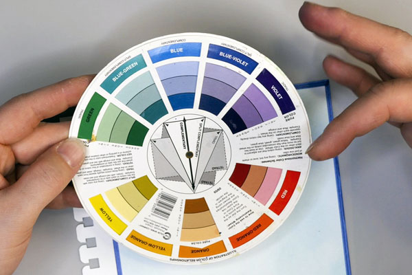
Color Wheel
The color wheel is very helpful for defining not only colors and combination of colors but also color values. A color wheel can help us bend the rules a bit, especially when creating a monochromatic project. A blue monochromatic layout can have blue-green and blue-violet in it and still be considered a monochromatic layout. This can lead to interesting combinations and challenges in learning how to make these colors work well together.
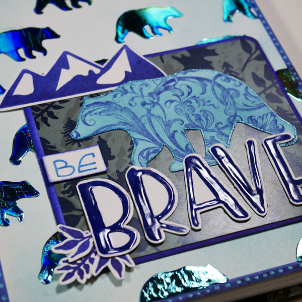
Art Journal Page
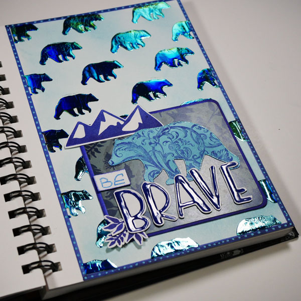
What inspired this art journal page was a challenge I created for the Wild Whisper Designs Facebook Community. My challenge was to create a monochromatic project and there were some questions about how to do so. I created this tutorial to demonstrate how to create a monochromatic art journal project and some of the design considerations for these types of projects. For my color I chose to use blue.
Adding a Border
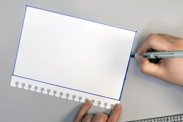
Start with a border around your project. I used a Zig Writer to add a dark blue border around the project using a ruler. This border can either be thin or thick depending on personal preference. To make the border thicker, continue to add lines with your ruler to expand the border.
Applying Distress Ink
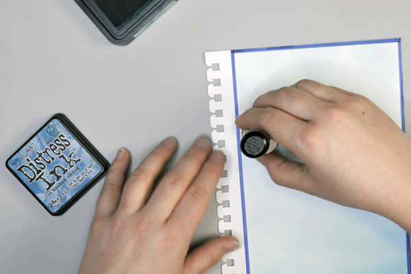
Start by blending distress ink onto the background using Tim Holtz Broken China Distress Ink with a blending tool and foam onto your layout. By applying a thin layer, this adds blue color to the layout but contrasts with the dark blue border.
Add Bear Images to the Background
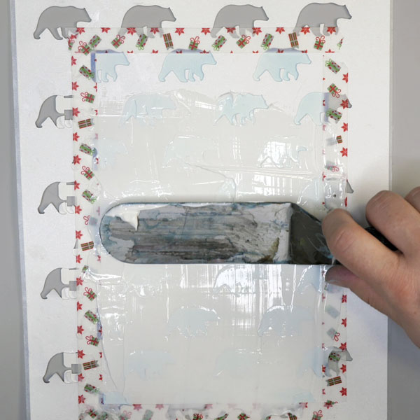
The image that I am repeating through this project is of bears. I love making my own stencils with cut files, so using the Wild Whisper Designs Adventure cut file I created a stencil with the bear image. After creating the stencil, tape it to your page using washi tape. Make sure to tape over the border to prevent it being covered by the gel that will be added next.
Using a palette knife, apply Deco Foil Transfer Gel through the stencil in an even layer. The key is to make sure to get an even application of the gel across the entire stencil. Remove the stencil and washi tape and allow the transfer gel to dry until clear. Depending on climate, this may take several hours.
You could use any stencil for this step. If you do not know how to make your own stencil and would like to use a bear image, you can also use stamped images for this step. The Wild Whisper Designs Adventure Stamp Set has bears that would work perfectly for this application.
Stamping Focal Images
Using the Wild Whisper Designs Adventure Stamp Set, stamp the mountain and leaf images using your favorite ink. I used Colorbox Midnight Pigment ink for this step because of the blue-violet color of the ink. Using the Wild Whisper Designs Capital Letter stamp set, stamp the word “Brave” with the pigment ink.
Coloring the Bear Die Cut
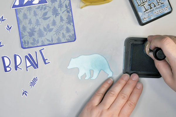
If you are using the Wild Whisper Designs Adventure Cut Files, cut the bear cut file on white paper. The bear in this project is 3.5” x 2.” Using Broken China Distress Ink, blend color onto the bear. Apply several layers so that it is darker than the ink blending on the background.
To add additional patterning to the bear, I used the Stamper’s Anonymous Baroque flourish to stamp Midnight Pigment ink on top of the bear. By adding these two colors of ink, this ties the more blue-green background into the blue-violet colors of the focal images. Finish off the bear image by adding Gelly Roll pen around the edges of the bear image.
Assembling the Focal Image
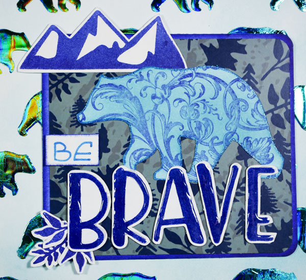
Using a piece of the Wild Whisper Designs Adventure paper, cut it to 3.5” by 4”. Cut a white piece of paper to 1/8” larger in both dimensions and color the edges with the midnight pigment ink. Round the corners on both pieces of paper and adhere the adventure paper to the colored cardstock.
Add the stamped images and die cut onto the paper. By layering the mountains behind the bear and the words on top of the bear, this will add dimension and depth to your project. Finish by writing the word “Be” on a piece of paper, inking the edges and cutting it out. Add glossy accents to the word Brave and set it aside to dry.
Adding Deco Art Foil
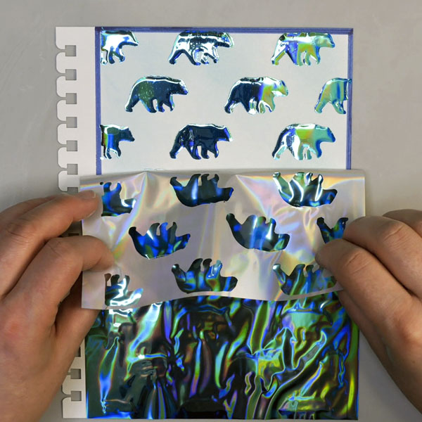
When the transfer gel background images have dried clear, add Deco Foil Glass Slipper onto the image. Add the foil to the bears with the color side up, put the paper and the foil between a folded piece of parchment paper. Run the parchment paper sandwich through a laminator. Remove the foil to reveal the bear images.
Final Touches
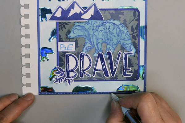
Adhere the focal image block to the art journal page and finish off the page by adding dots to the border using a Pentel Gelly Pop Pen.
What Do You Think?
What do you think about creating a monochromatic art journal project? Is this something that you would attempt? This is not just a technique for art journal pages, but can easily be transferred to a card, scrapbooking page, or tag. I hope that you have learned something new about color theory from this post. I would love to hear what you think of this project. Please leave a comment below or contact me directly. I am looking forward to seeing your projects and hearing from you!
Project Supply List
- Koh-I-Noor Bristol Paper Journal
- Zig Writer Blue Marker
- Tim Holtz Ideology Design Ruler
- Ranger Blending Tool and Foam
- Tim Holtz Distress Ink Broken China
- Palette Knife- Large and Small
- Washi Tape
- Stencil
- Deco Art Duo Transfer Gel
- Deco Foil Transfer Sheets Glass Slipper
- Wild Whisper Designs Adventure Cut File, Paper and Stamp Set
- Colorbox Pigment Ink Midnight
- Wild Whisper Designs Capital Letter Stamp Set
- Ranger Glossy Accents
- Tim Holtz Stampers Anonymous Baroque Stamp Set
- Staples White 90lb Cardstock
- Sakura Gelly Roll Pen Metallic Blue
- Pentel Milky Pop Blue Pen
- Stamping Block
- Swingline Inspire Laminator
- Parchment Paper
- Craft Knife