How to Create Layers Using Ink Blending
Creating in a journal is a great self-care practice but it can be challenging to add layers and dimension to a page. Today we will discuss how to create layers using ink blending in your creative projects.
Layering Inks
Layering inks is a great way of creating dimension in your projects. There are several things to consider when you are creating layers with your inks:
Color Values
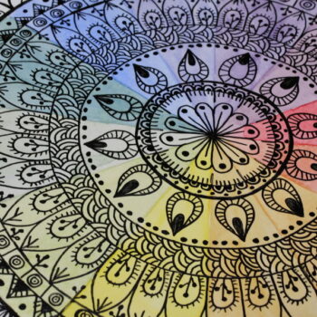
In my last article I shared about how to use color values when creating a monochromatic project. By using a variety of color values this creates different shades and intensity of color, which adds dimension to your project.
Type of Ink
Certain types of inks work better for layering than others. I love using the Tim Holtz Distress Ink and Tim Holtz Distress Oxide Ink for color blending. They blend smoothly with a foam applicator and color can be easily added in layers to create a variety of color combinations and color values.
Opacity of Ink
Before adding any ink to your project, test it out on a piece of paper so that you understand the opacity of the ink. If you are trying to blend an opaque ink on top of a translucent ink, the opaque ink will cover up the translucent ink. When you add layers of translucent ink together, this is how you will start blending and layering color.
You can use opaque ink on top of translucent inks, this can be a great way of adding a focal image or color to your project. When used correctly, this can also add depth and dimension to your project.
The Art Journal Project
The Intention
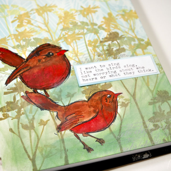
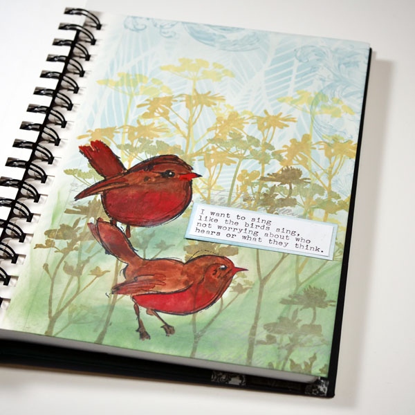
With every project that I create, I start with an intention. That intention might be to try out a product such as a stamp or image. Sometimes the intention is a word or quote. In this project, it was a bit of both. This beautiful quote from Rumi was the inspiration for this journal page.
I want to sing like the birds sing, not worrying about who hears or what they think.
This quote reminds and challenges me that we need to be who we are, even if people judge us or do not understand. When I think of birds, I am always reminded of their beautiful songs. They always seem cheerful, and it is hard to be cheerful if you are worrying. This is a wonderful reminder that sometimes we need to blaze our own path, trust ourselves, and be who we are without worrying about the opinions of others.
When I saw this quote, I knew the perfect image to use for this project. I used this stamp from Dina Wakley’s Scribbly Bird Stamps collection. They are so cheerful, and the sketchy design was a perfect complement for a creating layers using ink blending.
The Project
Step 1: Add Distress Ink to Page
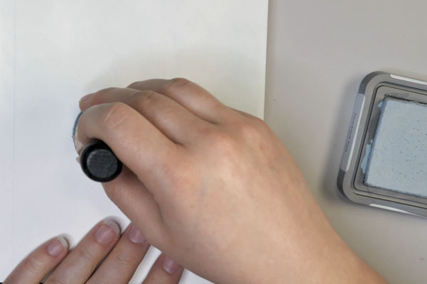
Add a light layer of ink to the page with Tim Holtz Speckled Egg Distress Oxide Ink using a blending tool. For more direction on how to blend ink, I have created a tutorial specifically on ink blending.
Step 2: Add Ink Through a Stencil
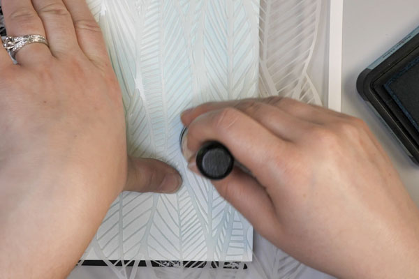
Using Tim Holtz Broken China Distress Ink, add the ink with a blending tool through the stencil. For this background, I chose to use the Stencil Girl Clustered Leaf stencil as the fine lines and textures of the design creates variety to the background. To add additional variation to your project, vary how much ink you apply in different areas on the stencil. This will give more sense of depth and variation to the sky.
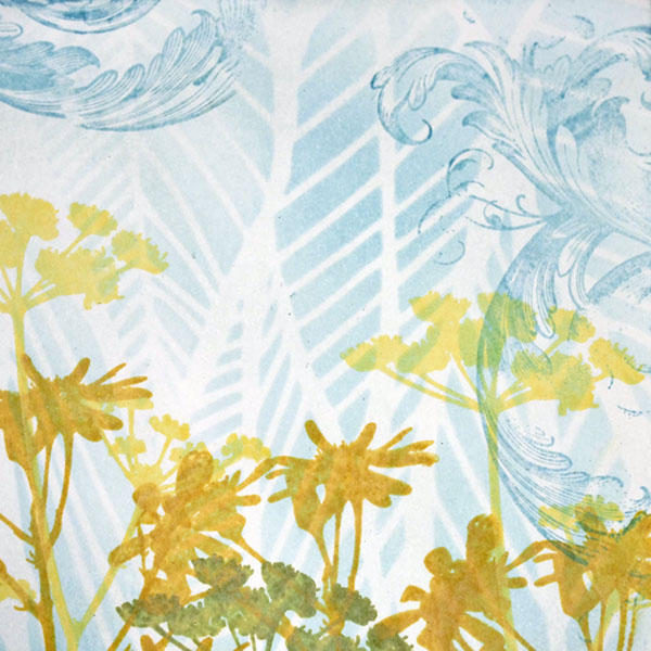
Step 3: Stamp Flower Image in Layers
Start stamping flowers in layers onto the project. Start with a light color for the flowers that will be farthest away and as you move down the page, move to darker inks with each layer. This also helps to create a sense of depth in the project. The light colors will make the flowers look further away at the top of the page, while the flowers that are in darker colors and further down the page will appear to be closer.
Step 4: Stamp Bird Images
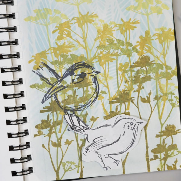
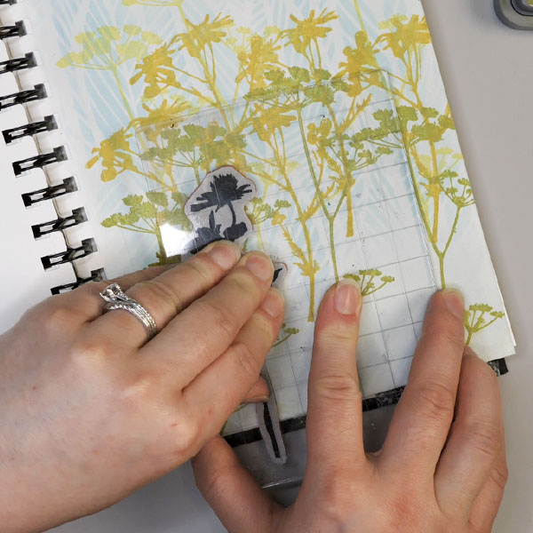
Stamp the Dina Wakley Scribbly Birds using Jet Black Archival Ink. If you are interested in layering the birds, create a mask.
To create a mask, stamp a bird image on a piece of paper and cut it out. Stamp the bird image onto the project, then cover it with the mask. When you stamp the second image that will overlay the first, this will not create stamp marks on the first image. This is another way to create dimension and depth to your project.
Step 5: Color Birds with Gouache Paint
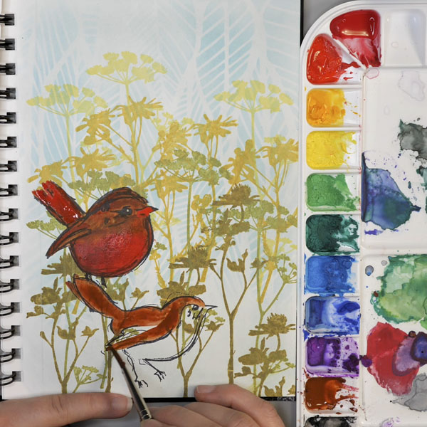
Using a paintbrush and water, add gouache paint to the birds. As gouache is an opaque watercolor, make sure not to cover up all the scribbly lines in the bird images. You can do this by painting around the lines. The other option is to thin out the gouache a bit to make it less opaque. Add paint to both birds and set aside to dry.
Step 6: Add Foreground Color
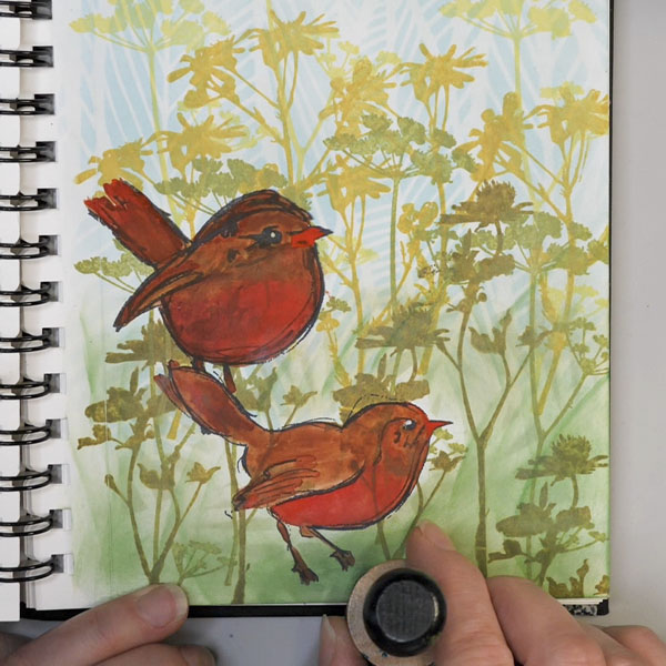
Using TCW Fantagle stencil, apply Tim Holtz Distress Oxide Bundled Sage through the stencil. Make sure to ink around the birds or use a mask to cover the birds as the Distress Oxide Ink has a more opaque finish. Remove the stencil and blend in additional Bundled Sage ink.
Continue to add additional ink to the page using Tim Holtz Distress Inks Mowed Lawn and Pine Needle. Blend the create darker areas and shadows underneath the birds. By angling your blending tool, you can swipe to make strokes that look like grass. By adding mark making in this way, it adds texture and variation to the blended ink.
Step 7: Stamp Words
To add additional texture to the project, use Ideology Faded Type stamp set to add words and letters to the project. By using Hickory Smoke Oxide Ink this will add subtle texture to the foreground.
Step 8: Stamp Baroque Image
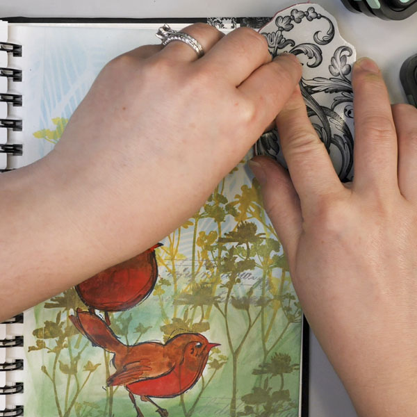
Using Tim Holtz Broken China Distress Ink, stamp the baroque image around the edges of the blue sky. By keeping the pattern random and only in small areas, this will bring texture and interest without looking repetitive.
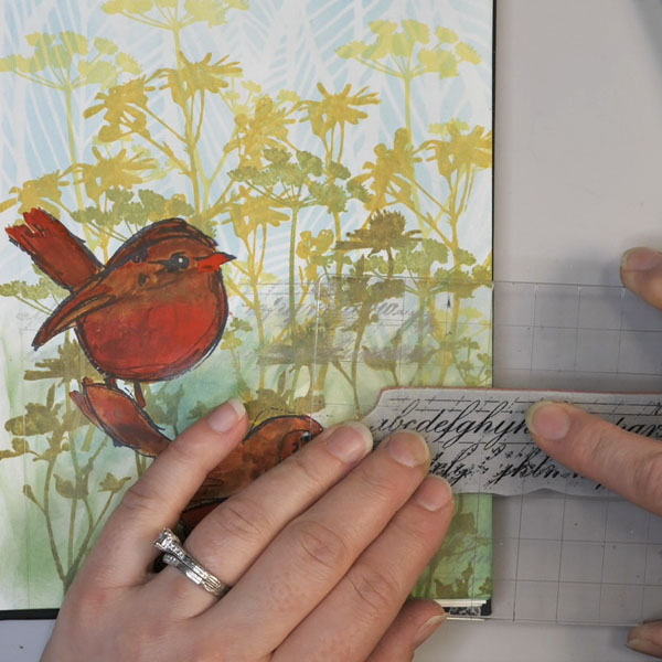
Step 9: Add Quote
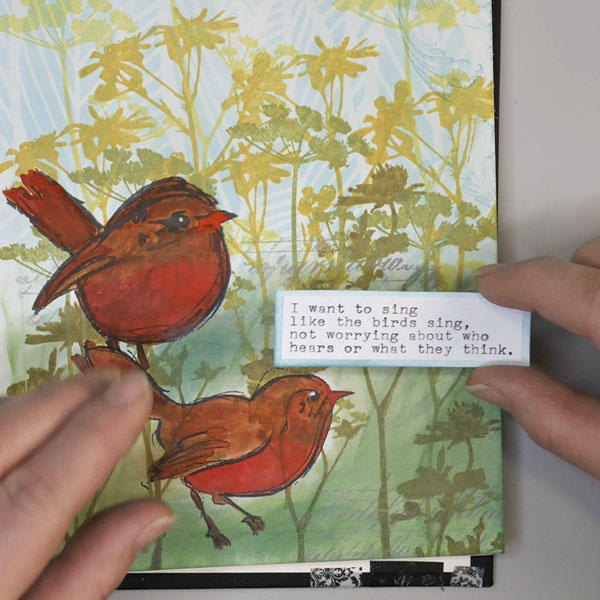
Write or type your quote on a piece of paper. For this step I used my Royal Manual Typewriter to type out my quote. Cut out your quote and cut another piece of paper ¼” bigger in both dimensions. Ink this piece with Broken China ink and adhere the quote to it. Add it to your project and group it with the birds.
Questions?
Do you have any questions about this project or how to create layers using ink blending? I hope that you enjoyed this project and learned something new about how to create values and dimension in your projects. I would love to see your work! Please use #hopalongstudio on Instagram so that I can view and like your projects! If you have any questions about this project, comment below or contact me directly.
Project Supply List
- Tim Holtz Distress Inks: Broken China, Mowed Lawn, Pine Needle
- Tim Holtz Distress Oxide Inks: Speckled Egg, Squeezed Lemonade, Fossilized Amber, Peeled Paint, Forest Moss, Bundled Sage, Hickory Smoke
- Stamps: Tim Holtz Stampers Anonymous: Faded Type, Wildflowers, Baroque. Dina Wakley Media: Scribbly Birds, Scribbly Birds Cousins
- Holbein Gouache Paint: Carmine, Flame Red, Permanent Yellow Deep, Burnt Sienna, Permanent White
- Stencils: Stencil Girl Clustered Leaf, The Crafter’s Workshop Fantagle
- Paintbrushes: DaVinci Cosmotop Spin Round Brushes Size 0, 2, 4
- Other Materials: Jet Black Archival Ink, Royal Manual Typewriter, Copy Paper, Ranger Blending Tool & Foam, Stamping Block, Water Cup, Water, Paper Towels, Scotch Advanced Tape Glider