Create the Ultimate Textured Collage with this Technique
Do you feel like your collage pages are missing something, but you’re not sure what? I’ve been there too. I’ve always loved collage but sometimes my pages feel a bit flat, like they need that extra something. Then I stumbled into these texture tricks and everything changed! Paper wasn’t just paper anymore; it became so much more.
Today I’m sharing my favorite ways to add depth and energy with textured collage techniques. Let’s dive into the collage process and unlock a whole new side to your creativity!
Hop-A-Long Studio is reader-supported. When you buy through links on our site, we may earn an affiliate commission at no cost to you. Learn more.
Choosing a Focal Image
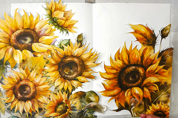
I like to start with a focal image because it dictates where the rest of the page will go. Today I’m using the Sunflower paper line from Simply Stated Design. If you love unique papers and ephemera, check out this fabulous small business. If you use nadine15 at checkout, you’ll get 15% off your first order!
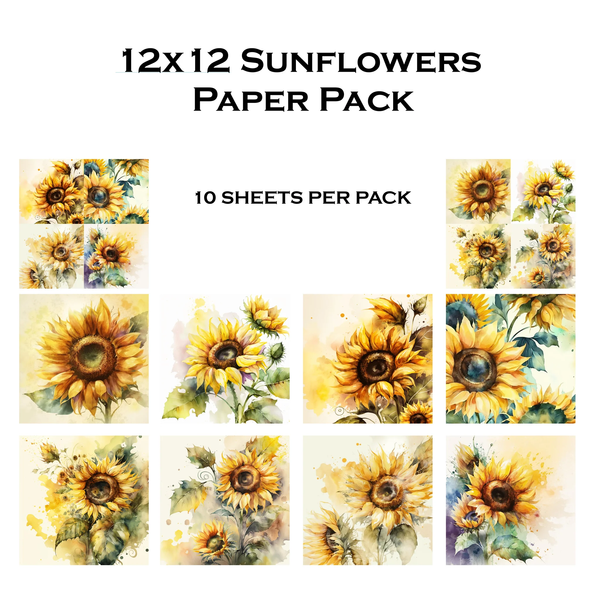
Collection of coordinating single sided patterned papers printed on high quality 80lb cardstock OR high quality gloss paper.
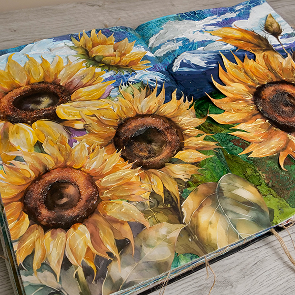
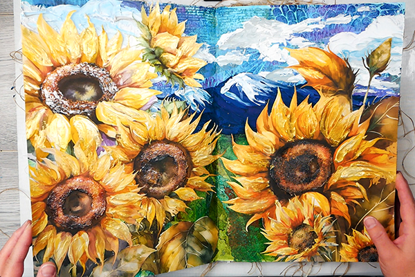
These sunflowers are meant for scrapbooking pages, but the large images are perfect for an oversized art journal. Today I’m using Dina Wakley’s large media journal that is 10” by 14”, giving me a double spread of 20” by 14” to work on.
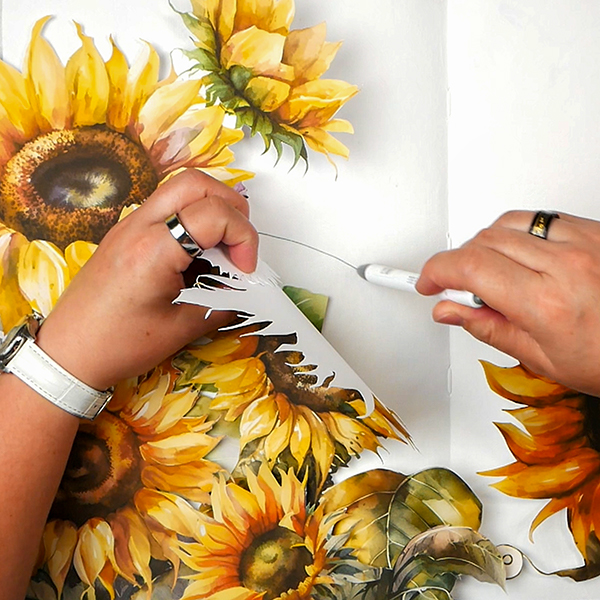
Using scissors, fussy cut out 5 pages of the sunflower images to use for this project. Any spaces that are too tight with scissors, use a craft knife and a cutting mat. This will let you get into tiny corners and help you get rid of all the background paper.
Start with Composition
Before we can add the textured collage, let’s start with creating a basic composition with our focal images. They are going to cover a good section of the page which dictates what kind of background we add to our page.
I like the idea of creating a landscape with mountains and sky with sunflowers in the foreground. Even with the focal images covering much of the area, there are going to be spots where you will see the background color. To help make it easier to see where the sunflowers will be placed, I’m using a Zebra Click Art Watercolor pen to sketch in the general areas where I’m putting the sunflowers. This way I can focus on adding a background in the places that you will see it.
Work in Layers
The key to a fantastic art journal page is working in layers. Don’t rush through this process. The layers give depth and create the unique collage textures that you’re looking for.
Start with Paint
With collage projects, I sometimes start with a layer of paint to create a color foundation for my projects. As I’m working with tissue paper layers to create additional texture, this layer of paint is essential. This prevents from having white areas that will stick out on your project.
In this landscape, for the green areas I’m using Pebeo Chrome Green Hue as it’s a great color for creating a bright mid value green, which is going to be perfect for layering tissue paper.
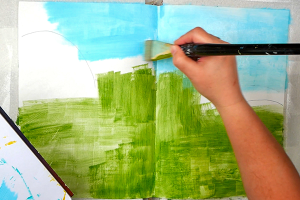
For the sky, I’m applying Amsterdam Sky Blue. By sticking with a lighter blue, this won’t wash out the colors of the tissue paper while still providing a blue background. By adding it across the entire surface, any spots that the sunflowers don’t cover will be a beautiful blue tone instead of stark white.

Proudly crafted in the Netherlands, these acrylic paints are value priced and easy to use, making them an excellent choice for the beginning or intermediate artist. They can be mixed with water or mediums, and clean up requires only soap and water.

Pebeo High Viscosity Studio Acrylic Paints are the ultimate mixed media acrylic! Vivid, deep, and richly pigmented, it offers very good lightfastness and permanence.
Adding in Textured Collage
I love using tissue paper for collage because of the delicate layers that they create. They give texture and color but aren’t fully opaque. Using some of my favorite tissue paper gel prints and altered tissue paper, I tore them up in pieces to add them to my collage. I also have a collection of printed tissue paper from gift bags that are perfect for collage.
Using matte medium, add in a layer of matte medium to the surface, then add the tissue paper on top and gently brush the matte medium on top of the tissue using a soft brush. The key with this is to be gentle otherwise you will tear your tissue paper.
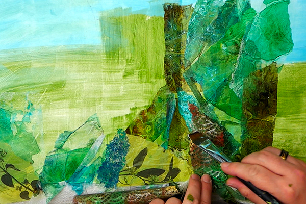
For the ground, I chose to use green, brown and dark blue tissue paper. Some pieces I added in strips, others I shaped to look more like leaves. By varying and layering the different tissue papers, this created some unique textures. I even used gel printed Japanese paper with unique textures to build a more textured collage.
Creating a Textured Collage Sky
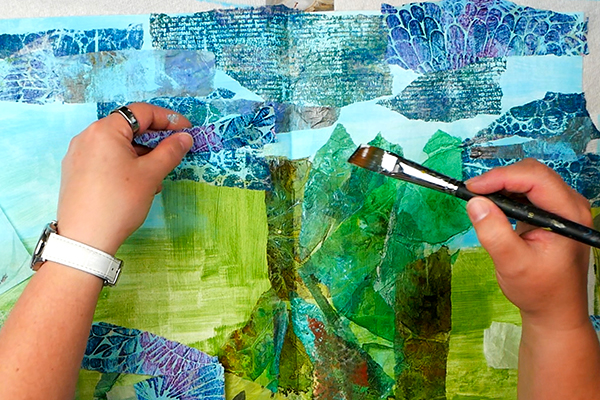
For the sky, the idea of creating bands of clouds was my focus for this composition. Using strips of blue, purple and grey printed tissue paper, add these in overlapping horizontal strips. By layering and overlapping, this created unique color combinations and texture to the page.
Creating Harmony in a Textured Collage
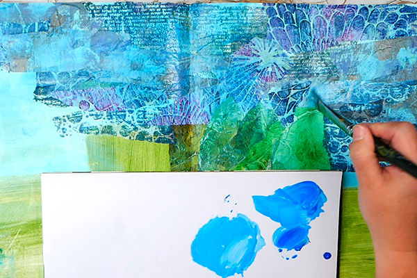
I love how this textured collage looks so far, but some of the patterns seem to stick out more than I’d prefer. This is where paint washes come in handy. Water down your paint with a bit of water and brush it onto the surface. For the sky I used a combination of Oriental Violet, Quinacridone Rose and Sky Blue.
Adding in Clouds
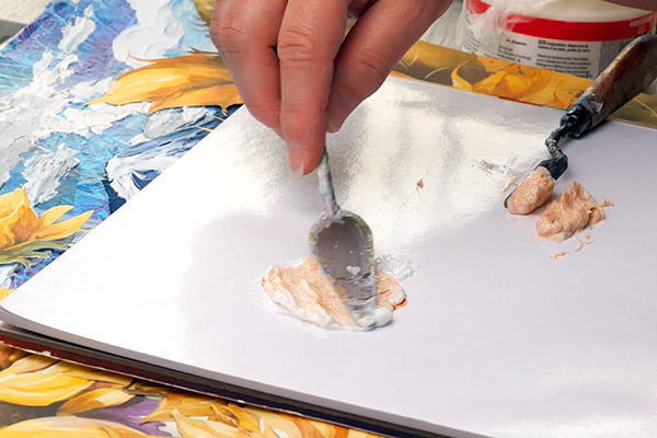
If you followed along with my How to Tint Pastes article last week, I talked in detail about how to tint pastes and gels. Using these techniques, I mixed Holbein Light Modelling Paste with Titanium white paint. The reason I tint modeling paste white is that the paste will not dry fully white and opaque. This way you get a true white on your project.

This modeling paste is lighter in weight, fluffier in texture, and more flexible than Holbein's other modeling pastes. This allows you to build up more voluminous shapes with less weight.
I tend to mix paste with a large palette knife and apply the paste with a small palette knife. Be aware that the size of your knife will affect the texture marks you make.
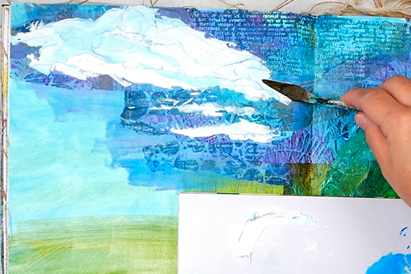
You can swirl and move your palette knife to create fluffy clouds or thin clouds. Each stroke you make creates unique texture, so be purposeful as you add your paste.
Creating Shadows and Midtones
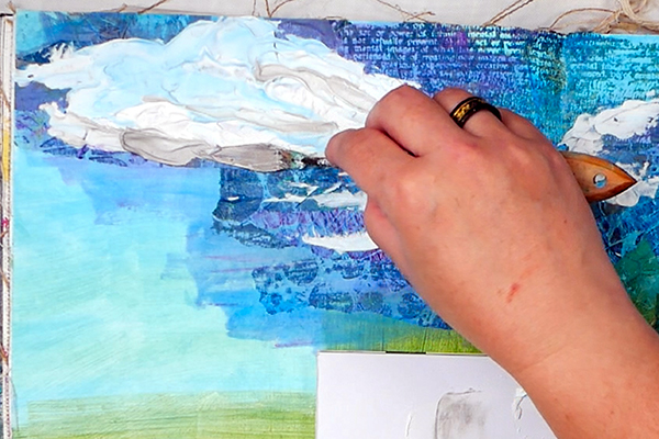
After you add the white base, you can mix in a touch of Primary Cyan to get pale blue. Add this into the wet white paste to create unique color values.
I also used a bit of Distress Hickory Smoke paint to the light modeling paste to add shadows to the clouds. By using the base and mixing in these other colors, this creates dimension and color variation that will help your page come alive.
Tips for the Best Results
If you want to add a color with a palette knife and have it stay very pure, add the paste to the surface, blend, then wipe your palette knife clean.
If you want to blend the color more, don’t clean the palette knife between applications. This will create a unique mix of colors in the areas you apply the light modeling paste. Both techniques work, it just depends on what you’re trying to create.
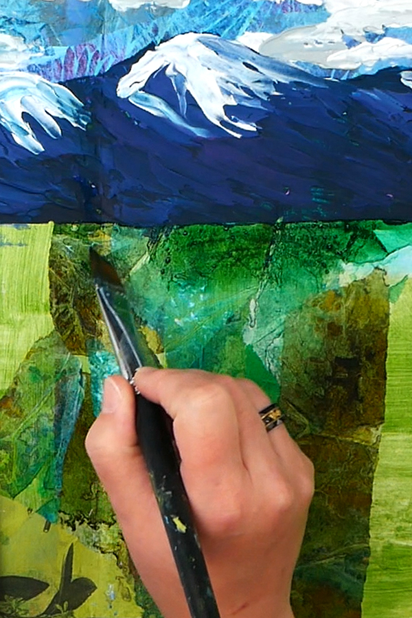
Adding in Mountains
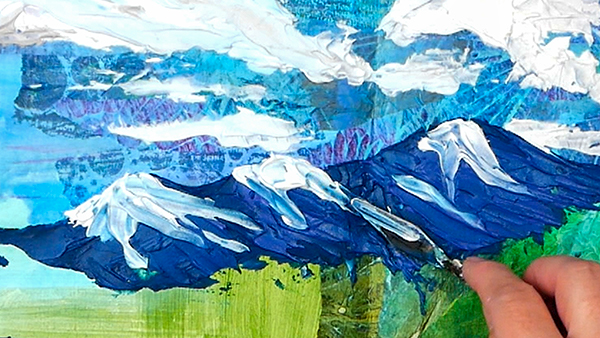
Originally, I was planning to leave this page as sky and flower fields. The plan was to have the leaves poking out around the sunflowers contrasting with the sky. But since the sunflower imagery is photo realistic, I didn’t think that the loose collage leaves would work well for this background.
Instead, I decided to add in a mountain landscape. Using the light modeling paste with Prussian Blue, Oriental Purple and titanium white, I added in the mountains. You can see that I was able to add texture just by the way I added strokes into the mountains.
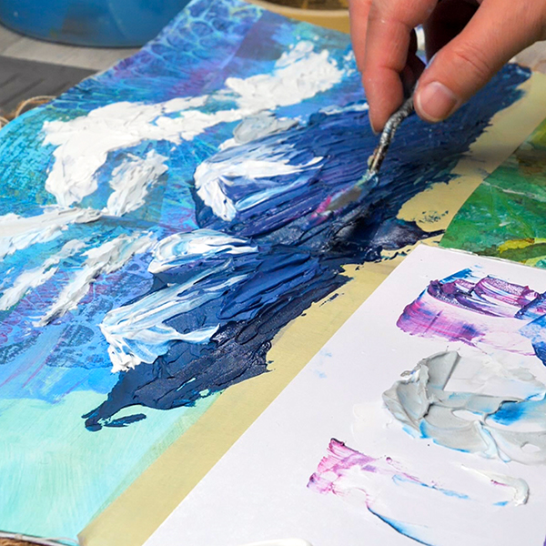
Direction matters with palette knife painting, and you can convey a lot just with a few strokes.
Getting the Perfect Horizon
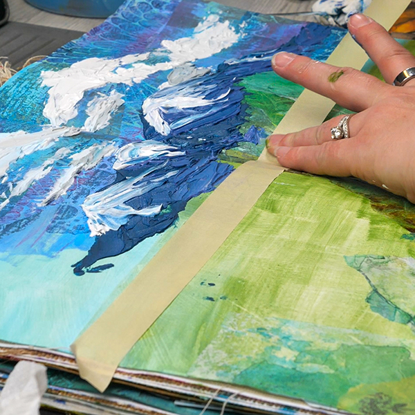
Getting the perfect horizon with this technique can be difficult, which is when I reach for my painter’s tape. Add a strip gently across the page where you want your horizon line to be. Don’t press down hard or rub in. We will be removing it as soon as the paste is applied. Just make sure that your collage is fully dry before adding the tape.
After you add in your paste, while it is still wet, pull the tape off. You’ll end up with a beautiful, crisp horizon line.
Make sure to let the paste dry before moving on. It was a very warm day outside, so I set my journal outside for 45 minutes and it was ready for the next layer!
Adjusting Colors
Sometimes you need to adjust colors in your textured collage to work with your focal images. I noticed that my eye was being pulled to the bright green background between the flowers. I like to squint or stand away from my page to see if there is anything that is standing out that should be more muted.
This is where the acrylic paint washes come in. Using Holbein Hooker’s Green paint with Burnt Sienna, creating a warm green-brown color to add to my collage. This toned down the bright spots to help the sunflowers pop more.
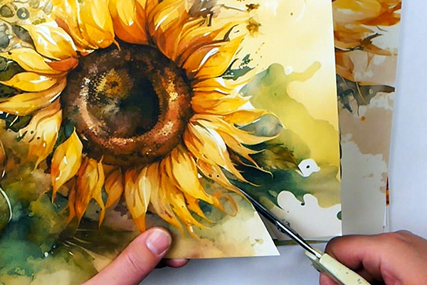
Adding the Sunflowers
Now it’s time to add the sunflowers using one of my favorite glues: Yes Paste! Make sure to check out this article Looking for the Best Collage Glue? Start Here! about my favorite collage glues for different types of paper.
Because the surface is so uneven and textured, instead of using my glue recipe, I’m using Yes Paste straight out of the jar. This will give me enough working time but will help the images stick to the uneven surface.
I like using a palette knife due to the thickness of the Yes Paste if you’re planning on using a brush to apply the paste, check out the recipe in my glue article to make the Yes Paste easier to spread.
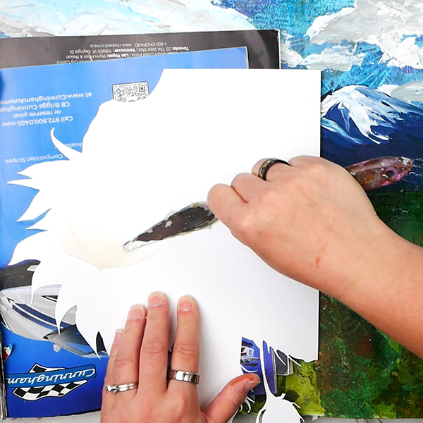
Take an old magazine and use a palette knife to add the paste to the sunflowers, working from the center out. When you work this way, you’ll get less glue on the front of your image. If you do get a bit of glue on it, wipe it gently with a baby wipe to remove any excess glue.
After adding the images, give it a few minutes to dry before adding the next texture layer. We want to make sure that we have a great hold on the page before we add in more wet texture.
My Images Don’t Lay Completely Flat
You might find that even with the Yes Paste, there are parts of your image that are on such a textured collage surface that they might not lay completely flat. That’s ok. We’re working with so much texture; this is to be expected. I’m attempting to have a thick, even layer of glue underneath the image so that the image is glued down as well as possible.
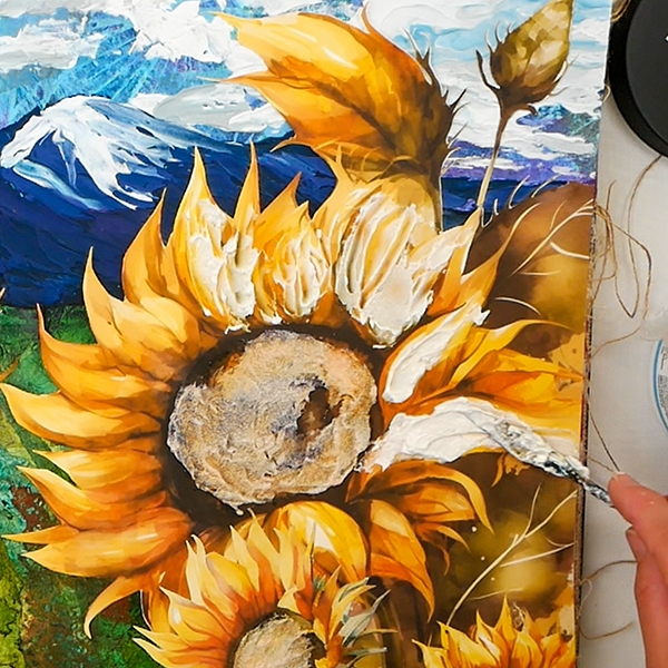
Adding in Sunflower Texture
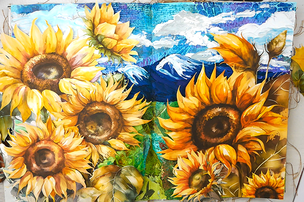
You could leave the page just like this, with beautiful sunflowers on a textured background. Part of me is tempted to leave it, but part of me wants to take this a bit further. You can let me know in the comments section below if you love the texture or if I took it too far!
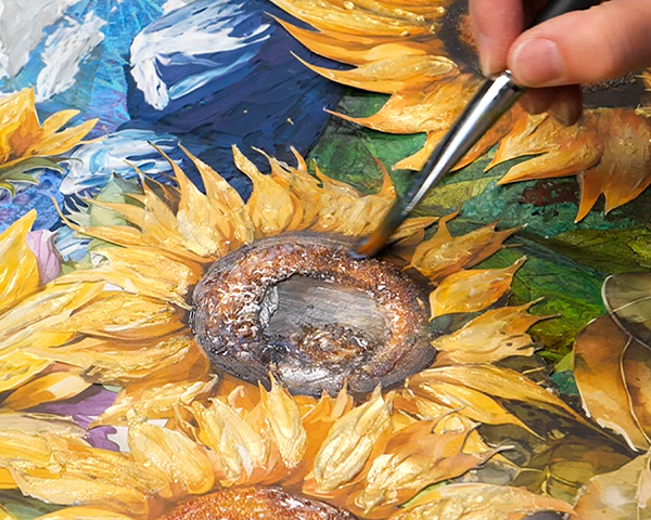
Glass Bead Gel and Metallic Paint
If you followed along with the tinting article a few weeks ago, we talked specifically about mixing acrylic gels with metallics. Today instead of using gels, I’m using glass bead gel. This is basically a gel with tiny glass beads mixed into it. You could make your own, but I’m going to use both the Amsterdam and Golden brands of Glass Bead Gel to show you how they work on a project.
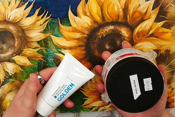
These are great to add to any surface to create texture and shine, but today we’re mixing glass bead gel with a bit of FW Copper Acrylic Ink to add color and luminance to the center of our sunflowers.
The intention is to create a light tint and shine without covering up the details of the sunflower stencils. Using a palette knife, add the tinted glass bead gel to the center of the bright highlighted areas.
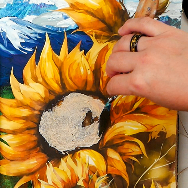
This can feel a bit scary to try! Glass bead gel will dry clear, but right now it’s super cloudy and always makes me wonder if I’ve ruined my project! Stick with the process and you’ll end up with a beautiful tinted layer of color.
Textured Petals with Interference Paint and Gels
I love interference paint because of the color flipping nature of the paint. From one angle you can barely see the color but move the page and you’ll see vibrant and beautiful shimmer! These come in a variety of finishes, but today we’re going to use Interference Gold Paint to add dimension and shimmer to our sunflowers.
Using Golden Extra Heavy Gel Gloss, mix some of the interference paint with the gel. The nice thing about the interference paints is that they are semi-transparent, so the gel creates texture and shine, but you’ll still get the details of the paper image.
Add the gel to the sunflower petals using a palette knife and focusing on the lightest areas. This can be a way of adding texture and creating highlights. This will look cloudy when first applied, but make sure to wait for it to dry fully. You’ll be amazed at the result.
Before and After
So now that this has fully dried, here’s the before and after.
As you can see, the difference is amazing! Gels can be challenging because the color when applied is different than when it dries. But the transparency and shine that can be mixed into the surface makes it worth it!
Final Touches
It’s important to let everything dry and come back one more time to see if any final touches are needed. I like the glass bead gel sunflower centers, but the matte areas contrast a bit too much with the rest of the flower. To make the sunflower centers more uniform, paint a bit of gel gloss medium onto sunflower centers. This way the sunflower center is a combination of texture and flat gloss color.
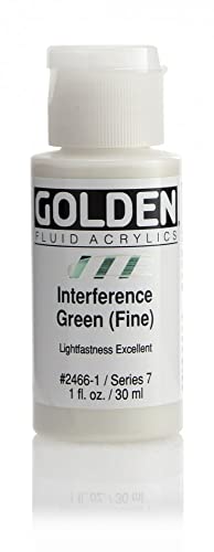
The sunflower leaves are beautiful, but I wanted to add a bit of color flipping shimmer. Using Interference Green Glue paint as a watered down wash, I added them to the margins of the sunflower leaves.
Adding in Journaling
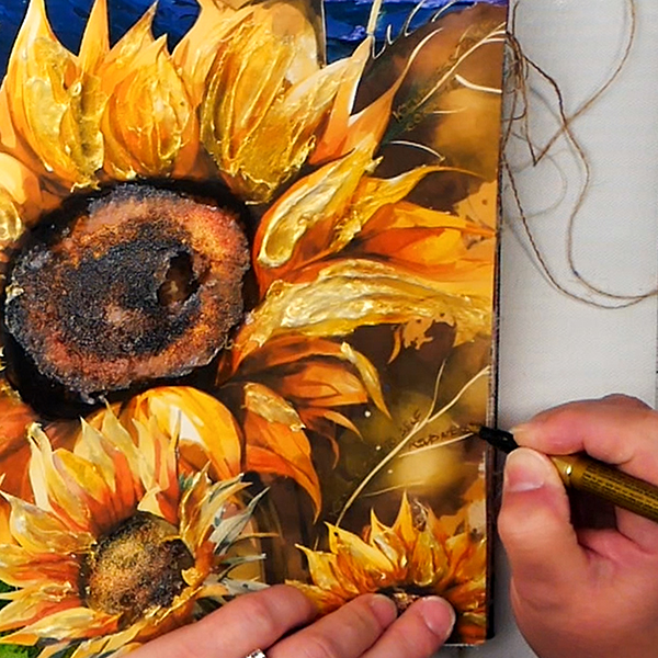
When I think about sunflowers, they always make me feel happy. Something about the vibrant color, the drooping flowerheads brings me joy. It’s important to me to add a bit of journaling to my pages. It’s about art, but it’s also about the journey.
I’ve been thinking a lot about kindness lately. About the importance of being kind both to ourselves and others. I’ve had moments of overwhelm lately and it can be easy to be unkind to ourselves. It takes courage to give ourselves the same grace that we show to others.
Using a gold pen, I wrote in the following words on the leaves:
Kindness takes courage,
Nadine Milton
Kindness to self, kindness to others,
Taking life slow.
Using a Pentouch gold paint pen makes it legible but it doesn’t stick out from the background. This is a way we can sneak our journaling into the page without it being front and center.
Want More Projects Like This?
If you love this textured collage project, check out my course where I share a found object assemblage project.
Also, sign up for my newsletter for free printable and be the first to know about upcoming courses!
Final Thoughts
Perhaps this is a new and very different way to approach textured collage and art journaling. I am a fan of paper collage textures so I love these kinds of projects. My hope is that this has given you a different perspective on how you can use paper and texture in your next project. Thanks for following along!
Project Supply List
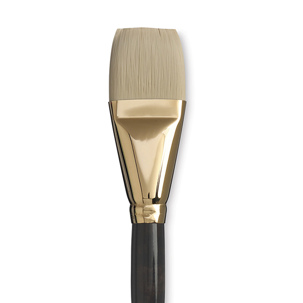
Princeton Dakota Series 6300 Synthetic Hair Brushes have long handles for maximum control, and synthetic bristles with excellent stiffness, snap, and shape retention.
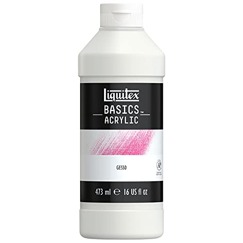
Liquitex Basics Acrylic Gesso is formulated to produce a smooth, absorbent, finely textured ground for painting on most porous surfaces, including canvas, paper, fabric, wood, or plaster.
Pebeo High Viscosity Studio Acrylic Paints are the ultimate mixed media acrylic! Vivid, deep, and richly pigmented, it offers very good lightfastness and permanence.
Proudly crafted in the Netherlands, these acrylic paints are value priced and easy to use, making them an excellent choice for the beginning or intermediate artist. They can be mixed with water or mediums, and clean up requires only soap and water.

Liquitex Basics Acrylic Fluid Mediums improve the flow of acrylic paint colors, resulting in easier blending and increased transparency.

This angled art brush provides a wide variety of 9 brush sizes (0, 2, 4, 6, 8, 10, 12, 14, 16) to help you achieve maximum desired painting result.

- Acid-free palette paper, 50 Sheets at 9" X 12"
- Smooth mixing surface against grey paper for a neutral back drop on which to view colors
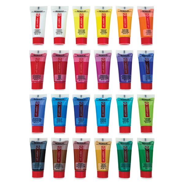
Talens Art Creation Acrylic Sets are perfect starter sets (and gifts!) for students, novices, and aspiring artists.
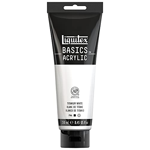
Liquitex Basics Acrylic Colors were developed for students and artists who require dependable quality at an economical price. Each color is uniquely formulated to bring out the maximum brilliance and clarity of the individual pigment.
This modeling paste is lighter in weight, fluffier in texture, and more flexible than Holbein's other modeling pastes. This allows you to build up more voluminous shapes with less weight.

Liquitex Basics Acrylic Colors were developed for students and artists who require dependable quality at an economical price. Each color is uniquely formulated to bring out the maximum brilliance and clarity of the individual pigment.

- Professional quality
- Comparable pigment load to Golden Heavy Body Acrylics
- 100% acrylic emulsion; no fillers, dyes, or opacifiers
- Intense, permanent colors with a smooth, fluid consistency
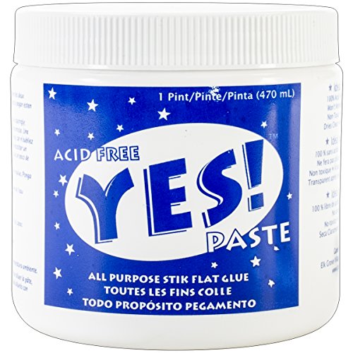
Acid-free glue that is slow setting, dries clear and cleans up with soap and water. A must have for any collage artist!

A coarse textured medium with a heavy body viscosity that holds peaks. Made with genuine glass beads to create a unique visual effect.

A 5-piece premium quality stainless steel artist palette knife set with sturdy comfort-grip wooden handles. Set includes the essential shapes and sizes needed for most types of palette knife techniques and painting applications.

The shimmering pearl effect created by these colors is startling!
Apply these beautiful inks with a dip pen, ruling pen, or brush. All colors are intermixable, translucent and permanent, and work best when put down freely rather than applying successive layers of color.

Thicker in consistency than Golden Heavy Body Acrylics, the Golden Heavy Acrylic Gel Mediums hold peaks and dry translucent. They're ideal for thickening, altering sheen, and increasing translucency of acrylic paint.

Golden Interference and Iridescent Heavy Body Acrylics add an exciting range of options to your creative repertoire. Used alone or mixed with other acrylic paints, they enable you to achieve color effects that are truly spectacular.
Golden Interference and Iridescent Heavy Body Acrylics add an exciting range of options to your creative repertoire. Used alone or mixed with other acrylic paints, they enable you to achieve color effects that are truly spectacular.

Introducing the ultimate tool for unleashing your creative potential - the Posca Paint Marker. Elevate your artistic endeavors with a marker that combines innovation, versatility, and top-notch quality, all in one package.
Collection of coordinating single sided patterned papers printed on high quality 80lb cardstock OR high quality gloss paper.

Proudly crafted in the Netherlands, these acrylic paints are value priced and easy to use, making them an excellent choice for the beginning or intermediate artist. They can be mixed with water or mediums, and clean up requires only soap and water.

Proudly crafted in the Netherlands, these acrylic paints are value priced and easy to use, making them an excellent choice for the beginning or intermediate artist. They can be mixed with water or mediums, and clean up requires only soap and water.


You May Also Like
3 Unique Ways to Make Fabulous 3D Holiday Cards
Mixed Media Tag “Nature Does Not Hurry”