Painting with Ink: An Art Journal Project
Have you ever tried painting with ink? In this week’s art journal project, I wanted to show you a way that you can use your stamp re-inkers to create beautiful images.
So why Try Painting with Ink?
I have re-inkers for all my stamp pads, because without them a stamp pad does not have a very long life. The nice thing about re-inkers is that they are concentrated ink so you can use very little of it to get a great result. But this could work with any water-soluble ink you have.
Why not Use Watercolor?
I love my watercolor paints and use them on so many projects. But it is also nice to mix things up a bit. If you are interested in watercolor but do not want to invest in watercolors yet, re-inkers are a great way to try out the medium.
Inks do not have the same finish or feel as watercolor, but it is still a great medium to play with. If you are uncomfortable mixing your own colors, this is a great way to start playing with understanding shading. By adding in water, this lightens the ink giving you less intense color.
Art Journaling Project
For this project I have completed a step by step video tutorial showing you all the steps for painting with ink in this project as well as providing written instructions below.
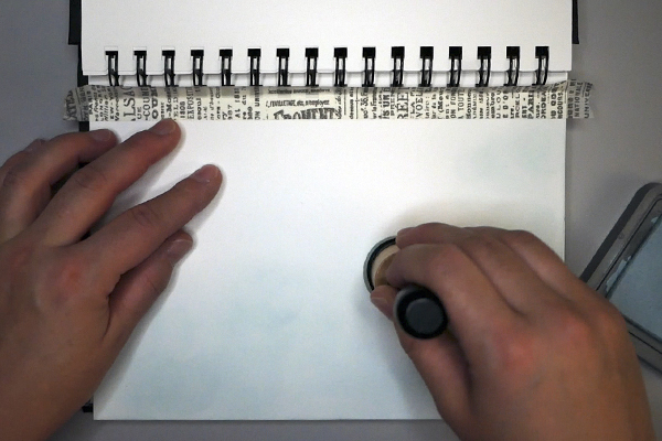
Adding a Base Layer of Ink
If you are using a journal that has coils, consider taping the coil edge of the page with washi tape. This gives a crisp line to the top of your project and protects the coils from ink.
Using a blending tool and foam, add in a base layer of ink onto the surface. I used Tim Holtz Distress Oxide Speckled Egg Ink. If you do not know how to blend ink, please view this video that provides step by step instructions.
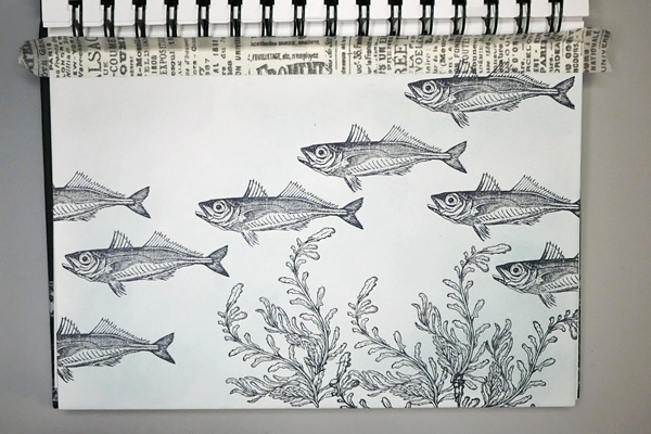
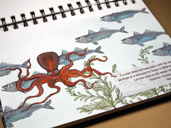
Stamping Images
Stamp in the frond images with Ranger Archival Jet-Black Ink to create a watery forest at the bottom of your page. Overlap stamps in some areas. To prevent messy images, mask off areas with a sticky note or piece of paper to prevent stamping in spots where you do not want ink. If you end up with some partially stamped images, you can carefully sketch in the missing image with a Faber Castell Pitt Pen as the ink color is the same shade of black as the Ranger Ink.
Add fish stamps in a random pattern. By stamping them close together but in a random pattern emulates the movement of a school of fish. When applying the stamp near the coils of you book, watch the position of your stamping block to make sure that you get a clear image. You may need to move your stamp in a different position on the block to make sure that the coils of the book do not get in the way.
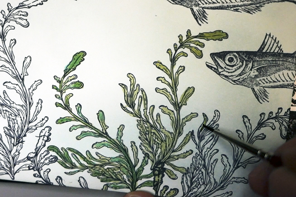
Painting Plants with Ink
When painting plants with ink, I used Peeled Paint, Mowed Lawn and Cracked Pistachio Distress re-inkers. I added a drop of each to my silicone painting mat and mixed in water with my watercolor brush. The re-inker is very intense, so use a fair amount of water to water it down. If you want a lighter color, add more water.
When painting the plants, I used a 000 watercolor paintbrush to add in color. I started with a base color of peeled paint on the entire image. Then I added some highlights along the plant using Cracked Pistachio. To create more intensity, I added in Mowed Lawn ink on top of areas with both peeled Paint and Cracked Pistachio. If you keep your inking random when highlighting your images, it adds a more natural effect to your scene.
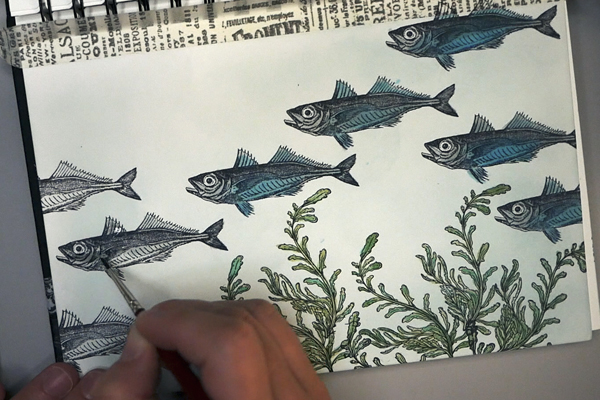
Painting Fish with Re-Inker
I chose Iced Spruce and Peacock Feathers for coloring in the fish. The Iced Spruce is a beautiful grey-green color, which makes the fish stand out, but it is still a muted color. By adding blue to the fish with Peacock Feathers we add highlights that are usually seen on fish but without making them too bright. In some cases, I mixed the two colors together to get a more muted look.
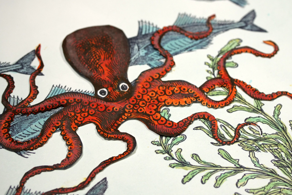
Stamping the Octopus
Once the background images are painted, I stamped the octopus on 90 lb cardstock. This makes it easier to cut out, but the paper is heavy enough not to buckle when adding ink and water. I usually stamp two images and use the cleanest of the two images in my project.
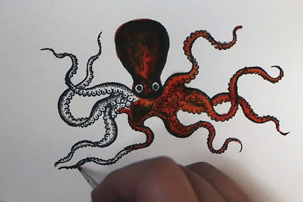
Adding Ink to the Octopus
When adding ink to the octopus using the Distress Oxide Crackling Campfire and Fired Brick re-inkers, be aware that the Oxide Ink is more opaque. I watered it down more and applied it less liberally to the stamped image so that it does not cover up the stamped image underneath.
What I love about Crackling Campfire is the different colors you get as your paint with it. As I thin it out, I get more yellow and orange colors showing through more than the red. It is a very interesting ink formula and I love using it in my projects.
I painted a layer of Cracking Campfire over the entire image and then added in Fired Brick for shadows. Once you have colored the octopus and let it dry, fussy cut out the image.
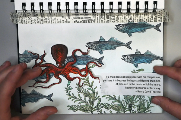
Adding in the Final Touches
To attach the Octopus to the layout, I used a combination of glue dots and PPA glue. The glue dots were to hold the image in place, the PPA glue was to adhere the tentacles that were hard to adhere with glue dots. Be aware that when you use liquid glue. It can rewet the ink, so work carefully with the image.
I also added a saying that I printed on vellum. I learned this week is that wet glue and vellum do not work well together. If you do use a liquid glue on vellum, it wrinkles in an unpleasant way. I would suggest a vellum specific adhesive. In my case, I chose a less transparent vellum and used my Glue Glider Pro to add tape along the entire back of the vellum.
The Project Design
I recently acquired a new Tim Holtz Stamper Anonymous Stamp Set “Sea Life” as well as Distress Oxide Cracking Campfire and Speckled Egg inkpads. I was looking for a new project to use these on. It was an interesting conversation at work that inspired this project. I was talking with one of my co-workers about why I am so happy at work. I realized how much of it had to do with not caring as much about what people think.
Learning What to Care About
I used to lose myself in work, getting too involved in politics and things that did not really deserve my attention. I have realized how important it is to be who I am, to care about the things that are really matter to me and not to worry so much about the opinions of others.
The idea of swimming against the flow, or choosing my own path came to mind. It made me think about my aquarium and the way fish school together for safety. In a lot of ways, life can be the same way. We are expected to conform and be like everyone else. The more I embrace who I am, including all my imperfection, the happier I have become.
The Crazy Octopus
This layout is intended to be an expression of choosing to be different. To swim against the flow and choose a different path. I purposely chose a very soft color for the water and more muted colors for the fish. I think of it as the grey part of life. Those times where we are expected to conform.
But then there is the crazy octopus, which is so different from the fish. The octopus is smart, a tool user and a chameleon. This octopus makes me smile, for me it represents choosing to be different. Being yourself even though it means that people might not understand. I purposely chose a bright color for this octopus to signify the idea that when we are different, we stand out and then we can be an encouragement or a light to others.
The Quote
I chose this quote to add to my page:
“If a man does not keep pace with his companions, perhaps it is because he hears a different drummer. Let him step to the music which he hears, however measured or far away.” – Henry David Thoreau
Sometimes we will not fit into the expectations of others, but that can be a good thing. Perhaps we have changed or have grown, and it means that we need to walk a different path.
How About You?
Have you ever had moments where you have chosen a different path or have stepped out to be different? If so, I would love to hear about it! Please comment below or contact me directly. Also, if you have any questions about this project or painting with ink, please let me know!
Project Supply List
- Koh-I-Noor Bristol Board Journal
- Tim Holtz Washi Tape
- Ranger Archival Ink Jet Black
- Clear Stamping Block
- Ranger Blending Tool and Foam
- Distress Oxide Ink Pad: Speckled Egg
- Watercolor Brushes: DaVinci Cosmotop Spin Sizes 000, 0 and 2
- Tim Holtz Distress Re-Inkers: Peeled Paint, Mowed Lawn, Cracked Pistachio, Iced Spruce, Peacock Feathers
- Tim Holtz Distress Oxide Re-Inkers: Fired Brick, Crackling Campfire
- Paper: Staples 90lb Cardstock, Vellum
- Adhesives: Zots Glue Dots, USA ArtQuest PPA Glue, Glue Glider Pro Tape Runner
- Other Supplies: EK Success Scissors, Water Container and Water, Faber Castell Pitt Pen