How to Create Stunning Image Transfers with Isolation Layers
Are you intimidated by the idea of using image transfers on your mixed media projects? Image transfers are a beautiful technique. But it can sometimes be hard to get great results, especially on a mixed media background. In today’s project I’ll show you how to can create a beautiful image transfer on a mixed media background that uses both resists and watercolor crystals.
Hop-A-Long Studio is reader-supported. When you buy through links on our site, we may earn an affiliate commission at no cost to you. Learn more.
The Challenge with Image Transfers
Having attempted image transfers in the past, I found that I often got mixed results. Part of it is working on a mixed media surface with a variety of mediums. Not all mediums work well with an image transfer. Some mediums will also rewet when adding the gel medium to create a transfer. Today I’ll be sharing with you my favorite solution to this problem.
The other challenge is how to get an effective, contrasting image transfer goes on completely without any flaws in the image.
Creating a Successful Laser Image Transfer
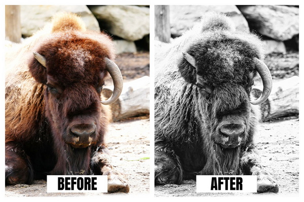
Let’s start by talking about what to look for in an image that will be a successful laser transfer. First, you want to make sure that you’re using a laser printer. This will give you the best image transfer because the toner is melted and pressed onto the surface. This is a different process than an inkjet printer which adds droplets of ink to the paper which is absorbed into the surface.
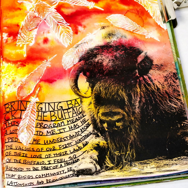
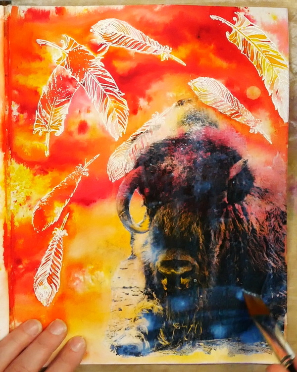
For this buffalo image, I started with one of my photographs that was color. I used the photo editing software ACDSee to adjust the photo. I increased the exposure, contrast, saturation, and vibrance until the photo looked a little unnatural. The point was to go from a softer, realistic image to one with a lot of contrasting detail.
I also love using Luminar for my photo editing. It is a powerful, easy, and fun software to use, especially if you like to play with filters. I changed the photo from color to black and white. The photograph was softer than I wanted, so I continued to play with the contrast until I had a very stark photo. By making these changes, it creates the contrast needed to make it a successful laser photo transfer.
Creating a Mixed Media Background
Before adding the laser transfer, let’s start by creating a beautiful mixed media background using watercolor and resist techniques.
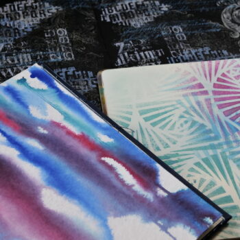
Creating an Embossed Resist
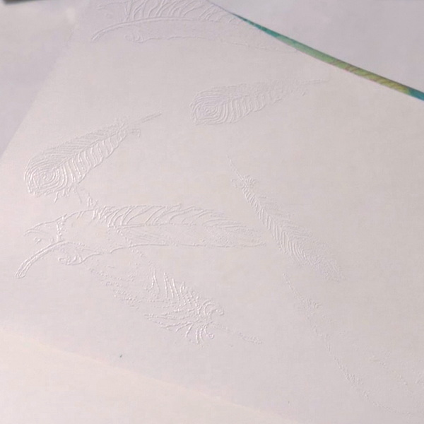
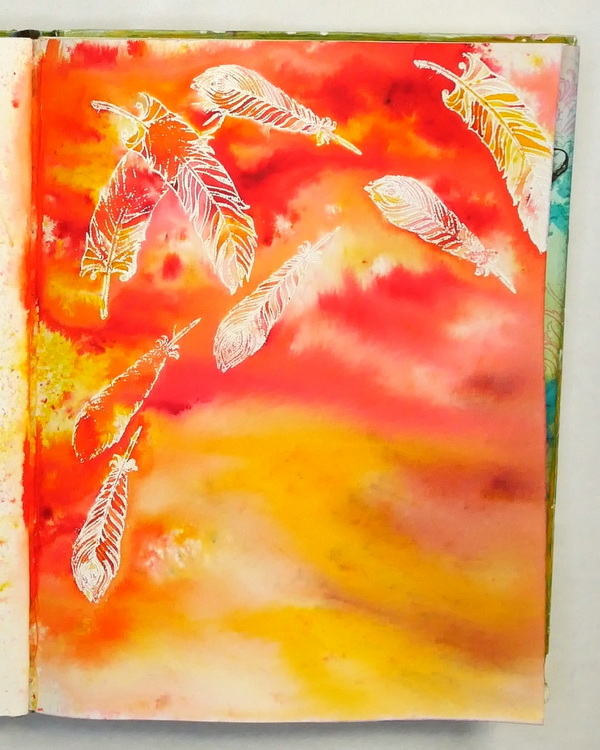
An easy way to create an embossed resist is using white embossing powder and a heat tool. Use your favorite set of feather stamps and clear embossing ink to stamp a series of images on your art journal page. It may be a bit hard to see where you stamp. If you move your page around, you should be able to see the wet glimmer of embossing ink.
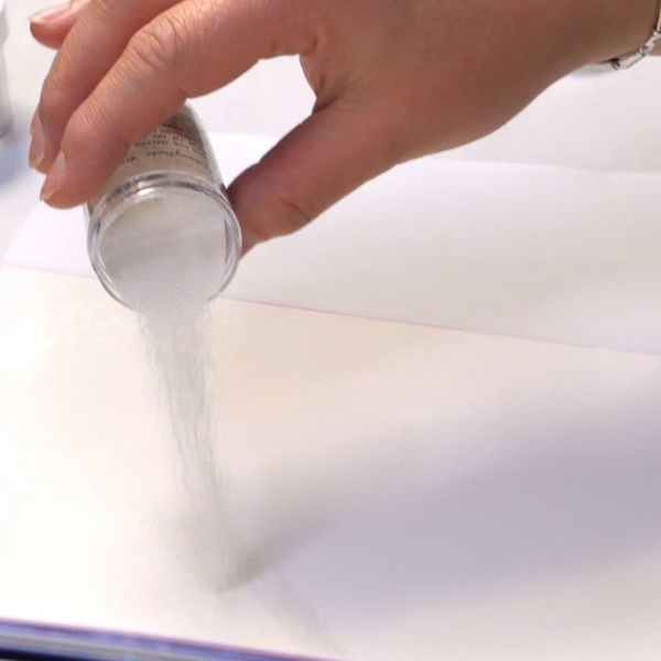
Using white embossing power, sprinkle the embossing powder on your page over the images. Once the images are covered, tip the excess powder off onto a piece of copy paper. Any extra embossing powder that has fallen off the sheet can be returned to the jar. The beauty of embossing powder is that one small container can be used for dozens and dozens of projects.
Take a close look at your page and you should be able to see the feather images. It’s a bit hard because you’re working white on white. The appearance of the images should be grainy due to the addition of the embossing powder.
If you see any areas on your page that have embossing powder where you don’t want it, use a small dry paintbrush to brush off the excess embossing powder.
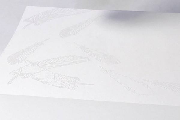
Using a heat embossing tool, melt the embossing powder. You’ll know it’s melted when the embossing powder is shiny instead of grainy and dull. When heat setting your page, continue to move your embossing tool around the surface. If you linger too long on one area of the page it can burn the paper or cause the embossing powder to bubble instead of melting.
Adding in Brusho Crystal Colours
For this next step I’ll be adding Brusho Crystal Colours, but you could use any sort of watercolor crystals. Instead of Brushos you could add color with watercolor pans, India Inks like Dr. Ph. Martin’s India Inks or any other wet medium.
Before adding color, I like to protect the other pages of my journal. I like to add a silicone mat between my pages to protect my journal. But for this project, I’m also adding in Xuan Half Raw paper. This way the extra medium will absorb into the Xuan paper and can be used on another project.
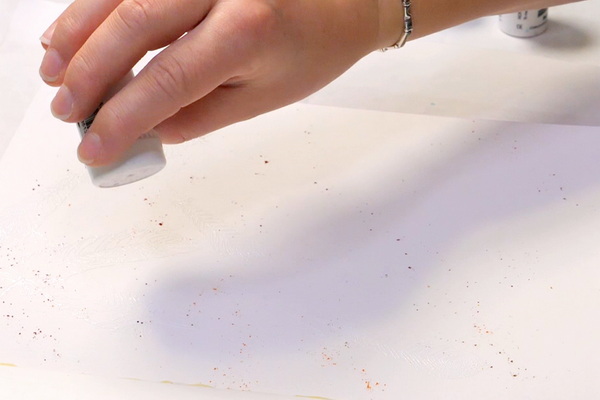
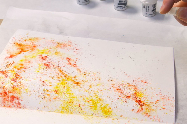
Start by applying a small amount of Brusho Crystal Colours onto the page. I’m using a combination of Brusho Crystal Colours Yellow Ochre, Lemon, Sandstone, Vermillion, Burnt Sienna, Teracotta, and Rose Red. When applying the color, the spot where I want to add my buffalo image I’m purposely using lighter colors to create sufficient contrast for my image.
Activating Brusho Crystal Colours
Activate the Brushos by spritzing water onto the page. If you want to create a speckled and more defined look, add less water. To create a softer, more blended watercolor look, add more water.
If you feel that you don’t have enough color, apply more Brushos and add a bit more water. I like to work up to the final color in layers over adding in all the color at once.
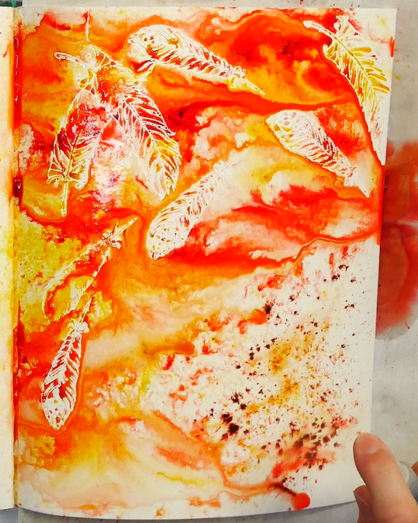
You’ll see that as you add the color, the embossing powder will resist the Brusho Crystal Colours creating a beautiful effect. This is why I like to use white embossing powder as it creates visual contrast on the art journal page.
Before moving onto the next step, make sure that your Brushos are fully dry. You’ll know that they are dry when the paper in your art journal is room temperature at the touch. If it still feels cool, dry it some more. To get a successful photo transfer, you need to start with a dry surface. I tend to be impatient, so I like to use my Ranger Heat It tool to dry my art journal pages.
Creating an Isolation Layer
When working with wet mediums like Brushos it can be hard to use them in mixed media applications. This is because they tend to re-wet when any moisture is added to the page. To be able to successfully use this background for a laser transfer you’ll need to create an isolation layer.
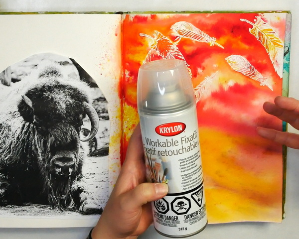
Isolation layers are generally a medium that is added that seals in the layer of color below so that it doesn’t bleed. If you use the right isolation layer you’ll be able to work on top of the surface that has been sealed. My favorite medium for isolation layers is Krylon Workable Fixative. This is meant to seal in the color you have already applied while still giving you the ability to add additional layers on top.
This workable fixative is different than a varnish. A varnish is meant as a sealant, with the expectation that you don’t add any other layers on top.
How to Use Krylon Workable Fixative
To add the Kryon Workable Fixative, I would suggest spraying it outside your home or art space. I’ll find a spot protected from the wind. I prefer to wear a mask to prevent from inhaling fumes, and I will spray my art journal.
Shake the can for a couple of minutes to make sure if it fully mixed. I spray several times in a horizontal direction, and then spray several times in a vertical direction. Make sure that you apply a thin, even coat. It is better to let the fixative dry and apply a second layer over adding too much fixative in one layer.
Let it sit for a minute or two to dry and off-gas a bit. The Krylon Workable Fixative has a strong smell, so the less fumes you have in your studio, the better. Now you’re ready to add other wet mediums on top of your mixed media page.
Adding the Photo Transfer
To add the photo transfer, apply a layer of Golden Soft Gel Gloss Medium to the front (the black and white side) of the buffalo image. You want to create an even layer that sits on top of the image. You don’t want to add too much medium, you should be able to still see the image underneath. But you also want to make sure that the image hasn’t soaked up all the medium.
Also apply a layer of the Golden Soft Gel Glass Medium to the art journal page in the area that you want to apply the transfer. Flip the buffalo image face down so that the black printed area of the image is facing the surface of the art journal page. When you do this, the two areas with the medium are adhered together. You should only have the white paper side of the image facing you.
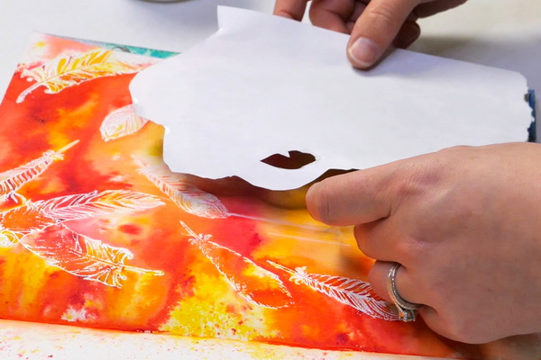
Smooth out the paper with your fingers to make sure that there are no bubbles or wrinkles in the image. If you have any edges that aren’t fully sealed down, add a bit of gel gloss medium underneath so that it fully seals to the surface. It should be cool to the touch because it isn’t fully dry. Using a heat tool, fully dry the image.
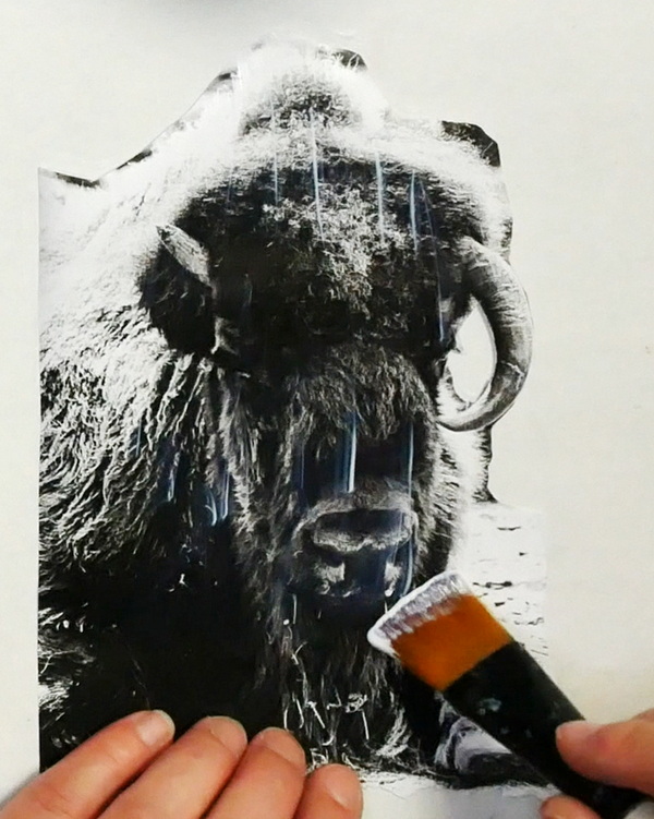
Removing the Paper to Reveal the Image
Once the image is fully dry, spritz the paper with water or add a wash of water on top of the paper with a brush. Using your fingers, gently rub in a circular motion to remove the paper fibers.
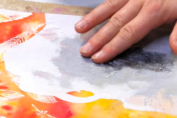
The key with this technique is to remove the paper fibers carefully and gently until all is left is the laser print. The key to this technique is not to try to do it all at once, but to work in layers.
I like to start by removing the main paper fibers by gently rubbing. Once these are removed, I’ll add a bit more water and remove the next layer of paper fibers. I generally will do this 2-4 times to remove most of the paper fibers from the image.
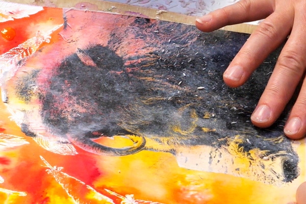
At this point, you might still notice areas that are still cloudy. If you gently rub the dried surface with your finger, you should be able to remove the last of the paper fibers.
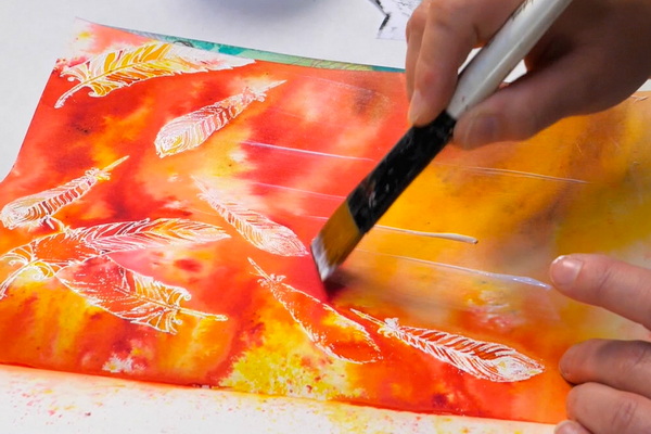
What if you Still Have Cloudiness?
I find that no matter how well your rub, you’ll still end up with inconsistent or slightly cloudy areas on your image transfer. To have the image transfer look its best, add a light layer of water across the image with a brush. You should notice that the image looks darker and has more consistent color.
Apply a bit of soft gel medium and mix it with the water on top. It may look a bit cloudy when first applied, but it will dry clear. When the gel gloss medium is applied when wet, it will seal in any of the loose fibers on the image transfer. This creates a contrasting, vivid image even after it fully dries.
The Benefit of Isolation Layers
You may have noticed when adding the soft gel gloss medium or adding in water to the page that the Brushos didn’t rewet. This is due to the isolation layer that we created. If we hadn’t added the isolation layer, you would have gotten a lot of bleeding of color into the gel medium. Also, you would have seen bleeding and other issues when adding water to remove the paper.
This is the beauty of isolation layers. It allows us to work with mediums that would rewet or not work well together. By creating an isolation layer, this opens so many more mixed media possibilities.
Adding the Final Touches
I’ve added in a few final touches to this piece to finish off the page. This includes journaling, shadows and highlights.
The Journaling
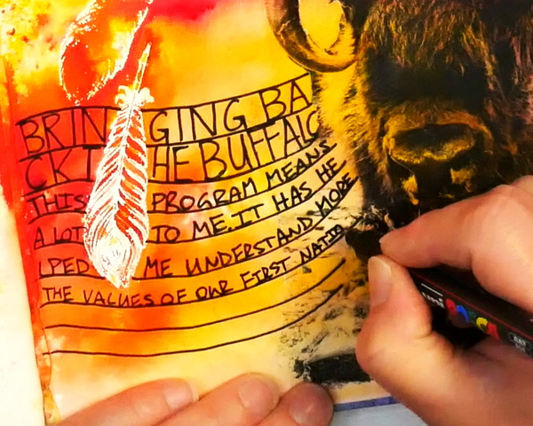
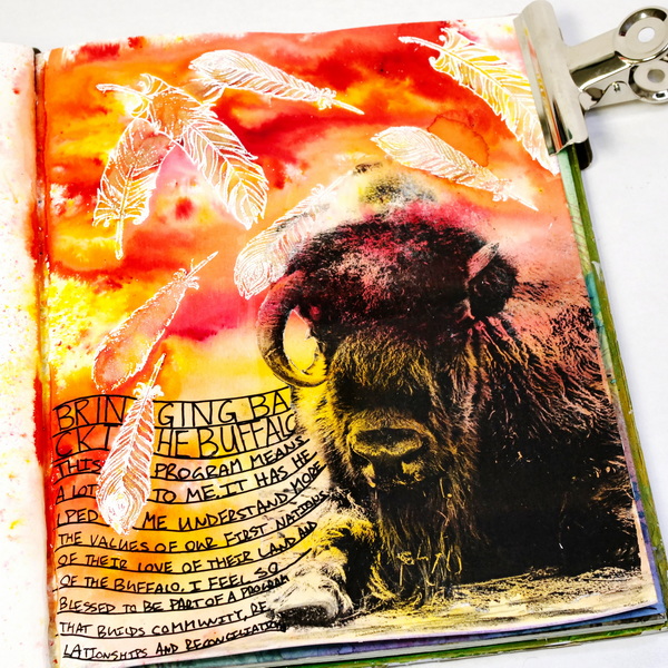
To add in the journaling, I used a Black Posca paint pen. I like to add in wavy lines because this creates more structure to the journaling and turns it into a complementing artistic focal point for the page. This also creates a different feel than adding in journaling around the images.
The Importance of Reconciliation
I was journaling about the Day of Truth and Reconciliation and things I want to honor and remember on this day. Over the last few years there has been more acknowledgement of the hurt and harm done to the First Nation populations. Canada’s National Day for Truth and Reconciliation is to honor the children who never returned home and survivors of residential schools, as well as their families and communities.
The discovery of mass graves, the awareness of the abuse and other travesties makes my heart hurt for the Indigenous people of Canada. The more I learn about the hurt, the more I ask myself the question, how can I show love to these people who are hurting? How can I give to this community in a way that is helpful to them? How can I be part of reconciliation?
Bringing Back the Buffalo
A few years ago, when I was contemplating this question, I received an email from Tearfund Canada. They have a phenomenal program called “Bringing Back the Buffalo” that is part of a multi-generational reconciliation process. The goal of the project is to build sustainable buffalo herds on First Nations land, owned by First Nations people. The intent is to help restore cultural identity and provide food for their own people. What I love about this program is that it’s about building long term relationships and building reconciliation in a way that is helpful to indigenous people. It’s focusing on their needs, not on my assumptions of what they need. It’s a tangible symbol of reconciliation. To learn more about this fabulous program, or to donate yourself, check out Tearfund’s website here.
I was able to join a call on Thursday to hear an update about the program and about the preparation of the newest herd to be sent to the Witchekan Lake First Nation. It was a powerful conversation with Chief Annie as she spoke about the harm and trauma, but also choosing to forgive, to move towards relationship and healing. In honor of the Day of Truth and Reconciliation it was important for me to create a page about what I am learning through this program. I chose the Buffalo image as this is an animal that has deep connections with the First Nations people. I also chose the embossed images of feathers as it represents the eagle, an animal accorded the highest respect by all First Nations.
Adding in Shadows
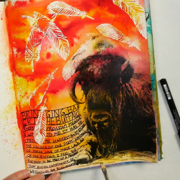
As I didn’t want the buffalo floating on the page. Using a Stabilo All Pencil I added in some shadows to the foreground. As this is a water soluble pencil, the color can be enhanced by using a small flat brush and a bit of water to create a soft, shadowy foreground.
Adding in Highlights with Beam Paints
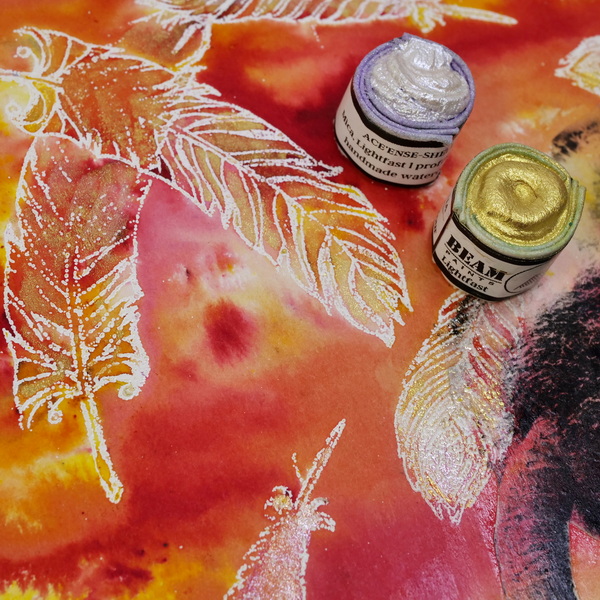
The final touch for this project is adding in highlights with mica based watercolor paints. My favorite mica watercolors are professional paints made by Beam Paints. Not only is this paint beautifully pigmented, the mica ethically sourced, and the paints lovely to use, but it’s also made in Canada by a female, First Nations entrepreneur named Anong Beam. Not only does she use local ingredients, but she also forages them herself. If you’d like to hear more about her story, click here.
I love the idea of supporting a First Nations, female entrepreneur who is creating beautiful and unique paints. I strongly believe in voting with my wallet. If I truly want to support local business and the First Nations community, I should purchase the beautiful products that they are creating.
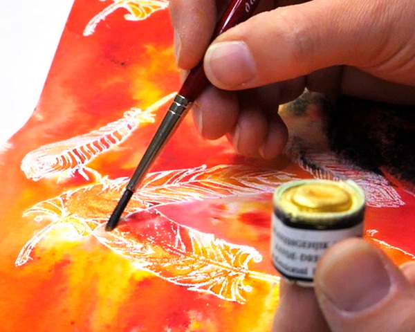
To finish up this page, add the Shell and Dreamers Gold mica paints to the feathers. I love how it creates color and shine but doesn’t move or cover up the beautiful base color that has been added.
Any Questions?
Any questions about how to make successful image transfers or any of the mixed media techniques I’ve shared? I’d love to answer any questions that you have. Please leave a comment below!
Project Supply List


Altenew – Clear Photopolymer Stamps – Golden Feather
from: Scrapbook.com

Brusho Crystal Colours – Set of 24 assorted colors, 15 g, pots
from: Blick Art Materials
Add a distressed look to your projects with the Distress Sprayer by Tim Holtz for Ranger Ink. This distress tool is used to spray water over Distress Ink, Paint, Stain, and more to create a water-droplet look on your projects.

A quick and easy way to melt embossing powder this heating tool was specifically design for speed quiet and convenience. It can also be used to heat set or dry ink. It won't overheat and burn projects.
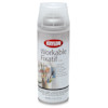
Krylon Workable Fixative – 11 oz, Matte, Spray Can
from: Blick Art Materials

You're going to feel just like an expert when you're cutting the smallest of details with the Cutter Bee Scissors by EK Success. These un"bee"lievable compact scissors will have you feeling like a queen bee when you swarm right into your fine detail or fussy cutting projects.


Premium hobby knife set is equipped with 10 different exacto blades. There are three types of blades, curved blades are suitable for carving curved lines; oblique fine point knife blades are fit for detail carving; flat blades are suitable for chiseling, removing excess material
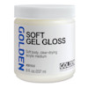
Golden Acrylic Medium, Gloss-Soft Gel, 8 oz jar
from: Blick Art Materials
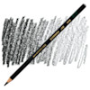
Stabilo Colored Marking Pencil – Black
from: Blick Art Materials
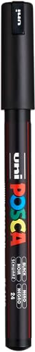
Introducing the ultimate tool for unleashing your creative potential - the Posca Paint Marker. Elevate your artistic endeavors with a marker that combines innovation, versatility, and top-notch quality, all in one package.

Perfect for adventurous artists, this water pot expands on site then collapses for transport. It's also easy to clean and store. Ridges around the rim keep brush handles separated and organized while you're painting.

My favorite paper towel to use in my art space, it's durable and strong.