Mystified by Acrylic Pastes? How to Color Pastes in 1 Easy Step!
Are you mystified by acrylic pastes? Acrylic pastes can add beautiful textures on any project, but if you don’t know how they work, they may seem hard to use. Today we’ll talk about what you need to know to purchase and color acrylic pastes.
Hop-A-Long Studio is reader-supported. When you buy through links on our site, we may earn an affiliate commission at no cost to you. Learn more.
Choosing the Right Acrylic Pastes
There are so many acrylic pastes available that you may be overwhelmed by choice. Here are some things to consider when choosing the right acrylic paste for your creative practice.
Craft Pastes
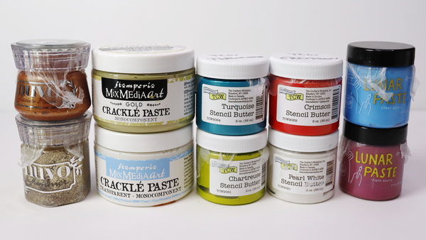
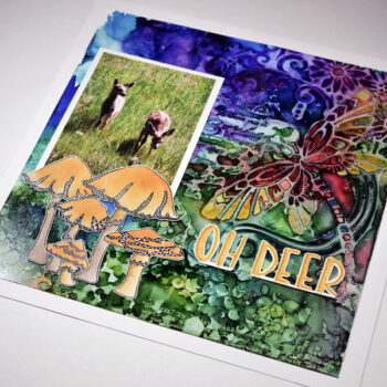
There are a variety of pre-colored pastes available at local craft stores. These include Tim Holtz Texture Paste, TCW Stencil Butter, and Stamperia Crackle Paste to name a few. Some of these pastes come pre-colored while others are white so that they can be tinted.
If you’re starting out and are unsure if you’ll like pastes, these are great because you get a small amount that has already been colored. The downside is that these acrylic pastes are much more expensive per ounce than the professional acrylic pastes.

Add 3D sparkling crystalized textured charm to your next project.

- Glamour paste is soft in color and texture that is thanks to the combination of micro grains powder and shiny mica.
- The paste is water-based, sparkling and versatile.

Are you ready to add some extra sparkle and shine to your stenciling projects? We have got the product for you! This little jar of Turquoise Stencil Butter from The Crafter's Workshop will take your stenciling to new heights! Not only does this product shine, but it will add dimension wherever you need it!

This jar of Fake Plant Lunar Paste is designed by Simon Hurley for Ranger Ink. This Lunar Paste is a creamy paste with a metallic shine.
Professional Artist Pastes
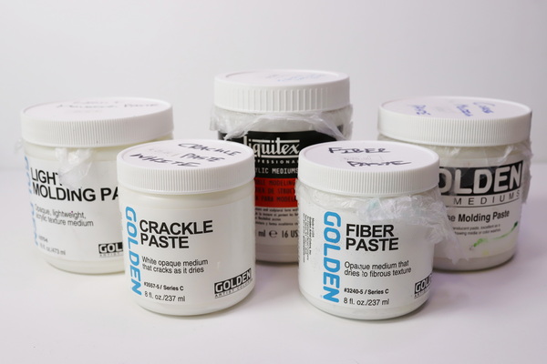
I like using professional artist acrylic pastes made by Golden, Holbein or Liquitex as they are high quality pastes tested for durability and longevity. You can purchase these in small or large quantities and these are less expensive by amount than craft branded acrylic pastes.
The professional artist pastes that you purchase will generally be white. The thought behind this is that as an artist you’ll want to be able to tint these pastes to any color, as this provides much more versatility in your work.
Each of these pastes start with a similar base of acrylic media. From there, other mediums and mixatives are added in to give them a variety of different textures.
Fiber Paste
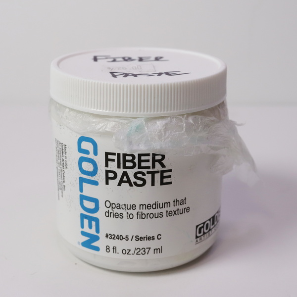
Fiber paste is made with paper fibers blended into the medium. This makes this paste fantastic to use with both acrylics and watercolor paints. It also creates a very unique texture for work on panels or in the art journal.

Golden Fiber Paste is opaque and fibrous, and creates a rough, flexible, paper-like surface on canvas and board. Use it as a ground for dry media, watercolors, digital imaging, and painting.
Modeling Paste or Molding Paste
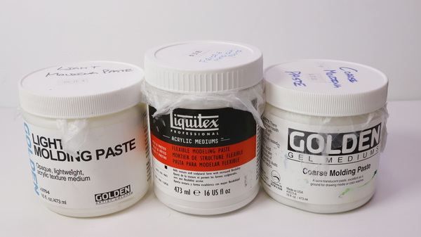
Modeling paste and molding paste are two names for very similar products. Golden Acrylics uses the term molding paste while Holbein and Liquitex use the term modeling paste. Having worked with both, I don’t notice a difference between the two mediums.
Weights of Molding Paste
As molding pastes are made from marble dust, these are very heavy compared to other pastes. The come in a variety of weights and textures depending on how you would like to use them in your projects.
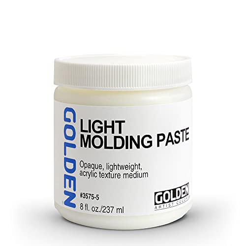
Light Molding Paste
Light molding paste is made from hollow acrylic spheres instead of marble dust. It provides a similar look and feel to regular molding paste but is much lighter. This makes it excellent for wall art as you can apply it thickly and it will weigh very little.
Regular Molding Paste or Flexible Modeling Paste
Heavier molding paste and modeling paste are made with marble dust. Golden molding paste is strong and flexible. This is one of my favorite mediums for the art journal because of its flexibility. For modeling paste, you need to look specifically for flexible modeling paste as this paste has been formulated to flex on a surface.
Coarse Molding Paste
Coarse molding paste is very strong and has a coarser feel to it than regular molding paste. This makes it a great medium for canvases because of the toughness of the paste. It can also be carved into when dry, which opens a lot of creative possibilities.
Use Golden Molding Paste Mediums to add textured relief to paintings. Mix them with acrylic mediums and paints, such as Golden acrylics, to create thick impasto layers. This modeling paste is water based, non-toxic, and formulated with 100% acrylic polymer emulsions.

Liquitex Modeling Paste is a thick, clay-like putty formulated with an acrylic polymer base and marble dust. Use alone or combine with acrylic colors to build forms and structures on rigid substrates.

Use Golden Molding Paste Mediums to add textured relief to paintings. Mix them with acrylic mediums and paints, such as Golden acrylics, to create thick impasto layers. This modeling paste is waterbased, non-toxic, and formulated with 100% acrylic polymer emulsions.

Use Golden Molding Paste Mediums to add textured relief to paintings. Mix them with acrylic mediums and paints, such as Golden acrylics, to create thick impasto layers. This modeling paste is waterbased, non-toxic, and formulated with 100% acrylic polymer emulsions.
Crackle Paste
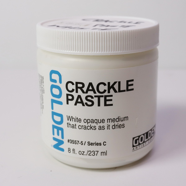
Crackle paste can be tinted but be careful not to overmix it too much. This is a light paste that has a lot of air trapped in the paste. The air is what helps create the cracks. Because of this, overmixing this medium will prevent cracks from forming.
I generally don’t use crackle paste for tinting paint into as I don’t want it to lose it’s beautiful properties. Instead, I apply white crackle paste to the surface and then paint on top of the medium. If you’re interested in seeing application demonstrations of many of these mediums, check out this article: Textured background techniques for the art journal
How to Color Acrylic Pastes
Take some acrylic paste out of the jar with a palette knife and add it to your palette. Add a few drops of fluid acrylic paints or inks, or a little bit of heavy body acrylic to the paste. Mix the paste and paint together with a palette knife. Once it is fully mixed, add it to your project.
When coloring paste you can use a variety of pigments. You can use dye or pigment ink, watercolor crystals, or acrylic paint to name a few. I prefer quality acrylic paint because heavy pigment load means you don’t need to use much paint to get beautiful colors with your pastes.
As pastes start with a white base, the more intense a color you want, the more paint that you will need to add. This is why I prefer high flow acrylics because of their high pigment load. You’ll only need a couple of drops of color to get beautiful color mixes. As heavy body paint has less pigment and more binder, you’ll need to use more paint to get similar results.
Can I use Dye Inks or Craft Paint for Coloring Pastes?
You can use craft paint or dye inks to color acrylic pastes, but you’ll need to use a lot of paint and ink and the color won’t be as vibrant. For more information about the differences between craft, student, and professional paints, visit this article: Is Craft Paint Really Cheaper? Choosing the Best Paint for Your Creative Practice
The other concern with dye inks over pigment-based paint and inks is that the light fastness is questionable. Where professional acrylic paints are tested for light stability for a period of 100 years, with dye and craft paints, how much and how quickly they will fade is unknown.
If you’re working in an art journal where you don’t have much light exposure, it won’t matter that much. But if you plan to display your work, the lightfastness of the paste and the paint used for tinting is important.
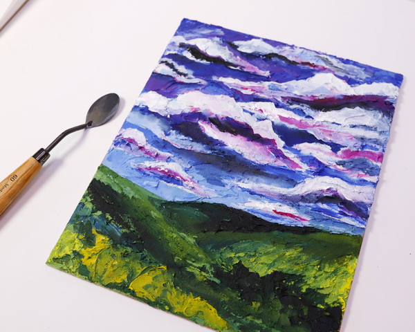
Painting a Landscape with Acrylic Pastes
Like many of you, I’m on a budget with my paints. I generally use student grade paint for many of my projects. But I do keep a small amount of high flow acrylic paints for using with mediums. I use the good paint where it counts.
By being selective on the colors that you choose and knowing which colors mix well together, you can get a large variety of colors out of a few colors of paint.
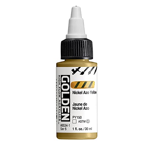
For this project, I’m using Golden High Flow Acrylics Titanium White, Quinacridone Magenta, Nickel Azo Yellow and Indigo (Anthraquinone). As the Indigo color is becoming harder to find, I would suggest using Phthalo Blue in its place.

Incredibly flexible, Golden High Flow Acrylics have an ink-like consistency that lends itself to a wide range of techniques — painting, pouring, drawing, staining, glazing, inking, hand lettering, spraying, and more.

- Professional quality
- Intensely pigmented, ink-like colors
- Ready to use in refillable markers, dip pens, and airbrush
- No thinning required
- Professional quality
- Intensely pigmented, ink-like colors
- Ready to use in refillable markers, dip pens, and airbrush
- No thinning required

- Professional quality
- Comparable pigment load to Golden Heavy Body Acrylics
- 100% acrylic emulsion; no fillers, dyes, or opacifiers
- Intense, permanent colors with a smooth, fluid consistency
Choosing a Surface
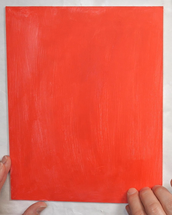
For this project, you can use a canvas, cradled board or a hardboard panel. For this project I chose an 8 x 10-inch hardboard panel. These boards can be found inexpensively online or at your local art store. To prepare this board for painting, add a layer of Liquitex Gesso and then add a coat of your favorite paint. I chose to use Amsterdam Pyrrole Red paint to add base color to the canvas.
The gesso works like velcro for the paint and mediums, helping them stick better to the surface. The reason I add a layer of color to the surface is so that if I don’t perfectly cover the canvas with color later, little areas of red will shine through. Instead of looking like a mistake, it looks like a purposeful decision in the painting. I love the look of a bit of color peeking through the painting.

Hardbord is a better support from start to finish! Build up your own unique painting grounds and textures on this ultra-stable hardboard support. Edges are sanded, so you can apply your favorite ground and create an extra dimensional painting.

Proudly crafted in the Netherlands, these acrylic paints are value priced and easy to use, making them an excellent choice for the beginning or intermediate artist. They can be mixed with water or mediums, and clean up requires only soap and water.

A ready-mixed painting ground, Liquitex Acrylic Gesso primes surfaces and adds the right level of tooth for optimum color stability, adhesion, and absorbency.
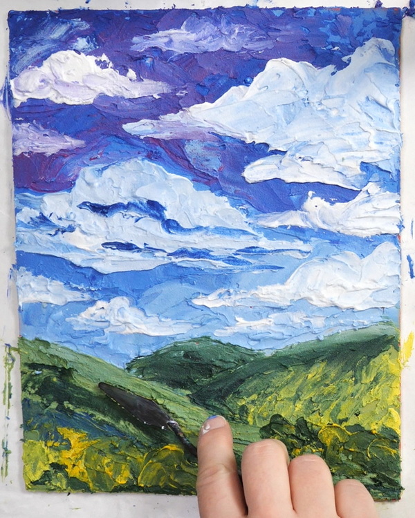
Adding in the First Layer of Acrylic Paste
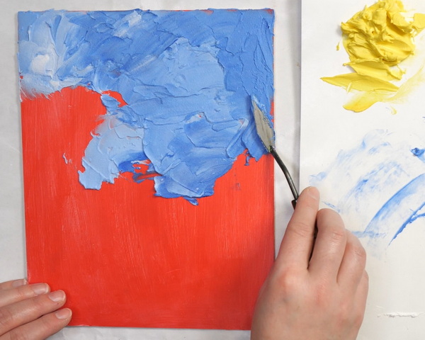
For adding acrylic paste to my board, I like to use a variety of palette knifes of different shapes and sizes. Every shape will create a different mark which creates variety in your painting. You can also use an acrylic brush to make marks and vary the texture.
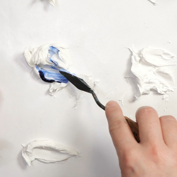
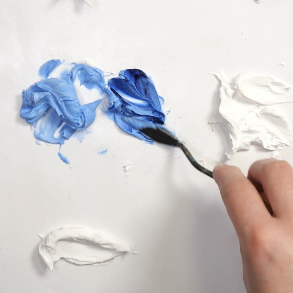
For the sky, I used molding paste mixed with indigo. You can get a variety of color values depending on how much paint you add to the paste. If you find that your sky is getting too dark in color, add in more paste to lighten the color or mix in white paste to the board surface.
Repeat the same technique to create the hilly landscape. To create green, mix Indigo and Nickel Azo Yellow paint to the paste. Vary the depth and value of color by adjusting how much paste and paint you add to the mix.
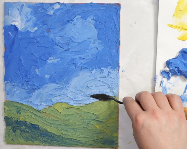
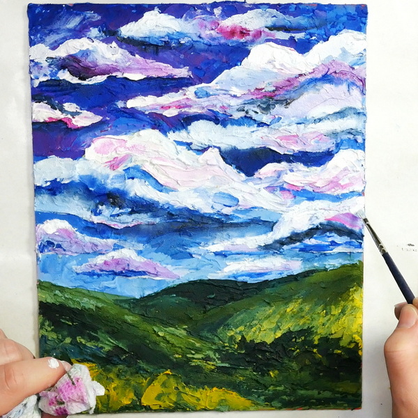
Adding in Details to the Sky
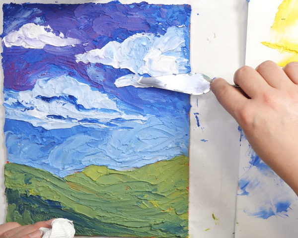
Now that you’ve added in your first layer of paste, add another layer of paste on top, while still wet. Mix it into areas with the color underneath. This creates unusual and unique color mixes. Add Quinacridone Magenta to the sky, mixing it with the blue already on the surface to create a beautiful purple color.
Using paste tinted with Titanium White, start adding in cloud shapes to your sky. Once you get the general shape, add in darker areas of Magenta and Indigo to add mid-tones and shadow to the clouds.
Adding in Details to the Hills
To create details to the hills, add in Nickel Azo Yellow paste to green areas to create a warm green color. To create a darker green, add more Nickel Azo Yellow and Indigo paint to the paste and add it to the painting. Continue to play around with the landscape, adding in bush shapes and creating texture in the landscape using a variety of brushes and palette knifes.
You can continue to add in details until you feel like you’ve finished your piece. You’ll have around 1-2 hours to work depending on how dry your climate is. This will require you to work quickly to make sure that the paste doesn’t dry out.
Adjusting Colors
When your painting is dry, if you want to adjust the color on your painting, you can add additional paint with a brush. This is another way of using pastes. Instead of mixing them into your paint, you can add a textured or smooth layer of white paste to your surface. Once dry, you can paint onto the surface using acrylic paints, watercolors, and inks.
I left my painting 24 hours to dry before adding more paint details. But it may take several days to fully dry and cure. It doesn’t have to be fully dry to paint on top. Just be aware that the paste may have a bit of give to it, so paint gently.
To tell if the paste is dry, it should be room temperature and hard. If it’s still cold to the touch, or feels moist and soft, it still needs time to dry and completely cure.
Using a Value Card
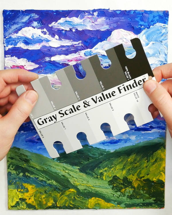
One of the most useful tools that I use is a value card. This is a great tool for figuring out if you have a full range of values or tones in your art piece. I felt that this painting needed more shadows and highlights. Using the same palette of colors, I added in color to the painting. I also added in Payne’s Gray and Golden Carbon Black to create some of the darker shades.

- Professional quality
- Comparable pigment load to Golden Heavy Body Acrylics
- 100% acrylic emulsion; no fillers, dyes, or opacifiers
- Intense, permanent colors with a smooth, fluid consistency

- Professional quality
- Comparable pigment load to Golden Heavy Body Acrylics
- 100% acrylic emulsion; no fillers, dyes, or opacifiers
- Intense, permanent colors with a smooth, fluid consistency

Determine color values and intensities with this Gray Scale and Value Finder! Place this die-cut card directly on a photo or piece of artwork, or view it between your eyes and your subject matter to match the gray values on the card to the colors you are seeing.
If you find that some of your shapes are not as defined as you’d like, this is also an opportunity to change the painting. Be aware that you’re painting on an uneven surface. Use a watered-down paint or fluid acrylic paint so that it will be easier to paint on top of the textured paste.
Any Questions?
Any questions on how to mix acrylic pastes or create this palette painting? I’d love to answer any questions that you might have! Please leave a comment below and I’d love to have a conversation with you! Acrylic pastes are not as complex as you might think. There are so many ways to incorporate them into your art journal pages and creative projects!

Project Supply List
Add 3D sparkling crystalized textured charm to your next project.
- Glamour paste is soft in color and texture that is thanks to the combination of micro grains powder and shiny mica.
- The paste is water-based, sparkling and versatile.
Are you ready to add some extra sparkle and shine to your stenciling projects? We have got the product for you! This little jar of Turquoise Stencil Butter from The Crafter's Workshop will take your stenciling to new heights! Not only does this product shine, but it will add dimension wherever you need it!
This jar of Fake Plant Lunar Paste is designed by Simon Hurley for Ranger Ink. This Lunar Paste is a creamy paste with a metallic shine.
Golden Fiber Paste is opaque and fibrous, and creates a rough, flexible, paper-like surface on canvas and board. Use it as a ground for dry media, watercolors, digital imaging, and painting.
Use Golden Molding Paste Mediums to add textured relief to paintings. Mix them with acrylic mediums and paints, such as Golden acrylics, to create thick impasto layers. This modeling paste is water based, non-toxic, and formulated with 100% acrylic polymer emulsions.
Liquitex Modeling Paste is a thick, clay-like putty formulated with an acrylic polymer base and marble dust. Use alone or combine with acrylic colors to build forms and structures on rigid substrates.
Use Golden Molding Paste Mediums to add textured relief to paintings. Mix them with acrylic mediums and paints, such as Golden acrylics, to create thick impasto layers. This modeling paste is waterbased, non-toxic, and formulated with 100% acrylic polymer emulsions.
Use Golden Molding Paste Mediums to add textured relief to paintings. Mix them with acrylic mediums and paints, such as Golden acrylics, to create thick impasto layers. This modeling paste is waterbased, non-toxic, and formulated with 100% acrylic polymer emulsions.
Incredibly flexible, Golden High Flow Acrylics have an ink-like consistency that lends itself to a wide range of techniques — painting, pouring, drawing, staining, glazing, inking, hand lettering, spraying, and more.
- Professional quality
- Intensely pigmented, ink-like colors
- Ready to use in refillable markers, dip pens, and airbrush
- No thinning required
- Professional quality
- Intensely pigmented, ink-like colors
- Ready to use in refillable markers, dip pens, and airbrush
- No thinning required
- Professional quality
- Comparable pigment load to Golden Heavy Body Acrylics
- 100% acrylic emulsion; no fillers, dyes, or opacifiers
- Intense, permanent colors with a smooth, fluid consistency
Hardbord is a better support from start to finish! Build up your own unique painting grounds and textures on this ultra-stable hardboard support. Edges are sanded, so you can apply your favorite ground and create an extra dimensional painting.
Proudly crafted in the Netherlands, these acrylic paints are value priced and easy to use, making them an excellent choice for the beginning or intermediate artist. They can be mixed with water or mediums, and clean up requires only soap and water.
A ready-mixed painting ground, Liquitex Acrylic Gesso primes surfaces and adds the right level of tooth for optimum color stability, adhesion, and absorbency.
- Professional quality
- Comparable pigment load to Golden Heavy Body Acrylics
- 100% acrylic emulsion; no fillers, dyes, or opacifiers
- Intense, permanent colors with a smooth, fluid consistency
- Professional quality
- Comparable pigment load to Golden Heavy Body Acrylics
- 100% acrylic emulsion; no fillers, dyes, or opacifiers
- Intense, permanent colors with a smooth, fluid consistency
Determine color values and intensities with this Gray Scale and Value Finder! Place this die-cut card directly on a photo or piece of artwork, or view it between your eyes and your subject matter to match the gray values on the card to the colors you are seeing.

A 5-piece premium quality stainless steel artist palette knife set with sturdy comfort-grip wooden handles. Set includes the essential shapes and sizes needed for most types of palette knife techniques and painting applications.

Use round palette knives to create a unique texture shape with working with pastes or gels.

- Acid-free palette paper, 50 Sheets at 9" X 12"
- Smooth mixing surface against grey paper for a neutral back drop on which to view colors
This angled paint brushes set includes 9 sizes (0,2,4,6,8,10,12,14,16) for achieving optimal painting results. Crafted for durability, these acrylic paint brushes deliver smooth strokes and precise color control. The resilient filaments hold paint effectively and release it evenly for seamless application.