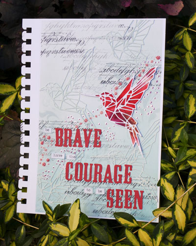
Having the Courage to be Seen
Have you ever had moments where having the courage to be seen is difficult? In my mindfulness practice this week I created this art journal project about how we can be brave in our lives and let ourselves be seen.
Having Courage
Having courage is rarely easy. We may upset people that we care about. It might mean making some hard choices to let ourselves be seen. Having the courage to be seen requires us to choose what is important to us, what we believe and how we want to be seen in the world.
Having the courage to be seen can be difficult. It can require hard conversations and a level of honesty that may be uncomfortable for ourselves and others.
At the same time, what is the cost of not having courage? We live a life of feeling invisible. We need connection and we need vulnerability in our lives and that does take courage.
This does not mean that we are vulnerable with everyone. Not everyone is safe to be vulnerable with. We should choose moments of vulnerability. These moments can so often affect the lives of those around us in such a profound way. If we can embrace vulnerability, it can allow people to see some of the most beautiful parts of who we are.
Art Journaling Project
My favorite place to process my thoughts are in my art journal. The inspiration for this page was from some new dies and inks I couldn’t wait to try out. I also made a point to use some of the dies and stencils that I haven’t used recently.
1. Add Washi Tape Border
The Koh-I-Noor art journal that I’m using is made with Bristol paper and has pages that can be removed and then re-inserted. For this project, I removed the page and wanted to create a small border around the artwork. Using Ideaology Washi Tape to adhere the Bristol paper to my craft mat prevented the paper from moving as I worked.
2. Color Page with Distress Oxide Ink
Using a blending tool, I applied my new favorite ink color, Speckled Egg Distress Oxide to the page. I created a gradation in the blend by using layers of Speckled Egg Distress Oxide and a touch of Broken China Distress Oxide.
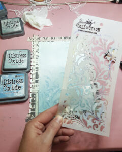
3. Add Ink through a Stencil
To add some additional texture, I used Tim Holtz Flourish stencil and inked through it with Speckled Egg and Broken China. By adding additional layers of these same colors it adds variation and interest to the background overwhelming the page.
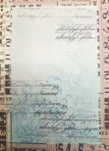
4. Stamp Multiple Values
To start creating more bold texture, using Archival Ink I stamped a cursive writing image onto the background. Each stamp I would place down 2 to 3 times before re-inking. This way I was getting 2 or 3 different values of black ink on the page.
5. Cut and Color Die Cut Shapes
Using my Tim Holtz Vagabond 2 I cut out the Sizzix Geo Springtime hummingbird die using white cardstock. I cut out 5 of the hummingbirds for this project and inked 4 of them with Speckled Egg ink. I then proceeded to use glue to attach the 4 colored hummingbirds to the background. The intent was to have a similar color hue but a variation in color intensity.
6. Tidy up Art Journal Edges
Once dry, the edges of the hummingbirds that were past the border of the page needed to be removed. As I was working on a silicone mat, I had to very gently cutting the edges with an Exacto knife as to not pierce through the Bristol paper. If I was to do this again, I would use a proper cutting mat for this step.
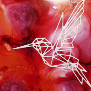
7. Create Focal Image
To create the focal image, I adhered the last hummingbird to a piece yupo paper that had been inked with alcohol inks. I like the idea of a slightly stained glass effect that this gives the hummingbird. Once dry, I used an Exacto knife to fussy cut around the image. I attached the hummingbird to the project using Zots Glue Dots.
8. Add Your Phrase
The next step is to add your words or a phrase. You can really use anything for your phrase: word stickers, stencils, or paint them by hand. In my case, I decided to use the Tim Holtz Alterations Sizzix Wanted Alphabet Die and Tim Holtz Distress Collection Coredinations Cardstock to cut out my letters with my Tim Holtz Vagabond 2 Die Cutting Machine. These die cut words I attached to the page using USArtQuest PPA Matte glue. To add variation to the letters, I used Tim Holtz Ideaology Chitchat Stickers. I inked the edges with Broken China ink and added to the layout.
![]()
9. Add Stickles and Perfect Pearls
Once these were adhered, I finished off the layout by adding Stickles and Perfect Pearls. I added them diagonally down the page from right to left to bring the eye across the page and down.
Project Supply List
- Koh-I-Noor 5.5 by 8.5 inch Smooth Bristol Journal (270gsm)
- Tim Holtz Ideaology Washi Tape
- Inks: Distress Oxide Speckled Egg and Broken China, Ranger Archival Black Soot
- Dies & Die Cut Machine: Tim Holtz Vagabond 2, Tim Holtz Vagabond Cutting Plates and Platform, Tim Holtz Alterations Wanted Alphabet, Sizzix Thinlits Geo Springtime
- Stamps: Tim Holtz Stampers Anonymous Faded Type
- Stencils: Tim Holtz Flourish
- Paper: 90lb Staples Cardstock, Tim Holtz Distress Collection Core’dinations Cardstock
- Stickers: Tim Holtz Ideaology Chitchat
- Stickles: Tim Holtz Distress Worn Lipstick, Cotton Candy and Liquid Pearls Pastel Raspberry
- Other Materials: Stamping Block, Ink Blending Tool and Foams, Perfect Paper Adhesive (PPA) Matte Glue
How About You?
So how do you find courage to be seen in your life? I would love to hear about it! Please leave a comment below or contact me directly.