Unique Techniques using Pan Pastels with Watermark Ink
Looking for ways to create beautiful details with Pan Pastels? Using Pan Pastels with watermark ink is a very simple way to add in interesting textures and details to your Pan Pastel creations. You can use this technique with both black and white paper to create a variety of unique effects.
Hop-A-Long Studio is reader-supported. When you buy through links on our site, we may earn an affiliate commission at no cost to you. Learn more.
What is Watermark Ink?
Watermark ink is a translucent ink used to make watermarks on papers or creative projects. When the ink is stamped onto the surface, it creates a mark slightly darker than the paper color, called a watermark. The unique properties of watermark ink, the slow drying time and translucency, make it an ideal ink for use with Pan Pastels.
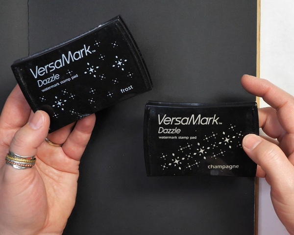
Versamark Watermark Ink
The ink that I will be using today is Versamark watermark ink in Frost and Champagne colors. These watermark inks have been tinted slightly to create a different look than clear watermark ink. Many different watermark ink brands can be used for this project. To make these types of inks to work successfully with Pan Pastels, you’re looking for a translucent ink with an extended drying time.

Unlock endless creative possibilities with the Large Clear VersaMark Watermark Ink Stamp Pad from Tsukineko! Achieve stunning watermark effects and elegant two-toned designs. Perfect for resist techniques and mixed media magic, this must-have ink pad elevates your crafting projects effortlessly!

Unlock endless creative possibilities with the Champagne VersaMark Watermark Ink Stamp Pad from Tsukineko! Achieve stunning watermark effects and elegant two-toned designs. Perfect for resist techniques and mixed media magic, this must-have ink pad elevates your crafting projects effortlessly!
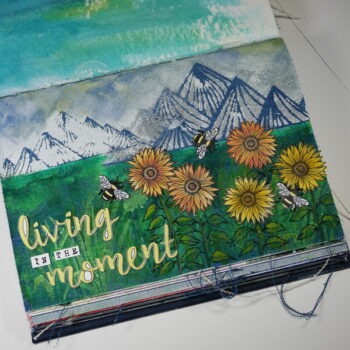
Art Journal Project Using Pan Pastels
For today’s technique tutorial, we will be creating an art journal project using Pan Pastels. To show you the versatility of this technique, I’ll be using both black and white paper in this project. I’m using the Dylusions Classic Journal for this project, but you can use any paper or journal that you have on hand. This does not require special paper.
Stamping with Versamark Watermark Ink on Black Paper
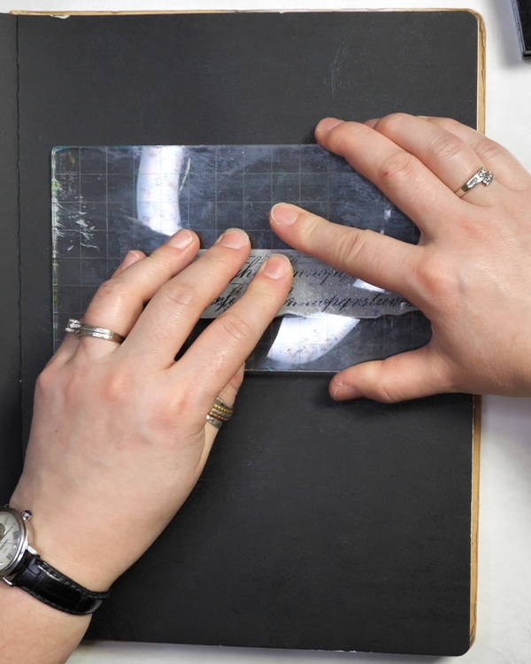
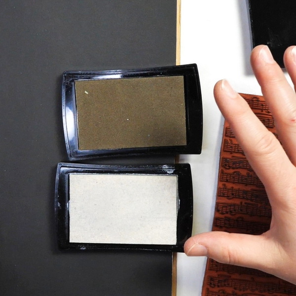
Using your favorite stamps, stamp with watermark ink onto your black paper surface. For this project I’m using Stamper’s Anonymous Fanciful Flourishes and Faded Type Stamp Sets along with a music stamp from Gina K Designs.
Using a stamp or a stamp on a stamping block, stamp these images randomly onto your page. You’ll notice that as you stamp, you won’t be able to easily see where the ink is on the page. But if you move the page around, the shimmer of the wet ink may catch the light.
I tend to stamp very randomly on the page, using both first and second ink values, as this is meant to be a very loose background design. For tips and more information about stamping, check out this article.
Adding Pan Pastels
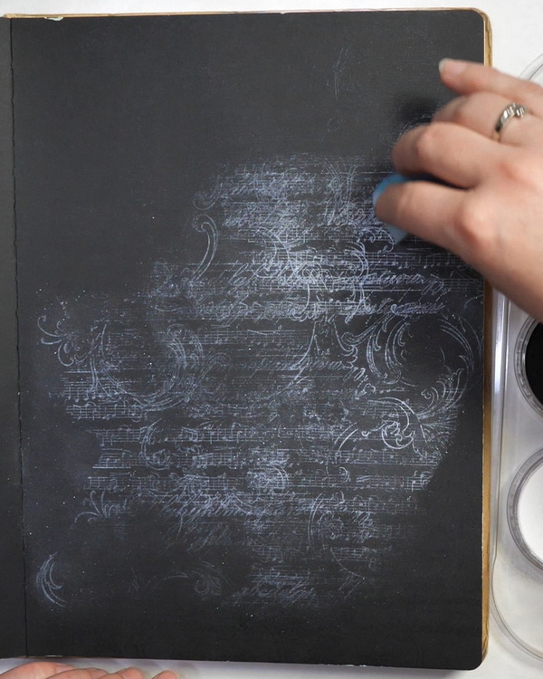
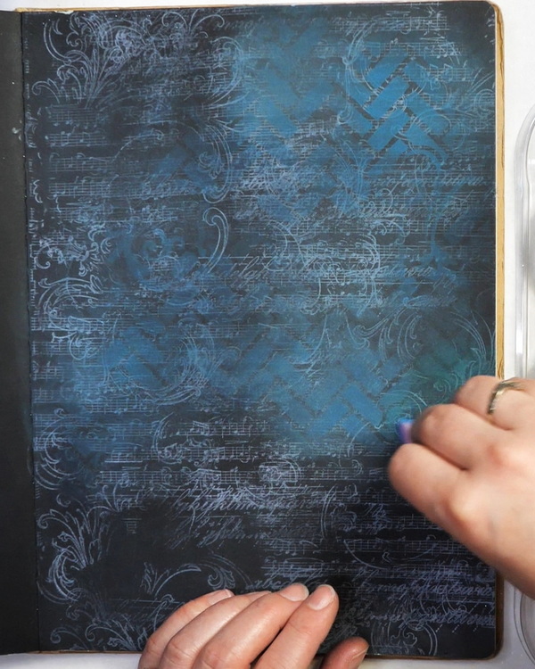
While the ink is still wet, blend Pan Pastels onto the page using a brush, sponge or Sofft tool. Work gently in a circular motion across the entire surface. This is where the magic happens! By adding the Pan Pastel to the watermark ink, your image will appear on the page. For the first layer of color, I’m using White Coarse Pan Pastel Pearl Medium as it provides a stunning and shiny contrast to the black paper.
You can add any color of Pan Pastel to the watermark ink. I tend to stick to lighter values so that it contrasts against the black paper. I like to start with a layer of pearl medium or metallic colors to create shine. Then I’ll add turquoise Pan Pastel or other lighter colors of Pan Pastel to the background.
Creating Contrast
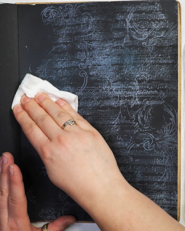
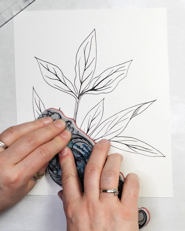
You might look at your page and notice that it’s lost a bit of image definition on the dark background. When you add the Pan Pastel, it will stick to the black paper and the watermark ink. But this is a very easy fix! Just use a piece of paper towel and rub the excess Pan Pastels off the page to create more contrast.
Why does this work? The watermark ink is a slow drying ink that absorbs quickly into the paper. This is why you can add the Pan Pastels right after stamping and not blur the image. The Pan Pastel adheres to the watermark ink then sets and becomes difficult to remove. This is why you can rub off the excess Pan Pastel off the paper without removing the stamped images. Once we remove the excess Pan Pastel, if you rub your hand across the paper, it should pick up little to no Pan Pastel color.

Adding Stencil Images
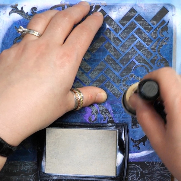
You could leave the background as it is, or you can make the choice to layer more colors and textures. Using a Ranger Mini Blending Tool and foam, I applied watermark ink through a stencil. Then add your favourite color of Pan Pastel to the stenciled images.
For this project, I’m using a combination of Turquoise Pan Pastel and Phthalo Green Pan Pastel for this step. Apply it to the images and rub off any excess Pan Pastel with paper towel.
If you are interested in more information about how to use Pan Pastels with stencils, check out this article.
Adding Watermark Ink on White Paper
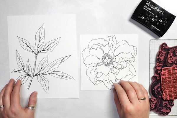
Now that our background is completed, we will focus on adding texture and Pan Pastels to our main images. These images were traced onto watercolor paper from original drawings that I created. If you’re not sure how to trace, check out this article for details.
You can use any image that you have for this project. You can choose to create outline drawings of your own or use stamped images.
Any pastel paper or watercolor paper can be used for this step. I like watercolor paper because it’s thicker than the mi-Teintes pastel paper but still takes Pan Pastel color very well.
Stamping on Focal Images
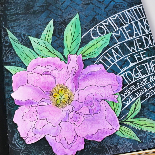
Using the same technique as above, add watermark ink to the stamp and stamp it randomly on the main images. As these focal images are going to be cut out, you don’t need to be too particular about where the images are added. I used the Stamper’s Anonymous Baroque and Faded Type stamp sets to add texture to the peony and peony leaf images.
Applying Pan Pastels
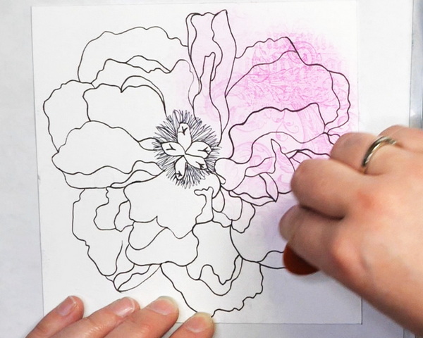
Apply the Pan Pastels with a sponge, brush, or Sofft tool. You’ll notice that on white paper, the blending marks will be more noticeable. When applying Pan Pastels on white paper, I like to use the Pan Pastel Colorless Blender. You will generally end up with a smoother blend and it will extend the color application a bit further. If you have a limited set of Pan Pastels, this will help you get beautiful soft pastel shades even if you are using more intense colors.
Add a layer of Magenta Pan Pastel to the peony image and a layer of Pthalo Green Pan Pastel to the leaves. If you find that you blend some areas too dark, use a paper towel to remove some of the color.
Unlike the black, some of the color will remain on the white paper. You can lighten it, but you won’t be able to remove all the color. Any color added to the watermark ink cannot be removed. I generally show more care blending with my Pan Pastels on white paper as the color of the paper will show the inconsistencies more clearly.
You can also use an eraser to remove Pan Pastels from the surface if you’re unhappy with the color blend. Again, the areas with the watermark ink are permanent, but you can still lighten up the color that is blended on the white paper.
Peony Blending Techniques
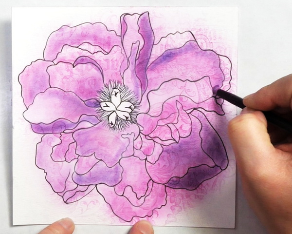
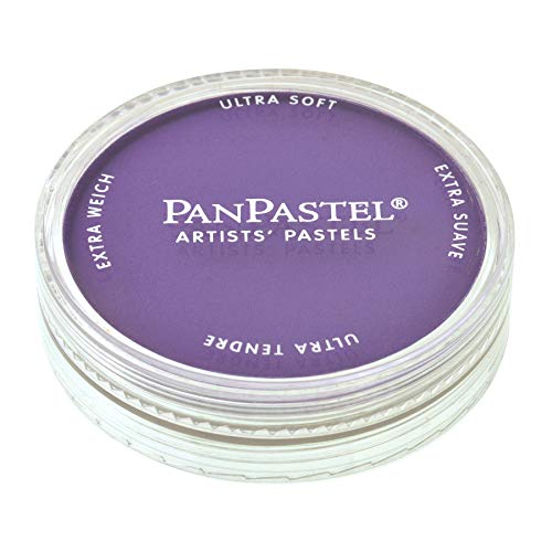
Using a variety of different fine blending brushes, add layers of Magenta and Violet Pan Pastel to the peony. In areas that you want to create highlights, keep the areas light in color. This can be done by adding very soft color or toning down intense colors with colorless blender or Titanium White Pan Pastel. To create shadows, add more layer of Pan Pastel at full color intensity.
Peony Leaf Blending Techniques
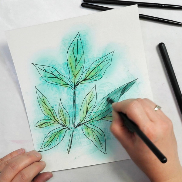
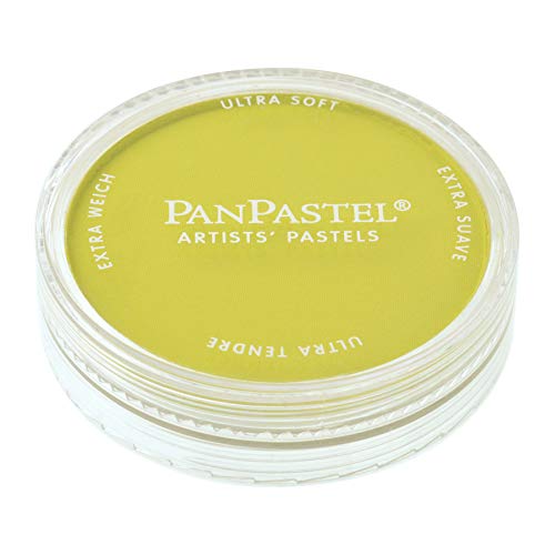
As the peony leaves already had a layer of Pthalo Green Pan Pastel on the surface, add a layer of Yellowish Green to the centers of the leaves. To create shadows, add a layer of Pthalo Green Extra Dark in areas to create depth.
Because we’re mounting these images on a dark background, I like to keep the color lighter. If we darken the leaves too much, they won’t have contrast enough from the background.
Sealing Pan Pastels
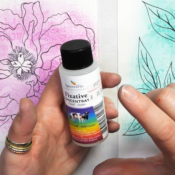
The only sealant that I can recommend for Pan Pastels is SpectraFix which is an excellent way to set your Pan Pastels. Spritz the surface of your project with a light layer of SpectraFix. When dry, dab with your finger. If any color comes up, spritz again lightly. This sealant works the best when added in thin layers as it absorbs quickly and won’t make the Pan Pastels run.
What I like about this sealant is that it doesn’t smell very strong and dries quickly. It also doesn’t darken the color of the Pan Pastels as it dries, and it leaves a very even finish. The ingredients of SpectraFix are casein, water, and alcohol, which is why the sealant doesn’t smell very strongly and can be used indoors.
Be aware if you have a dairy allergy that you should wear a mask when using SpectraFix as casein is a dairy product.

This is the fixative you've been waiting for!
Non-toxic, workable, and fully archival, SpectraFix is a casein-based fixative that utilizes milk protein and grain alcohol to hold and protect your media without dulling or darkening colors. Because it's all-natural and odor-free , you can spray your project indoors while you work — no more odors, unhealthy fumes, or long waits outdoors!
Finishing off this Art Journal Page
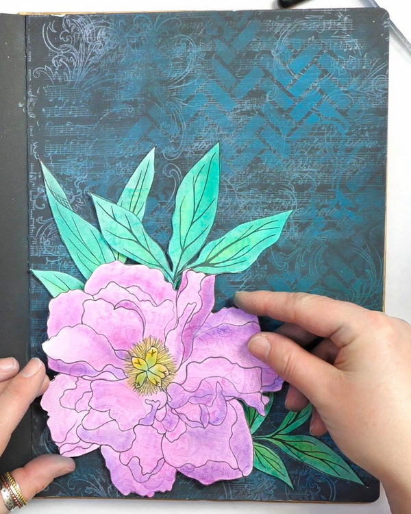
To finish off this page, fussy cut out the focal images after sealing and arrange them onto the page. To create some extra dimension on this page, use Scapbooking Adhesives 3D foam squares on the back of the peony to raise it up slightly from the page.
Adding Journaling
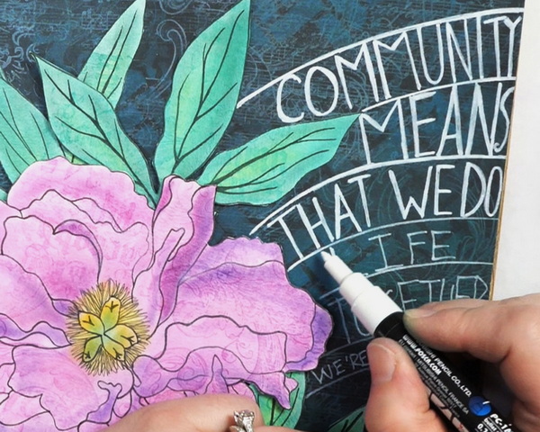
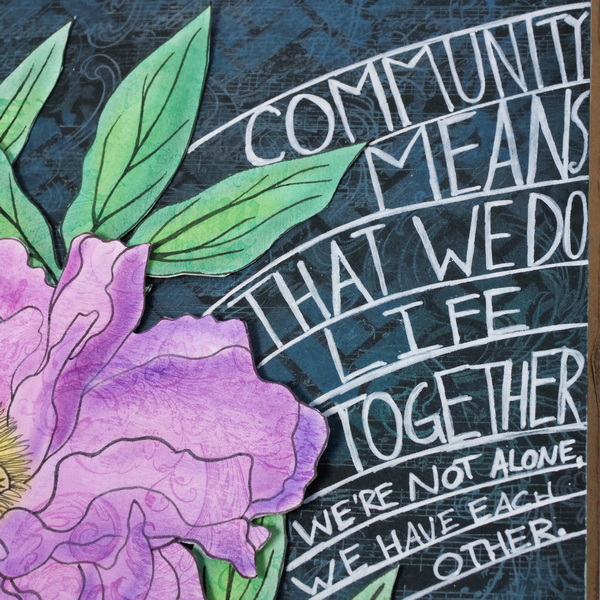
To add the journaling, I used a Posca paint pen to draw arches onto the art journal page. Use these guidelines to add in your words. If you want precise lettering, try adding it onto the page with pencil first. I freehanded my spacing, which made it inconsistent, but I love the inconsistencies of the font.
The question that I wanted to answer in this art journaling page was:
“What Does Community Mean to Me?”
For me, community means that we don’t do life alone. It’s a place where we have people around us who support us, and we can live life together.
But community isn’t always easy, and sometimes it’s hard to find the right community. Even when you find community, there’s always new challenges.
You may go in with good intentions, but then things don’t work out the way you expect it to. Sometimes it means taking a step back, taking a mental break before putting ourselves out in community again. It does take bravery to meet new people, to put ourselves out there, to find authentic community.
I went through a season where I was very isolated. My world felt so small, and I really struggled to find authentic community. I believe that these seasons of our world shrinking can happen from time to time.
It might take us a while before we find a new community that is right for us. In the last couple of years, I have found that my community has started to expand again. I’ve made new friends, found fantastic people in the art community and through attending church. It’s been a breath of fresh air, to feel connected to others and have people who I can live life with that feel safe.
What Does Community Look Like to You?
Often when we talk about community, we might think of people who live around us or our immediate family. But it doesn’t necessarily have to be relatives. I think it can be anyone that you connect with honestly that can give you advice, encouragement, and friendship. This connection can be found in person and online. It’s been amazing how many people I’ve finally met in person after spending so much time with them online!
Looking for Community?
Art can be a powerful way to find community. I’ve started teaching Zoom classes online and in-person and I’m always amazed that by the end of the class how many people have become friends. I love that art journaling classes aren’t just about art, they’re also about connection with others. My next upcoming art class starts at the end of April 2023. I limit these classes to 12 students to keep a small class environment to create a small and safe community for people to learn in.
If this interests you, check out all the information for the online class here. I’d love to meet you and help you find community online!
Any Questions?
Any questions about using Pan Pastels with watermark ink? I’d love to know how you use these techniques in your art journal pages and creative projects. Please leave a comment below, I’d love to start a conversation with you! If you’d like to see more articles about Pan Pastels, click here.
Project Supply List
Every time you purchase from the affiliate links below, it helps support this website. Thank you so much for your support!

PanPastel Artists’ Pastels are pigment-rich, professional-grade soft pastels in a stackable pan format. Each contains 0.3 oz—about 35% more material than the average pastel stick—giving you easy access to intense, ultra-soft color that’s easy to lift, blend, layer without overfilling your surface’s tooth.

PanPastel Artists’ Pastels are pigment-rich, professional-grade soft pastels in a stackable pan format. Each contains 0.3 oz—about 35% more material than the average pastel stick—giving you easy access to intense, ultra-soft color that’s easy to lift, blend, layer without overfilling your surface’s tooth.

PanPastel Artists’ Pastels are pigment-rich, professional-grade soft pastels in a stackable pan format. Each contains 0.3 oz—about 35% more material than the average pastel stick—giving you easy access to intense, ultra-soft color that’s easy to lift, blend, layer without overfilling your surface’s tooth.

PanPastel Artists’ Pastels are pigment-rich, professional-grade soft pastels in a stackable pan format. Each contains 0.3 oz—about 35% more material than the average pastel stick—giving you easy access to intense, ultra-soft color that’s easy to lift, blend, layer without overfilling your surface’s tooth.
PanPastel Artists’ Pastels are pigment-rich, professional-grade soft pastels in a stackable pan format. Each contains 0.3 oz—about 35% more material than the average pastel stick—giving you easy access to intense, ultra-soft color that’s easy to lift, blend, layer without overfilling your surface’s tooth.

PanPastel Artists’ Pastels are pigment-rich, professional-grade soft pastels in a stackable pan format. Each contains 0.3 oz—about 35% more material than the average pastel stick—giving you easy access to intense, ultra-soft color that’s easy to lift, blend, layer without overfilling your surface’s tooth.

PanPastel Artists’ Pastels are pigment-rich, professional-grade soft pastels in a stackable pan format. Each contains 0.3 oz—about 35% more material than the average pastel stick—giving you easy access to intense, ultra-soft color that’s easy to lift, blend, layer without overfilling your surface’s tooth.

PanPastel Artists’ Pastels are pigment-rich, professional-grade soft pastels in a stackable pan format. Each contains 0.3 oz—about 35% more material than the average pastel stick—giving you easy access to intense, ultra-soft color that’s easy to lift, blend, layer without overfilling your surface’s tooth.
PanPastel Artists’ Pastels are pigment-rich, professional-grade soft pastels in a stackable pan format. Each contains 0.3 oz—about 35% more material than the average pastel stick—giving you easy access to intense, ultra-soft color that’s easy to lift, blend, layer without overfilling your surface’s tooth.
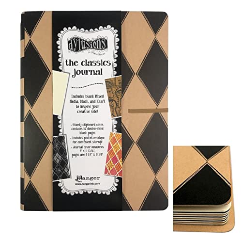
When you need somewhere to create and preserve your artwork, look no further than this Dylusions Classics Journal from Ranger Ink, designed by Dyan Reaveley. This journal includes 52 double-sided pages, 28 mixed media, 12 black and 12 Kraft pages, all waiting for your inspiration.
Unlock endless creative possibilities with the Large Clear VersaMark Watermark Ink Stamp Pad from Tsukineko! Achieve stunning watermark effects and elegant two-toned designs. Perfect for resist techniques and mixed media magic, this must-have ink pad elevates your crafting projects effortlessly!
Unlock endless creative possibilities with the Champagne VersaMark Watermark Ink Stamp Pad from Tsukineko! Achieve stunning watermark effects and elegant two-toned designs. Perfect for resist techniques and mixed media magic, this must-have ink pad elevates your crafting projects effortlessly!
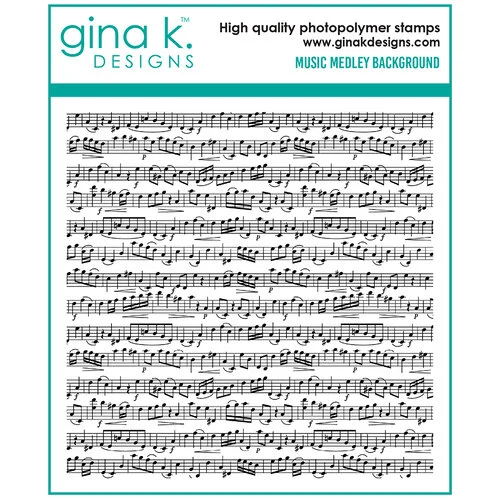
Bring your paper crafting projects to life with the Gina K Designs Clear Photopolymer Stamps Music Medley Background. This versatile stamp set allows you to create stunning designs on cards, scrapbook pages, tags, and more.

Great for using with Tim's signature distressing techniques! These red rubber stamps come mounted on cling foam so you can use them with any acrylic block (sold separately).

Create breathtaking DIY projects with the Baroque Cling Mounted Rubber Stamp Set designed by Tim Holtz for Stampers Anonymous. The set includes 2 cling rubber stamps that can be used with your favorite inks and an acrylic block (sold separately).

You'll quickly love creating mixed media projects with Tim Holtz's Faded Type Cling Mounted Rubber Stamp Set by Stampers Anonymous. Included in the package are 6 cling rubber stamps that can be used with your favorite inks and an acrylic block (sold separately).

Stamping block tools with grid and grip, 8mm thickness, assorted sizes.
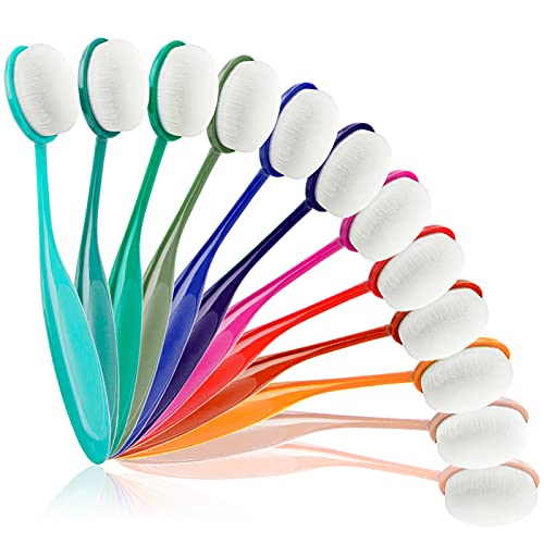
Application is easy, quick and finished product is perfect. 12 Colors Blending Brushes with strong handle and soft bristles.

Makeup applicators are great for blending Pan Pastels, applying paint through stencils and many other mixed media techniques.
Made of dense, semi-rigid and slightly domed synthetic bristles, the professional dry brush with a well-crafted wooden handle is durable and not deformable, and it's easy to achieve a variety of painting effects.

Not only is the Mini Round Ink Blending Tool cute as a button, but it’s also great for giving you a lot more control when applying a little bit of ink using a pouncing motion when using with stencils.
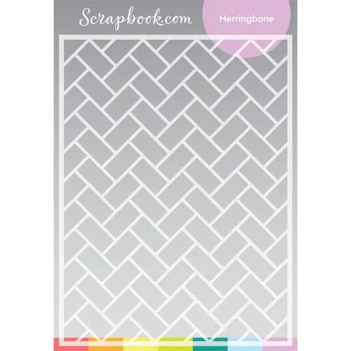
Add depth, design, and amazing patterns to your projects with Scrapbook.com's exclusive Stencils Collection! This high quality reusable stencil is ready to be inked, painted, misted, and moussed to create unbelievable texture and interest on your layout pages, cards, home decor and more!
Designed to appeal to students, Canson XL pads contain more sheets at a comparable or better price than other value pads in the marketplace.

Pitt Artist Pens offer a waterproof pigmented India Ink with unsurpassed lightfastness. These acid-free pH neutral markers come in a wide variety of colors and nib sizes and provide great versatility to pen-and-ink drawings requiring lots of intricate details.

You're going to feel just like an expert when you're cutting the smallest of details with the Cutter Bee Scissors by EK Success. These un"bee"lievable compact scissors will have you feeling like a queen bee when you swarm right into your fine detail or fussy cutting projects.

The best way to adhere embellishments like beads, buttons, flowers, and chipboard is to use Zots from Therm O Web. Many adhesives aren't strong enough, hot glue is potentially dangerous, and liquid glue is messy. Zots are clear adhesive permanent glue dots.

Small Pre-Cut 3D Foam Squares add height and interest to the layers on your scrapbook pages, cards and mixed media projects.
This is the fixative you've been waiting for!
Non-toxic, workable, and fully archival, SpectraFix is a casein-based fixative that utilizes milk protein and grain alcohol to hold and protect your media without dulling or darkening colors. Because it's all-natural and odor-free , you can spray your project indoors while you work — no more odors, unhealthy fumes, or long waits outdoors!

Introducing the ultimate tool for unleashing your creative potential - the Posca Paint Marker. Elevate your artistic endeavors with a marker that combines innovation, versatility, and top-notch quality, all in one package.