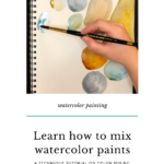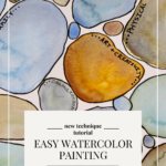
Intimidated by Watercolor Mixing? An Easy Watercolor Tutorial
If you are new to watercolor painting, watercolor mixing may seem intimidating. Watercolor mixing is a great way of learning the palette, but where to start? What colors do you use? How do you mix colors without creating mud?
When I was first learning how to use watercolor and acrylic paints, color mixing seemed impossible to learn. But I was determined to move past only using the color from the tube. I experimented, learned from others and I continue to grow in my skills.
The effort to learn color mixing is worth it. Not only does it improve your paintings, but it also provides so much freedom in your creative practice! Today I am sharing one of my favorite art journal exercises that will help you gain confidence in watercolor mixing.
Hop-A-Long Studio is reader-supported. When you buy through links on our site, we may earn an affiliate commission at no cost to you. Learn more.
Basics of Watercolor Mixing
If you were anything like me when I first started to paint, I only used the color out of the palette or tube. I owned dozens and dozens of colors because the idea of color mixing seemed too overwhelming. As I continued to learn about paint through practice and lectures at my local art store, I started gaining an understanding of basic paint mixing.
Watercolor mixing can be a very complicated process or very simple, depending on what you want to achieve. I’ve been in lectures where the teachers have such a strong understanding of color theory that they only use 6-12 paint colors. That is a level of mastery that takes years and much practice to achieve.
For us mere mortals, just being able to get a nice color mix and not mix mud may be our goal. Today I wanted to share some basic principles for watercolor mixing to help you get started.
How Not To Make Mud
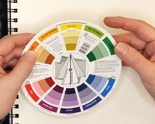
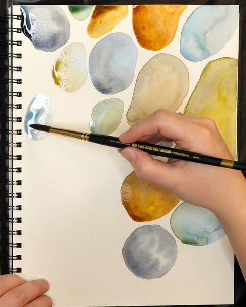
First of all, we need to understand the color wheel. The color wheel is made up of both primary colors, red, yellow, blue, and secondary colors, orange, green, purple. Based off of this basic understanding, blue and red should make purple.
This is true, but will you get a clear, vibrant purple or a muddy purple? In the examples below, I show you three different red and blue watercolor mixes. The one on the far left is blending a cool red and cool blue, this creates a very muted eggplant color. The middle example is a warm blue and a warm red, which creates a lilac tone. The example to the right is a warm blue and a cool red, which creates a purple color that is more vivid, but not as vibrant as the middle example.
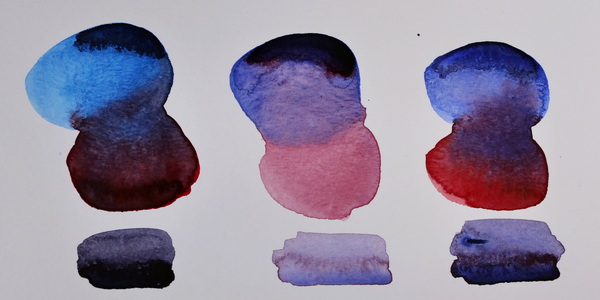
So why is there so much variation when trying to mix purple? Because it depends on the warm and cool tones you choose for your paint. This affects the blend of color that you will get.
Color Charts
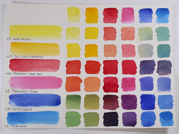
When learning how to mix watercolor or any type of paint, color charts are helpful for understanding the results of color mixing. My favorite color chart is created by using warm and cool colors of the 3 primary colors. Each color will give you a different mix depending on if you are using a cool or warm color.
For example, the difference between using a warm or cool blue with a warm yellow creates two very distinct colors. One color is closer to teal, the other a leaf green. By creating color charts this can give you a better understanding of watercolor mixing and how to use these mixes in your projects.
Complex Color Charts
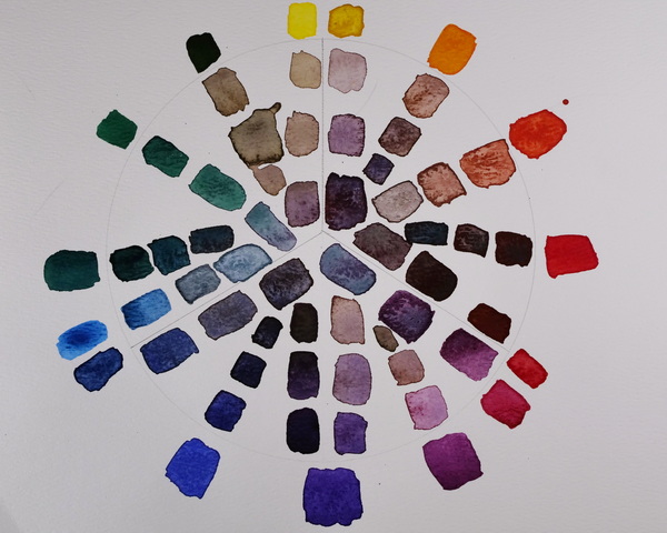
You can also create more complex color charts like the one above. In this case, I was mixing with the color opposite on the color wheel. This gives a lot of different variations (including some muddy values). But I love this exercise for getting a stronger understanding of watercolor mixes.
How to Apply Watercolor Mixing
So how do we apply watercolor mixing to our projects? It is one thing to create pools of color, it’s a completely different thing to add it to a project. Color mixing takes experimentation and sometimes we just need to start adding color to a page to see what works and what doesn’t.
I like creating simple art journal projects that help me with my watercolor mixing. This week’s project is a simple tutorial using basic shapes to help you gain confidence in your color mixing.
Why the Rocks?
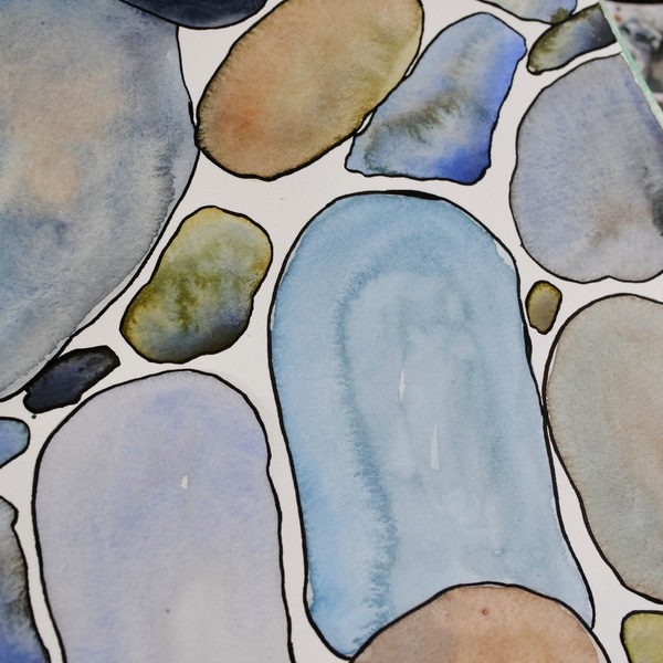
The symbolism of rocks is a reminder for me to choose my priorities carefully. If you have ever read the book The 7 Habits of Highly Effective People there is a section in the book that talks about priorities, or the “big rocks” in our lives.
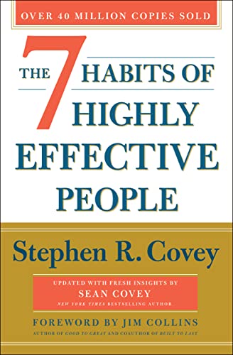
One of the most inspiring and impactful books ever written, The 7 Habits of Highly Effective People has captivated readers for nearly three decades. It has transformed the lives of presidents and CEOs, educators and parents
It is great analogy for helping us figure out our priorities. There are the big rocks, small rocks and the sand. The challenge is how to arrange them in a container in a way that everything fits. To make everything fit, the big rocks need to come first, then the small rocks, then the sand.
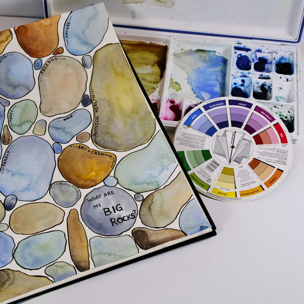
What are your Big Rocks?
From this picture, this can help us ask some important questions. What are our big rocks? What do we want to focus on this year and what do we value?
It can help us define the smaller rocks. What are the things that are important but come secondary to the big rocks?
The sand ends up being all the other things. The pressures from others, the regular, mundane things that take up our time. These come secondary to the big rocks but are still things that we want to accomplish. The sand is really all the other things, the pressures and regular everyday things that take up our time.
Sand or Big Rocks?
I have learned that so often the little things, the distractions, the emergencies (the sand), can use up all my time, so the big rocks never happen. I always have great intentions at the beginning of the year, and by the end of the year, those big goals (or big rocks) have made no progress. So often I let the sand get in the way of the big rocks.
It is so challenging because the little things can seem so important at the time. They can feel overwhelming and focusing on them can help take the stress off. But it doesn’t make us happy.
SMART Goals and Boundaries
This year I have focused on setting SMART goals and boundaries to help me define the big rocks. I reference back to them on a weekly basis to make sure that they don’t fall to the side. I also am working on boundaries, on staying no to the things that are less important. This way I can say yes to the things that I value.
Remember that the big rocks don’t have to be accomplishments. Most of my big rocks are things like family, friends, mental and physical health. These are priorities for my life and if I want to stay happy and healthy, these need to take priority. The big rocks look different for all of us, but it is a reminder to be mindful and define the things that bring us joy and happiness.
If you’re interested in going deeper into outlining your values and using them to create achievable goals, I have created an e-book outlining my process for determining values and goal setting.
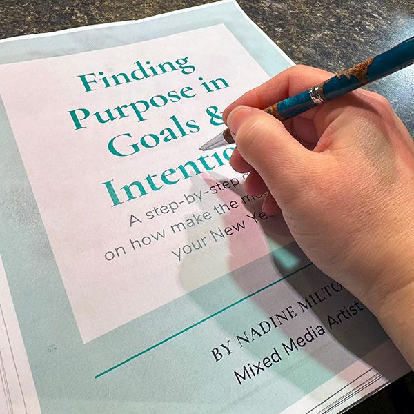
Tired of the usual New Year's resolutions? Let’s focus on setting a meaningful intention for the year! Learn how you your values, goals and intentions intersect to make sure you have the best year yet!
This 22 page e-book includes worksheets to help you define your goals and intentions for the year.
This art journal page is a reminder to always put the big rocks first and then let everything else fit around them.
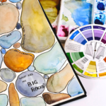
Big Rocks Art Journal Page
Step 1: Add in Rock Shapes by Mixing Watercolor
Add in a variety of rock shapes by mixing your watercolors. For these rocks I chose to use 8 colors to mix with. By limiting the color palette, this gives more color harmony to your page. Paint a variety of big and small rocks using a wet on wet technique. You can use reference photos from nature or use shapes that just come to mind when creating your rocks. Every rock is different, so this is a fun exercise to play with color and shape.

- Quality student-grade range
- 40+ colors, including modern and historic pigments
- Strong tint strength
- Reliable transparency and lightfastness
- Uniform consistency for beginners and students
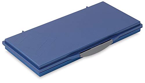
- 24 ergonomically slanted wells with two (2) generous mixing areas
- Removable mixing tray for easy cleaning
- Colors appear the same on both the palette and watercolor paper
- Leakproof and airtight palette for watercolor or oil paint keeps colors fresh for weeks

Designed For Water-Based Paints - Wide variety of shapes and sizes for various watercolor art techniques from precise detail to large washes; Fine tipped Rounds #0 #3 #6 #8 #10 #12; Dagger Striper 3/8"; Oval Wash (Cat's Tongue) 3/4"; Flats #6 3/4"
Step 2: Draw in Rock Outlines
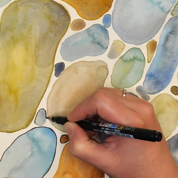
You can leave the painting as is, but I wanted to add outlines to the rocks as I had them overlapping in places. I outlined my large and small rocks using a fine tipped permanent pen. But you can choose to create heavy outlines to the rocks depending on your preference.

Great for calligraphy, hand lettering, and drawing, Fudenosuke Brush Pens contain water-based, pigmented, odorless ink. Create extra-fine, fine, or medium strokes simply by adjusting brush pressure.
Step 3: Add Journaling
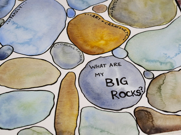
You can finish this page off by adding in your big rocks for the year. As not everything can be a big rock, you will see that some rocks are left empty. I also included writing on some of the medium and smaller rocks to also identify the things that sometimes get in the way of my big rocks.

Similar to a technical pen, the Faber-Castell Pitt Artist pens are designed for precise and detailed work. They are ideal for sketching, studying, and inking.
Made with waterproof pigmented India ink, artwork won’t fade or bleed.
What are Your Big Rocks?
What are your big rocks? I hope that this gives you a place to write down those big rocks for your life.
My hope is that this tutorial has given you more confidence in watercolor mixing and how to use colors together. I love these types of exercises because they are so easy and relaxing to create and give you a place to add some personal journaling.
I would love to hear what you think about this project! Leave a comment below or contact me directly. I would love to hear from you!
Project Supply List
One of the most inspiring and impactful books ever written, The 7 Habits of Highly Effective People has captivated readers for nearly three decades. It has transformed the lives of presidents and CEOs, educators and parents
Designed For Water-Based Paints - Wide variety of shapes and sizes for various watercolor art techniques from precise detail to large washes; Fine tipped Rounds #0 #3 #6 #8 #10 #12; Dagger Striper 3/8"; Oval Wash (Cat's Tongue) 3/4"; Flats #6 3/4"

My favorite, yet inexpensive watercolor brush. I purchased these for a class on a whim and now use them in my watercolor and mixed media work. Round watercolor brush set includes Sizes: #2, #4, #6, #8, #10, and #12.
- Quality student-grade range
- 40+ colors, including modern and historic pigments
- Strong tint strength
- Reliable transparency and lightfastness
- Uniform consistency for beginners and students
- 24 ergonomically slanted wells with two (2) generous mixing areas
- Removable mixing tray for easy cleaning
- Colors appear the same on both the palette and watercolor paper
- Leakproof and airtight palette for watercolor or oil paint keeps colors fresh for weeks
Great for calligraphy, hand lettering, and drawing, Fudenosuke Brush Pens contain water-based, pigmented, odorless ink. Create extra-fine, fine, or medium strokes simply by adjusting brush pressure.
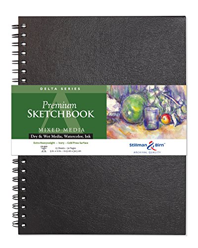
Explore infinite creative possibilities with Stillman & Birn Delta Series Spiralbound Sketchbooks. Featuring robust, extra heavyweight 180 lb (270 gsm) ivory sheets, these versatile sketchbooks are ideal for experimenting with dry media, ink, watercolor, and mixed media techniques.
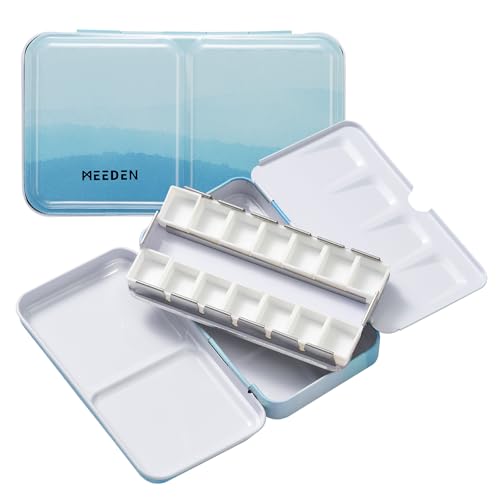
Small blue watercolor painting palette tin box with lid makes it a compact watercolor case, perfect for traveling. Sturdy, reusable, and rust resistant. The 14 half pans that can be removed for quick clean up.

- Quality student-grade range
- Strong tint strength
- Reliable transparency and lightfastness
- Quality student-grade range
- Strong tint strength
- Reliable transparency and lightfastness
- Uniform consistency for beginners and students

- Quality student-grade range
- Strong tint strength
- Reliable transparency and lightfastness
- Uniform consistency for beginners and students

- Strong tint strength
- Reliable transparency and lightfastness
- Uniform consistency for beginners and students

- Professional quality
- Maximum pigment loads and pure gum arabic
- Highest possible lightfastness and permanence

- Professional-quality
- Maximum pigment loads
- Excellent lightfastness
- Natural granulation and distinctive pigment properties

- Quality student-grade range
- Strong tint strength
- Reliable transparency and lightfastness
- Uniform consistency for beginners and students

- Quality student-grade range
- Strong tint strength
- Reliable transparency and lightfastness
- Uniform consistency for beginners and students

Create both thick and thin lines with Zebra Zensations Fude Brush Pens. These pens feature waterbased, water-resistant, archival pigment ink for a wide variety of techniques, including drawing, illustration, design, calligraphy, and hand lettering.
Similar to a technical pen, the Faber-Castell Pitt Artist pens are designed for precise and detailed work. They are ideal for sketching, studying, and inking.
Made with waterproof pigmented India ink, artwork won’t fade or bleed.

Perfect for adventurous artists, this water pot expands on site then collapses for transport. It's also easy to clean and store. Ridges around the rim keep brush handles separated and organized while you're painting.