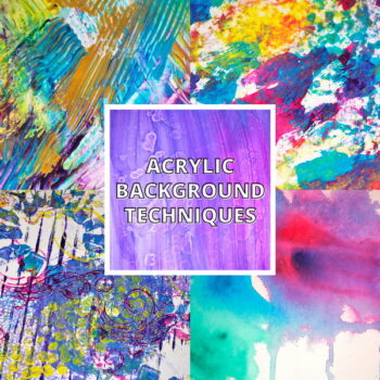
Mixed Media Magic: Altered Photo Techniques for Your Art Journal
Do you ever use altered photos in your art journaling pages? We take photos all the time with our phones but may not realize that these photographs can be perfect additions to our art journal pages. The challenge is how do we seamlessly incorporate our photos into our pages? By using altered photo techniques this can help use change our photographs from snapshots to elements that are perfect for our art journal pages.
Today I’ll share with you not only how to alter and adjust your photos for use in the art journal but also how to create a seamless and cohesive art journal page with a range of unique elements.
Hop-A-Long Studio is reader-supported. When you buy through links on our site, we may earn an affiliate commission at no cost to you. Learn more.
Printing Your Photo
The first design decision to make is whether you want to use a color, sepia, or black and white photo for your project. Each style gives a very different look to the page. It comes down to the design aesthetic that you’re looking to create in your journal.
Choosing the Right Paper
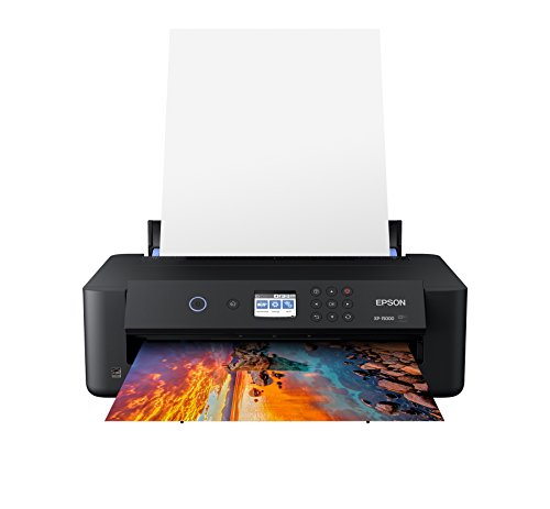
I print my photos at home using my Epson XP-1500 photo printer. This printer gives me great results every time and lets me use a large range of photo papers and up to very large sizes. For this project, I’m using 100% cotton rag watercolor photo paper to print on. The paper that I’m using is no longer available, but Canson Infinity Aquarelle Rag Photo Paper is a similar paper that should give you excellent results.
I love printing on the watercolor paper because of the textured surface and the beautiful matte finish of the paper. This makes it excellent for use in any art journal project.
If you don’t have watercolor photo paper available, use the most matte photo paper that you can find. It’ll give you a beautiful result and makes it easy to add other mixed media layers to your project.
Professional ultra HD photo quality get brilliant border less prints up to 13 inches X 19 inches. Individual 6 color Claria photo HD ink includes red and gray inks for an ultra wide color gamut and enhanced black and white prints.

- 100 percent cotton rag, white, photographic paper with an ultra smooth texture
- The whiteness is controlled with natural white pigments to ensure the highest archival standards and age resistance
- Internally buffered, acid free, and museum grade

This high-quality photo paper from Canon delivers professional quality prints. The matte finish and heavy 8.5-mil (0.22 mm) thickness help to give your prints detailed lines, crisp colors, and a surface that feels just like it came from a photo lab.
Differences in Paper
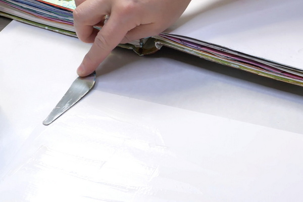
Every paper will give you a different effect. The photo below shows the difference between printing on copy paper versus the watercolor photo paper.
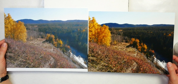
You can see what a difference using proper photo paper can make on a project! Use any paper that you have but be aware that glossy paper will give a very different look than watercolor paper. As my intention is to add other mediums on top, using a matte and more absorbent paper will generally give me better results.
Adding Photographs to Your Art Journal
For today’s project I’m using the photo as my piece of background paper. This is just one way to use altered photo techniques in your art journal. If you’d like to see some other ways that I like to use photos in my art journal, leave a comment below. I’d love to share some other altered photo techniques at a later date.
Choosing the Right Glue
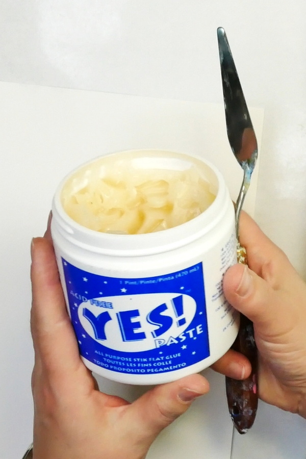
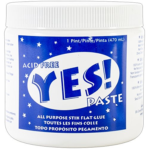
To glue the photo to the art journal page I’m using my Yes Flat Stick Glue (I’ll refer to it as Yes Paste in this article). I use this glue a lot because it is archival, has great adhesion and is a very dry glue. You’ll get less warping and wrinkling if you use a dry glue like the Yes Paste over a wetter glue like Art Glitter Glue or matte medium.
To see my recommendations for the best collage glue, visit this article: Looking for the Best Collage Glue? Start Here!
To spread this glue, use a palette knife. Spread the glue in a very thin layer onto the back of the photograph. I suggest also adding in a layer of the Yes Paste onto your art journal page.
Why I’m adding glue to both surfaces is to make sure that I get the best adhesion possible. This way if I miss an area on either the photo or the art journal, the extra glue will make sure that I still have good adhesion.
It also gives me more working time. If I haven’t positioned my photo just right, I can slide it around slightly to line it up correctly. This is due to the surface tension between the two layers of glue. Make sure to rub the photo once it’s in place so that it is fully adhered to the background.
Acid-free glue that is slow setting, dries clear and cleans up with soap and water. A must have for any collage artist!

A 5-piece premium quality stainless steel artist palette knife set with sturdy comfort-grip wooden handles. Set includes the essential shapes and sizes needed for most types of palette knife techniques and painting applications.
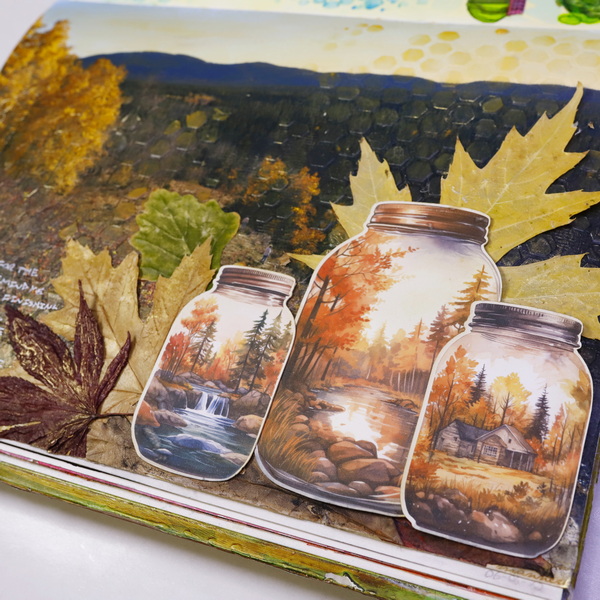
Adding in Texture and Color
I love this photo, but it still feels too much like a photograph over an element in an art journal page. To transform this photo, I’m going to be using a new medium I’ve been playing with recently, Deco Art Wax Effects translucent layering paint. The Wax Effects are meant to give the look of encaustic on any project.
Using Wax Effects Paste with a Brush
The first way I’m going to alter my photo is with a thin layer of Beeswax Wax Effects Paste and a brush. I started with spreading out some of the acrylic paste with a palette knife and then moving to a brush to apply a thin layer across the entire photo. You’ll notice that the areas that are dark become slightly darker. The lighter areas and the mid-tone areas create a softer, more aged look to the page.

DecoArt Wax Effects Acrylic Paint is a waxy, ready-to-use acrylic designed to recreate the sheer, luminous, lovely qualities of traditional beeswax encaustic. No heat or other preparation is needed.
It’s a subtle change, but it makes a big difference on the overall look of the page. You’ll notice the most visible difference in the sky area of the photograph.
With the Deco Art Wax Effects, it’s suggested to let them dry naturally and not heat set them. If you put on a thin layer of medium, it should dry within a few minutes, and you should be able to add your second layer quickly.
Adding Stencil Texture
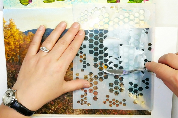
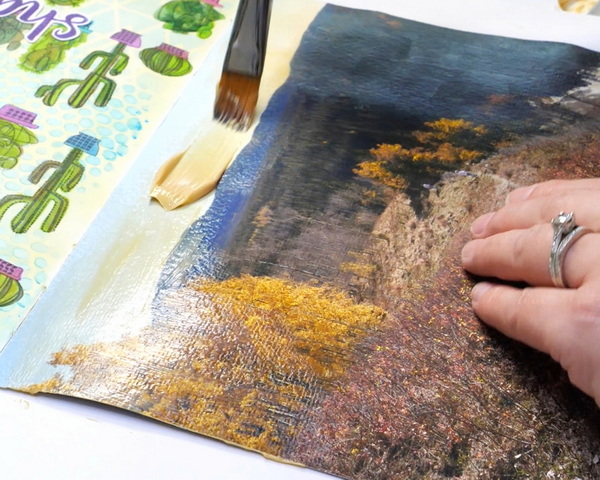
Once the surface is dry, add your favorite stencil on top to create additional texture. I’m using the honeycomb stencil from Wild Whisper Design for this step. Start by applying a layer of Neutral Deco Art Wax effects paste through the stencil. This paste looks white when applied, but it will dry clear. You can choose a few places to add stenciling or you can add a layer across the entire image.
As you’re adding the Neutral Déco Art Wax Effects through a stencil, add in a bit of Beeswax Deco Art Wax Effect Paste and let these color mix together. This tints the neutral paste slightly without having the beeswax color take over.
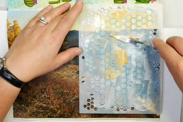
Let the art journal page air dry until the neutral wax effects paste is completely clear. This could take a few hours depending on your climate.
DecoArt Wax Effects Acrylic Paint is a waxy, ready-to-use acrylic designed to recreate the sheer, luminous, lovely qualities of traditional beeswax encaustic. No heat or other preparation is needed.

DecoArt Wax Effects Acrylic Paint is a waxy, ready-to-use acrylic designed to recreate the sheer, luminous, lovely qualities of traditional beeswax encaustic. No heat or other preparation is needed.

10 honeycomb bee stencils with 10 different honeycomb size options, and 2 stencils sizes. Large stencils measure 11.8x11.8 inches, the small stencils measure 5.9x5.9 inches.
Adding Definition
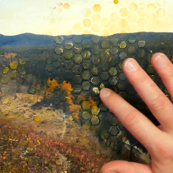
As the texture of this background is pretty subtle when dry, to lighten up some of the dark areas, use a bit of Golden Iridescent Gold (Fine) acrylic paint. Using your finger, rub small amounts of it around the edges of the hexagon shapes to create definition.

Golden Interference and Iridescent Heavy Body Acrylics add an exciting range of options to your creative repertoire. Used alone or mixed with other acrylic paints, they enable you to achieve color effects that are truly spectacular.
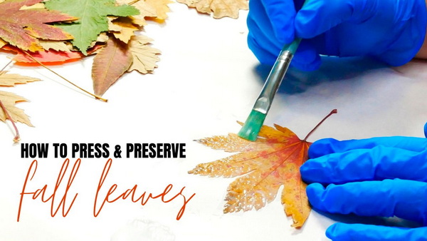
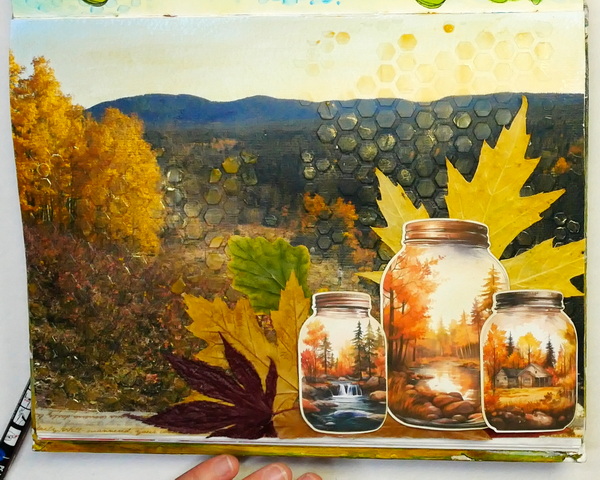
Adding in Leaves
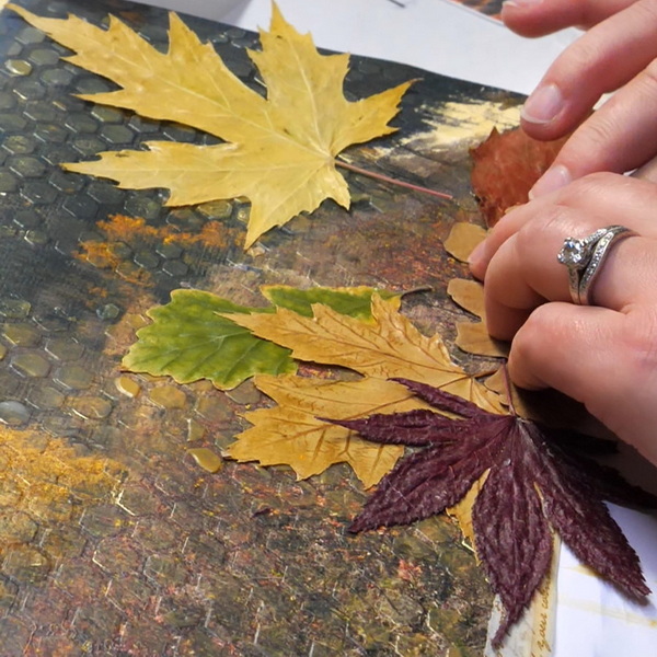
To complement this beautiful fall scene, I wanted to add in some beautiful leaves I’ve collected this fall. Before the leaves can be applied, they need to be dried and sealed. For details on this process, check out this article: How to Seal Fall Leaves
Play around with the placement of the leaves. Once you’re happy with the design, add to the surface using Yes Stick Flat Glue. Due to the bumpy surface from the paste and the uneven surface of the leaves, the yes paste creates a slightly thicker layer of adhesive. This way the unevenness of the surface won’t be an issue.
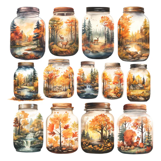
Adding Your Focal Images
The focal images I chose for this page is a collection of fall jar images from Simply Stated Designs. I love these images because of the beautiful fall scenes in each of the jars. The whimsy and fall colors bring me so much joy and I thought they’d be perfect for this project!
Package of die cut paper embellishments printed on high quality 80lb cardstock OR high quality gloss paper.
Use nadine15 at checkout to get 15% off of your first order!
Altering the Focal Images
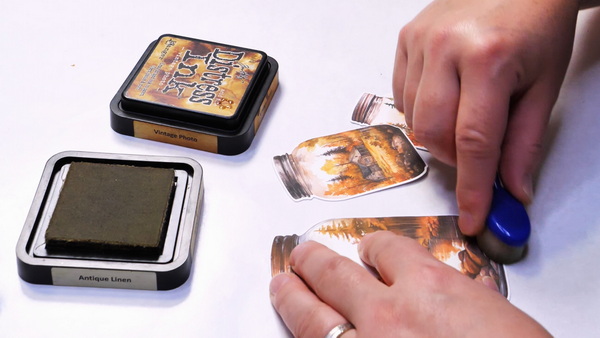
One thing I did notice was how bright the white paper was compared to the rest of my elements on the art journal page. An easy way to adjust color is to use a bit of dye ink and your favorite ink blending tool. One of my favorite ink blending tools for light layers of color are the Yoseng Ink Blending Brushes. They give you a bit more control when adding color so that you can add a little bit at a time.
Using the Tim Holtz Distress Ink Antique Linen, I added ink to the edges of the jars and any of the larger white areas of the image. But I didn’t add any ink to the water areas of the images. By leaving small areas of white, it ends up becoming a highlight and doesn’t detract from the overall image.
I like how the images look but just want to add a bit of darker color around the edges. Using Tim Holtz Distress Ink Vintage Photo, add a bit more color to the outside edges. When blending with this color, I only let the edge of the brush blend onto the image. This is a way to control how much color you add to your project. It means that you end up with more ink on your craft sheet, but it gives you more control with your blending.

Give your projects a timeless, antique effect with the Vintage Photo Distress Ink Pad from Ranger Ink and Tim Holtz. This 2" x 2" warm brown ink pad is perfect for aging paper, enhancing mixed media, and distressing scrapbook layouts and cards with depth and rustic charm.

This soft, aged parchment hue is perfect for blending, distressing, and adding warmth to backgrounds.
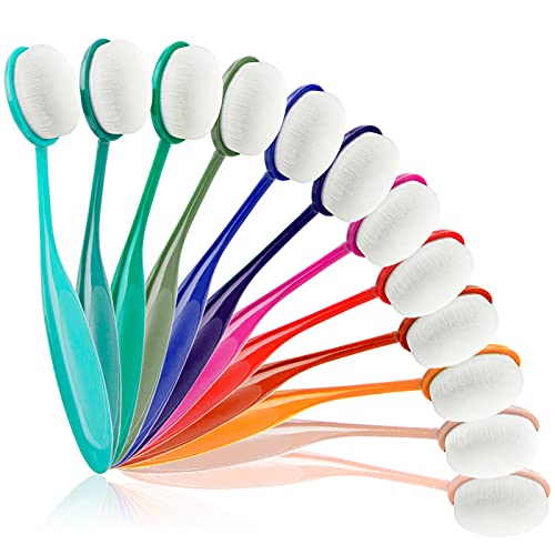
Application is easy, quick and finished product is perfect. 12 Colors Blending Brushes with strong handle and soft bristles.
Adding the Images with Yes Stick Flat Glue
Because there is a lot of bumpiness to the surface, I would recommend using Yes Stick Flat Glue for adding the focal images on top of the leaves. This way you’re ensured that your images will stay on the page.
Adding Shadows and Highlights
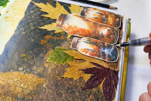
To help the jars feel more grounded in this project, use a Stabilo All black pencil and a water brush to blend shadows in and around the jars.
I like to create more contrast in the leaves by adding a few highlights. Using the Golden Iridescent Gold (fine) fluid acrylic, add in watered down paint to the veins of the leaves using your finger or a water brush.

Water Brush Pens for Watercolor Painting: Blend, glaze and paint with your favorite watercolors as well as with water-soluble colored pencils and markers without the need for a water cup.

Stabilo's soft, waxy leads mark on virtually any surface. This is not an artist colored pencil, for drawing and sketching, but rather a colored marking pencil. Use it for writing in color on paper and other surfaces, even difficult surfaces like plastic, film, and mylar.
Finishing off with Journaling
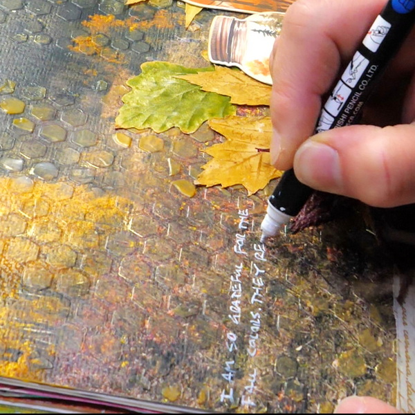
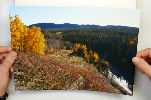
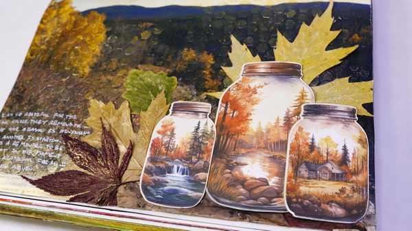
The photo in this page was from a visit to Sheep River Provincial Park a few weeks ago and there was a story behind this photo that I wanted to talk about in my journaling.
I had friends visiting from Ohio on the Canadian Thanksgiving long weekend and we took them out for a drive to see the beautiful fall colors. It was a beautiful day! Some years by Thanksgiving weekend we have a lot of snow. So being able to go out for a drive and have a wonderful conversation in 20C weather was such a blessing! It made me think of the importance of gratitude and how we can choose gratitude in our lives. We can be thankful for these beautiful moments and use our art journal to record these amazing times and express our gratitude. This is what I wrote in my art journal:
I am so grateful for the fall colors. They remind me that one season is finishing, and another is starting. It’s a reminder to be present in the moment and be grateful for all I’ve been given.
Nadine Milton
We can sometimes focus on what’s not going right or wishing the season that we’re in would end. I like the reminder that there are always new opportunities ahead. To see the current situation as it is, a season in our lives. But instead of fighting against it, try to be present in the process, realizing that things will change. Sometimes it’s for the good, sometimes not so good, but to focus on always find gratitude in the season we are in.
Choosing a Journaling Pen
Working on an uneven surface with a lot of texture can sometimes be tricky. I like to use my White Posca Paint Pen when working on uneven and slippery surfaces. It writes really well on any surface and dries quickly. I tend to write in capital letters on bumpy surface so that the pen doesn’t catch on the paper.

Introducing the ultimate tool for unleashing your creative potential - the Posca Paint Marker. Elevate your artistic endeavors with a marker that combines innovation, versatility, and top-notch quality, all in one package.
Questions?
Any questions about altered photo techniques for your art journal pages? This is just one of many ways that you can alter photos. I’d love to know if you have any questions about the mediums I’ve used, the prompt, or any thoughts about this project. I’d love to start a conversation with you! Please leave a comment below!
I hope that you take some time to reflect on what you’re grateful for and spend some time in creative self-care this week!
Project Supply List
Every time you purchase from the affiliate links below, this supports my website (at no additional cost to you) and lets me bring you new content every week. Thank you for your support!
Professional ultra HD photo quality get brilliant border less prints up to 13 inches X 19 inches. Individual 6 color Claria photo HD ink includes red and gray inks for an ultra wide color gamut and enhanced black and white prints.
- 100 percent cotton rag, white, photographic paper with an ultra smooth texture
- The whiteness is controlled with natural white pigments to ensure the highest archival standards and age resistance
- Internally buffered, acid free, and museum grade
This high-quality photo paper from Canon delivers professional quality prints. The matte finish and heavy 8.5-mil (0.22 mm) thickness help to give your prints detailed lines, crisp colors, and a surface that feels just like it came from a photo lab.
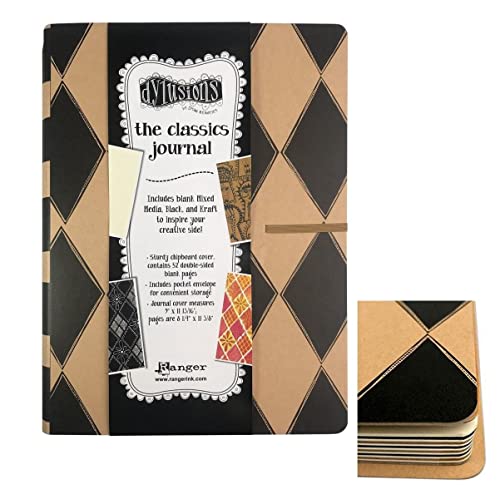
When you need somewhere to create and preserve your artwork, look no further than this Dylusions Classics Journal from Ranger Ink, designed by Dyan Reaveley. This journal includes 52 double-sided pages, 28 mixed media, 12 black and 12 Kraft pages, all waiting for your inspiration.
Acid-free glue that is slow setting, dries clear and cleans up with soap and water. A must have for any collage artist!

HARP DURABLE STAINLESS STEEL BLADES: Forging press manufacturing process enables high-density steel that makes 3 times harder than ordinary stainless steel, precision-ground offer a lasting sharp edge that cuts all the way to the tip.
A 5-piece premium quality stainless steel artist palette knife set with sturdy comfort-grip wooden handles. Set includes the essential shapes and sizes needed for most types of palette knife techniques and painting applications.
DecoArt Wax Effects Acrylic Paint is a waxy, ready-to-use acrylic designed to recreate the sheer, luminous, lovely qualities of traditional beeswax encaustic. No heat or other preparation is needed.
DecoArt Wax Effects Acrylic Paint is a waxy, ready-to-use acrylic designed to recreate the sheer, luminous, lovely qualities of traditional beeswax encaustic. No heat or other preparation is needed.
10 honeycomb bee stencils with 10 different honeycomb size options, and 2 stencils sizes. Large stencils measure 11.8x11.8 inches, the small stencils measure 5.9x5.9 inches.
Golden Interference and Iridescent Heavy Body Acrylics add an exciting range of options to your creative repertoire. Used alone or mixed with other acrylic paints, they enable you to achieve color effects that are truly spectacular.
Package of die cut paper embellishments printed on high quality 80lb cardstock OR high quality gloss paper.
Use nadine15 at checkout to get 15% off of your first order!
Give your projects a timeless, antique effect with the Vintage Photo Distress Ink Pad from Ranger Ink and Tim Holtz. This 2" x 2" warm brown ink pad is perfect for aging paper, enhancing mixed media, and distressing scrapbook layouts and cards with depth and rustic charm.
This soft, aged parchment hue is perfect for blending, distressing, and adding warmth to backgrounds.
Application is easy, quick and finished product is perfect. 12 Colors Blending Brushes with strong handle and soft bristles.
Stabilo's soft, waxy leads mark on virtually any surface. This is not an artist colored pencil, for drawing and sketching, but rather a colored marking pencil. Use it for writing in color on paper and other surfaces, even difficult surfaces like plastic, film, and mylar.
Introducing the ultimate tool for unleashing your creative potential - the Posca Paint Marker. Elevate your artistic endeavors with a marker that combines innovation, versatility, and top-notch quality, all in one package.
Water Brush Pens for Watercolor Painting: Blend, glaze and paint with your favorite watercolors as well as with water-soluble colored pencils and markers without the need for a water cup.