How to use a Color Wheel to Create Unique Art Journal Color Combinations
Have you ever used a color wheel when designing an art journal page? The color wheel is a valuable tool that helps you create color combinations quickly. But if you’ve never used a color wheel before, learning how to use a color wheel may feel confusing.
Recently I’ve been noticing a trend among my students. Every time I pull out my color wheel, there’s always a couple of people who ask me how to use it. Today I’m sharing with you a few simple concepts to help you create more dynamic art journal pages by using the color wheel as a guide.
Hop-A-Long Studio is reader-supported. When you buy through links on our site, we may earn an affiliate commission at no cost to you. Learn more.
What is a Color Wheel?
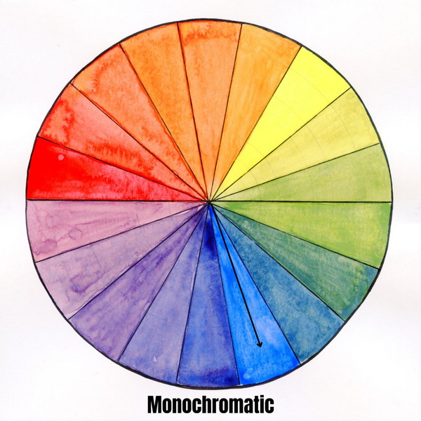
A color wheel is a visual tool for showing you the relationships between colors. On a color wheel you will find primary, secondary, and tertiary colors. You can use the color wheel as a reference to understand how these colors are mixed and how they relate to each other.
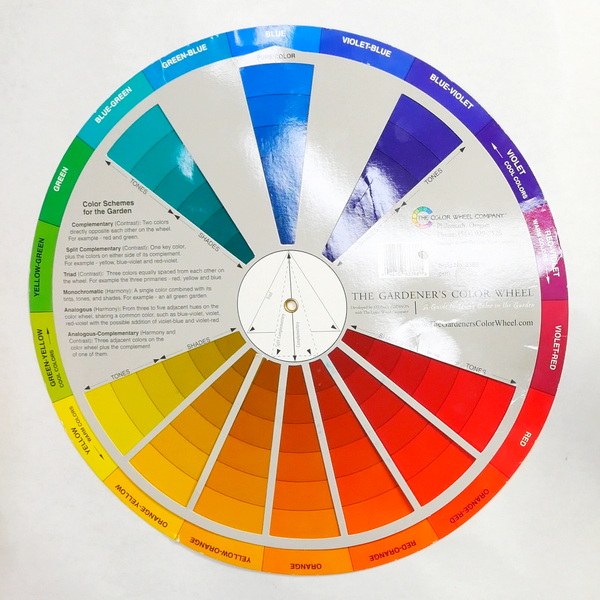
Color wheels come in large and small formats. Depending on the size and manufacturer, they will include information that shows the relationships between colors.

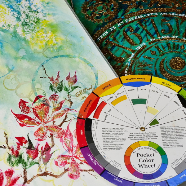
- This 360 degree rotatable color wheel help you to understand color relationship and make choices and combinations easier.
- The front side shows basic principles. Just spin the wheel and you will find the color mixing results in the window.
- The back side indicates the color relationships such as complementary colors and triad colors. It gives you more color combo inspiration when creating.
Primary, Secondary and Tertiary Colors
Before we get into the specifics of color mixing, let’s quickly review the basic colors on the color wheel and how they are made.
Primary Colors
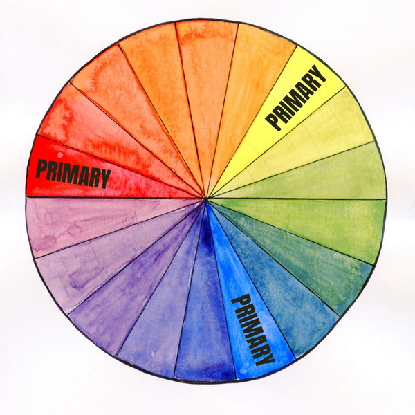
There are three primary colors: red, yellow, and blue. These three colors can be mixed to make any other color. What makes primary colors unique is that they can’t be created by combining other colors together.
Secondary Colors
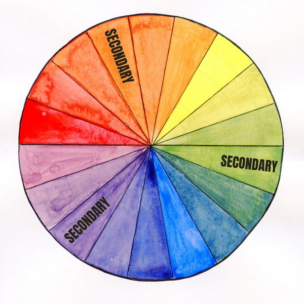
Secondary colors are made by mixing two primary colors. Red and yellow create orange, and yellow and blue create green. Blue and red create purple. By combining equal amounts of two primary colors, this creates a secondary color.
Tertiary Colors
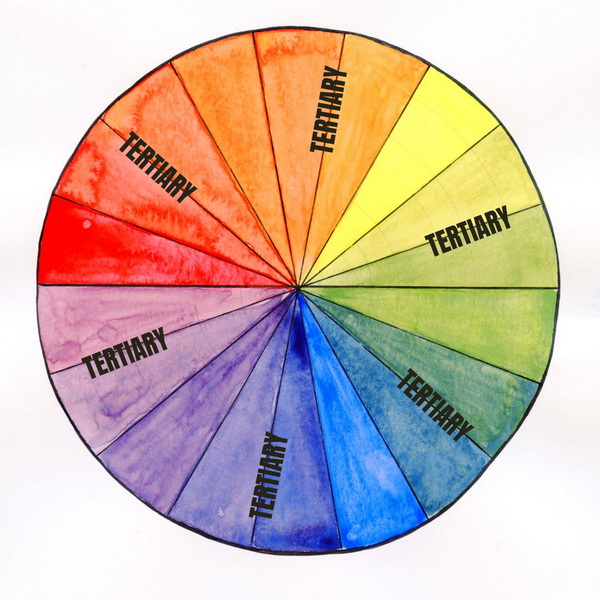
Tertiary colors are created by combining a secondary color with a primary color. For example, you can create a blue-green color by combining the primary color (blue) with the secondary color (green).
By adding in more blue than green, this can create a green-blue, or if you add in more green, this creates a blue-green. By adjusting the amount of primary or secondary colors that you add to a color mix, you can create very interesting color tones.
If you’re interested in learning more about color mixing, visit this article: Intimidated by Watercolor Mixing? An Easy Watercolor Tutorial. These color mixing techniques apply to both watercolor and acrylic paints, the theory is the same for both mediums.
5 Color Relationships that You Should Know
Now that we’ve covered how the color wheel is laid out and how the colors relate to each other, let’s talk about color relationships. There are 5 color relationships that you should try to take advantage of in your art journal pages.
Complementary Colors
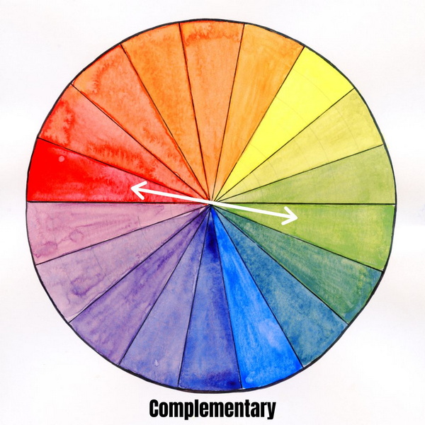
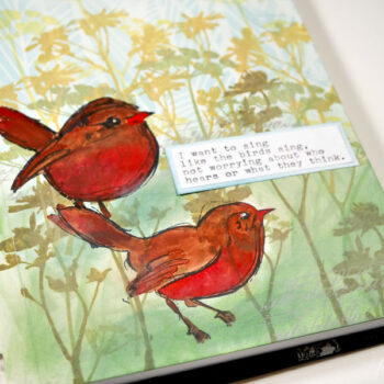
These complementary colors when placed next to each other on a journal page make the other color look even more vibrant. Both yellow and purple are vibrant colors, but placed next to each other, bring on a greater sense of vibrancy and contrast. This is why complementary colors like red and green are popular Christmas colors.
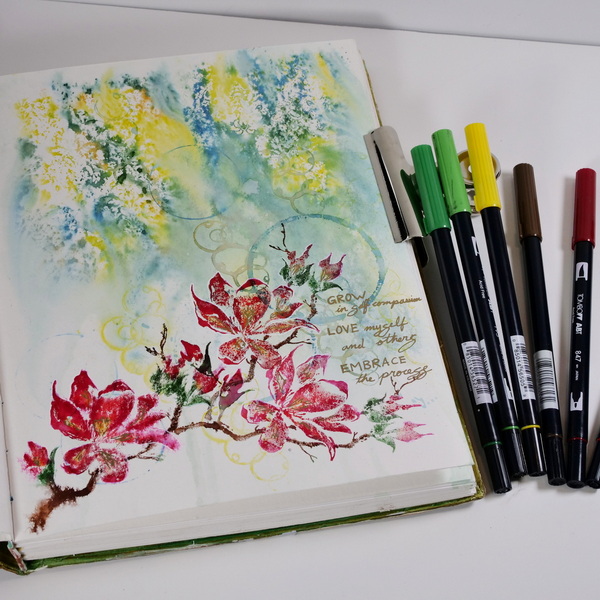
Complementary colors when added to the art journal can really make the images pop. The art journal page above was a study of my brand colors, blue-green and red-orange which also happen to be complementary colors.
Split Complementary Colors
Split complementary color combinations are created by combining a focal color (like red) with the colors on either side of the complementary color (blue-green and green-yellow). This creates an interesting combination of colors that can create more variation and diversity to an art journal page.
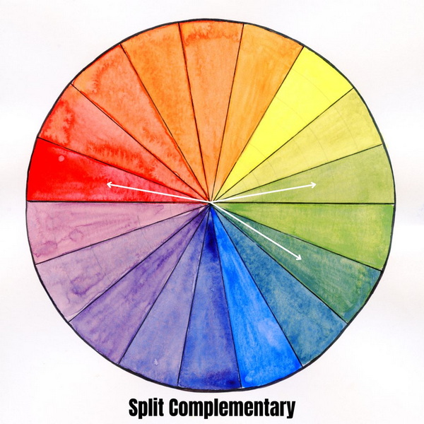
This is a combination I use on a lot of my art journal pages When using these colors together, I would suggest not necessarily having equal amounts of each color on the page. When I use combinations like this, I generally have several colors be more distinctive with a third color being a bit more of an accent on the page.
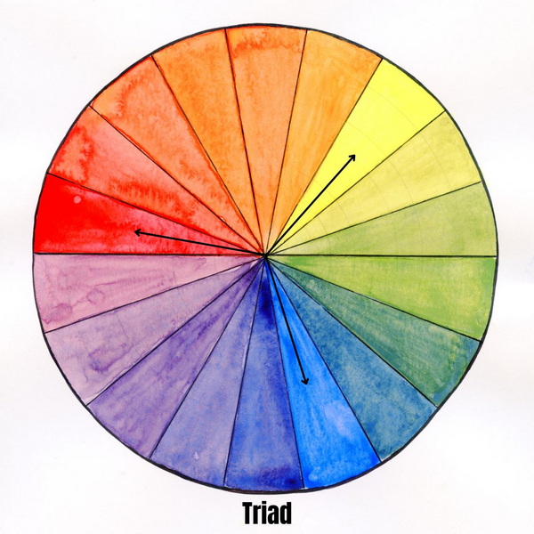
Triad Colors
Triad color combinations are created by using 3 colors that are equally spaced around the color wheel. An example of this is red, blue, yellow (the primary palette). Another example is using green, violet, and orange. But you can use any color on the color wheel, to create a triad. An example of this with tertiary colors is green-yellow, violet-blue and orange-red.
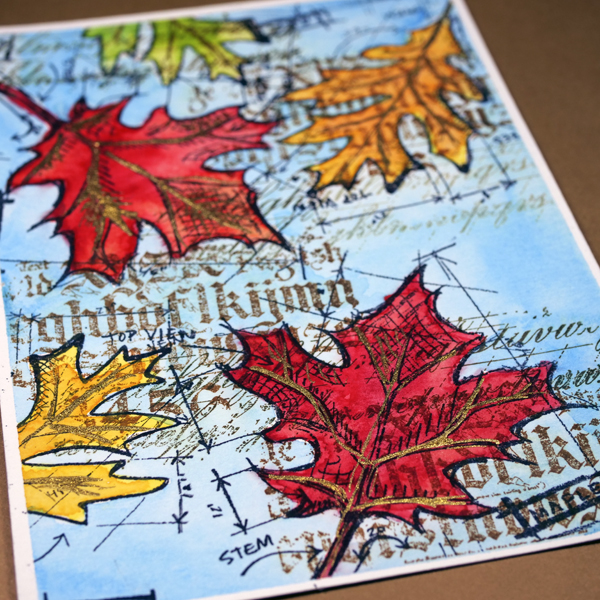
As you can see in the fall leaf project above, I chose the primary palette of red, blue, and yellow, but I also added in some secondary colors on the leaves as well. I like to start with a color combination and adjust it a bit as I go.
Monochromatic Color Scheme
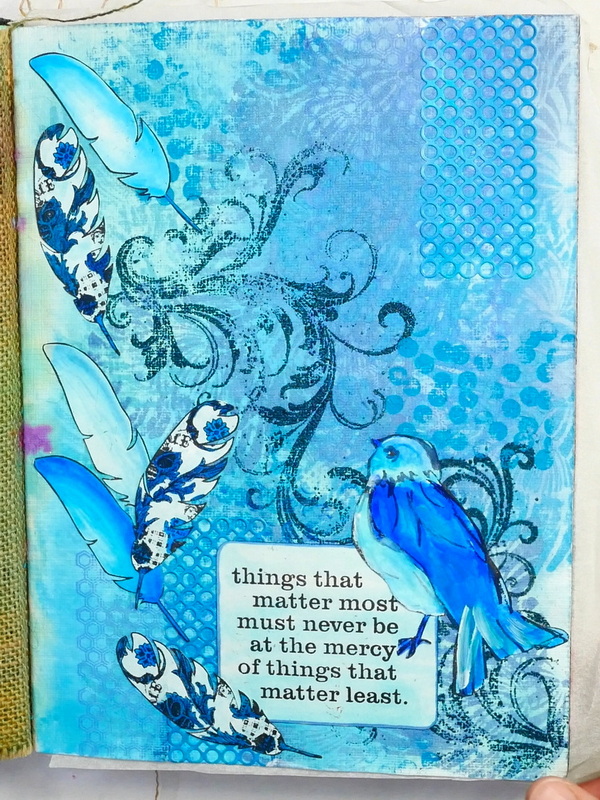
A monochromatic color scheme is created using only one color and the tints and shades from that one color. This means that every possible value of that color can be used on one project. To create a tint, add white to the color. To create a shade, add Black or Payne’s Grey to the color. This a color combination that creates harmony on an art journal page.
I like using the monochromatic color scheme as a challenge to figure out how many different colors and values I can get out of one color.

As you can see in the examples, I love creating monochromatic art journal pages in blue! But remember, you can do this with any color. It’s a great way of understanding how you can lighten and darken one color and use it on your art journal page.
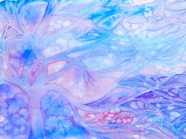
Analogous Color Scheme
An analogous color scheme starts by choosing a color and using three to five adjacent hues on the color wheel. For example, if using blue as your main color, you can use violet-blue and green-blue to create an analogous color scheme. But you could also extend that analogous color scheme to include blue-green and blue-violet.
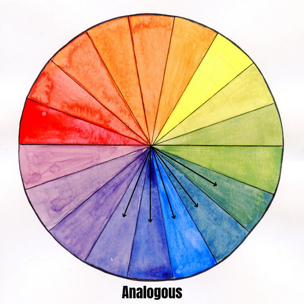
This is one of my favorite color combinations to use in my art journal because all the colors work together. It’s also an easy color mix to create if you’re new to painting. By simplifying your colors to a couple color where you can mix different colors, shades, and tints, it’s a great way to gain confidence with your paints.
Warm Colors vs. Cool Colors
We’ve talked about color relationships, but we can’t forget to mention warm and cool colors. The color wheel can be split into two. One side includes warm colors like yellows, reds and oranges. The other side shows cool colors, like blues and greens. Try using only warm colors or cool colors in your art journal page, you’ll learn a lot from the process!
Another option is using predominantly warm colors and then adding a cool color in to add contrast. This is another way to help a focal image pop on a colorful background.

Art Journaling with Color
By understanding the color wheel and a few color combinations, this can give you all sorts of ideas for your art journal. You may have created a beautiful background but are unsure where to go next. Look at your color wheel for inspiration!
Should I Make or Purchase a Color Wheel?
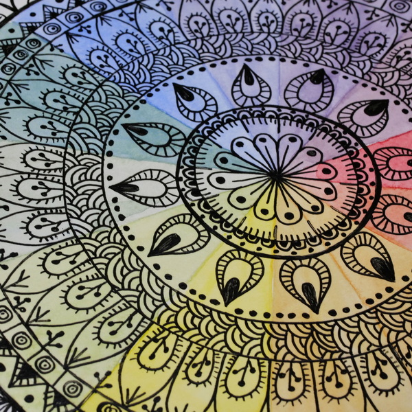
If you want to learn how to mix colors, a great exercise to do with paint or ink is to create your own color wheel. To do this, you just need to draw a circle and equidistant lines to create 18 sections on your color wheel. You can mix your colors and add them into the color wheel. Visit this article How to Create a colorful Mandala Using the Color Wheel where I demonstrate this technique.
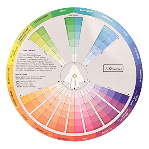
Purchasing a Color Wheel
I tend to purchase my color wheels, just because I use them a lot in my work. They are usually coated paper that can be wiped off if you get paint on them, and they are made to last. Good color wheels will have indexes on them listing the color relationships. This is helpful when creating color combinations. They’re usually created from several pieces of paper, so that you can spin and adjust them as you’re working to create color combinations.
You can usually get them in small and large sizes. I have a large color wheel that I use at home or in classes with my students. I also have smaller ones that I tuck into my sketchbook so that I always have a color wheel on hand when I’m creating.

This clever double-sided wheel explains and demonstrates the various relationships of one color to another. Simply by turning the wheel you can see the results of mixing two colors.
- This 360 degree rotatable color wheel help you to understand color relationship and make choices and combinations easier.
- The front side shows basic principles. Just spin the wheel and you will find the color mixing results in the window.
- The back side indicates the color relationships such as complementary colors and triad colors. It gives you more color combo inspiration when creating.
Our Color Mixing Guide is more than just a wheel; it's a comprehensive learning board designed for artists, painters, and coloring enthusiasts of all ages.
Can You Use Color Wheels in Other Places Besides the Art Journal?
Yes, you can absolutely use color wheels outside the art journal. If you look around you, you’ll see color combinations everywhere! When planning my garden for the year, I use a color wheel. In fashion and design the color wheel is used constantly.
One of my favorite things to do is to take pictures of color combinations around me that I love. They may be from nature, from clothing, from posters or paintings. The world around you can help you explore color to be used in your next journal project.
Any Questions?
Any questions about the color wheel and how you can use it in the art journal? Do you have any favorite color combinations that you use in your projects? I’d love for you to comment below and share your favorite color relationships and color combinations!