Painting in the Art Journal: Trying a New Style
Are you looking for painting inspiration for your art journaling practice? There’s so much we can learn by drawing inspiration from another artist’s style.
Sometimes I get in a rut with my art journaling where I fall into using the same techniques all the time. To mix things up, I’ll look at the work of other artists and see what aspects of their style I want to use in my own creative practice. This is a great way to bring fresh perspective to your work and encourages artistic growth.
Hop-A-Long Studio is reader-supported. When you buy through links on our site, we may earn an affiliate commission at no cost to you. Learn more.
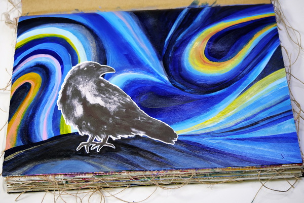
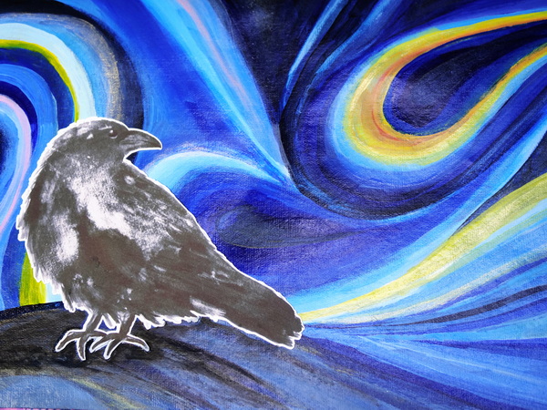
In today’s project I’m challenging myself to paint in the style of Julie De Boers. I love her style. The flowing lines, bright colors and the whimsy in her painting style makes me feel so happy. As a starting point for today’s project, I’m using her painting, “Winter’s Night” for inspiration. This is a great opportunity to play with a different style and color and see what comes from it.
Why Emulate Another Artist?
So why would I want to emulate another artist’s work? It’s not about copying but it’s a way for us to try something different and an opportunity to play with some new techniques. It’s an experiment. You never know what will come of it. You might find that your style gets influenced in a positive direction by emulating another artist’s work.
One of my favorite artists (and a fabulous art teacher herself), Samantha Williams-Chapelsky, talked about this recently in a class that I took with her. She encouraged us to study other artists but cautioned us not to spend too much time painting in only one artist’s style. Otherwise we end up painting only in their style and lose our own.
To work in our own style, it’s important that we take the time to study a lot of different artists and experiment with many different techniques. This is how we will truly develop our own style and a unique form of expression.
Painting in the art journal is an excellent way to play and test new techniques. I like to create in a journal because it gives me a place to experiment without getting too precious about the results. I find painting on a canvas can be a little intimidating. If I create something beautiful in my art journal, then I’ll often recreate it on a larger canvas. This is a fun way to learn new styles but not to feel too much pressure about the process.
What To Focus on When Emulating Another Artist
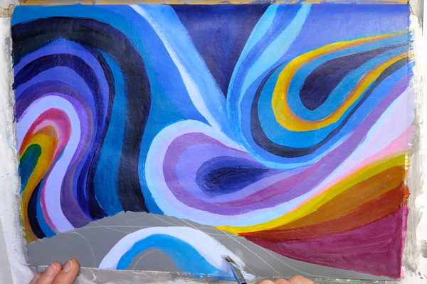
It’s important that we take some time to figure out what we love about another artist’s pieces. Is it the colors, the composition, the flow of the piece, or the subject matter? While painting in the art journal this week, I wanted to focus on how Julie De Boers paints her skies. I really struggle with skies and I love the unusual way she makes these skies so beautiful and unique. It’s the colors, variation and flow of the skies that I’ll be focusing on in my painting today.
Start with Drawing
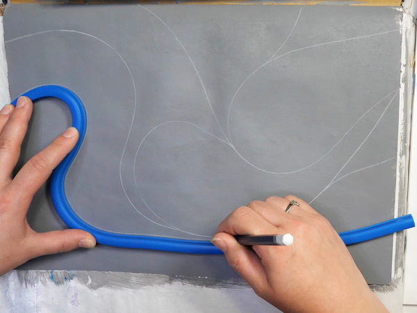
Even if you don’t consider yourself an artist or you don’t feel confident drawing, this is an easy piece that will help you improve your drawing skills. We need to think about shapes and how simple shapes can create a really interesting composition.
Today I’ll be using a flexible curve to help me with creating my composition. If you’ve never seen a flexible curve, this is a drafting tool that can be bent into a variety of shapes. The stiffness of the curve helps the curve stay in place as you trace the shape.
To use this tool, place the flexible curve on your page. Create the shape, and use a pencil to add in the curved line to the page. It’s a very easy tool to use and you can create complex, beautiful designs quickly and easily.
You could also choose to freestyle the shapes, but I like the simplicity that the flexible curve brings to my work. It keeps the process quick and intuitive instead of getting too caught up in the details. If you don’t have a flexible curve, but have a French curve, you can get the same effect with a different tool.
Paint the Shapes
Once you’ve added in lines, add paint to the basic shapes. I’m using a combination of Golden Titanium White, Quinacridone Red, Hansa Yellow Medium, Benzimidazolone Yellow, Dioxazine Purple, Maganese Blue Hue, Anthraquinone Blue (Indigo), and Liquitex Payne’s Grey to add color to these areas.
I’m working with mostly fluid and high flow paints from Golden and Liquitex. These paints have high pigment load and create beautiful, smooth color quickly. For the heavy body paints, to help them blend more easily, add water, and mix to get a smooth and even flowing paint. But make sure not to add too much water!
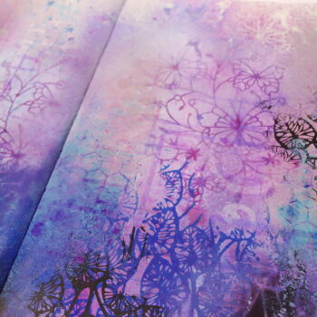
This is the stage to figure out general colors and gradation of color that you want to use on your piece. When I see Julie’s work, she has areas of vivid contrasting color (like oranges and yellows) which add interest to the different blues. This is an opportunity to play with color, figure out what you like and what you might want to change for the next layer.
Adding in Blending and Adjusting Color
After adding the first coat of paint, I noticed that I had too much color variation. I had a lot of blues, but I also had purples, reds, oranges and yellows. There were too many colors competing for attention. This is why it’s great to add the first layer of paint. It gives you an indication of colors and values. At this point you can decide what you want to adjust before you spend a lot of effort blending and adjusting color.
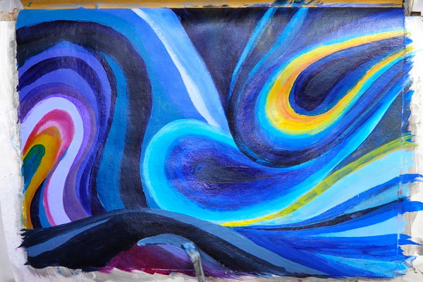
I decided to simplify my colors by removing the purple and sticking to shades of blue and yellow. A lot of my color mixes came from blending several of paints together.
Any of the blues can be mixed with white to lighten up a color. I also love mixing Manganese Blue Hue with Phthalo Blue (Red Shade), this gives a fabulous blue color with a red undertone. Manganese Blue Hue also mixes beautifully with Payne’s Grey. By playing around with your blues, this gives you a variety of blues that have a lot of harmony but very distinct and beautiful individual colors.
You can also do the same thing with the Benzimidazolone Yellow and Hansa Yellow Medium. I mixed both of these colors together and then added a bit of white to make them more opaque. The yellows will generally be more translucent. Adding in white will give them more contrast instead of disappearing on the page, especially if you’ll be adding more paint layers overtop.
Blending the Colors
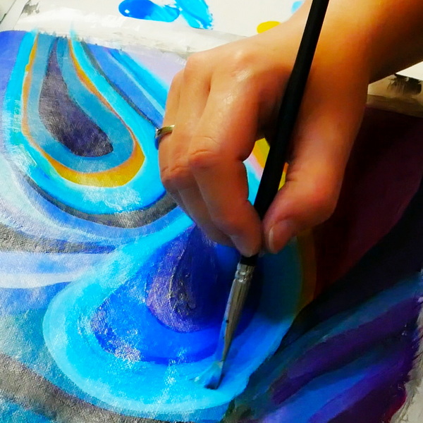
To create softer blended areas, while one color is still wet, add a second color next to it, then blend them together. This wet-on-wet technique will give you some unique color blends. Just be aware of your color wheel as you make these blends. You’ll notice there are small areas of green on my background. This is caused by the wet on wet mixing of blue and yellow together. You can make brown by accident if you aren’t careful or don’t understand color theory.
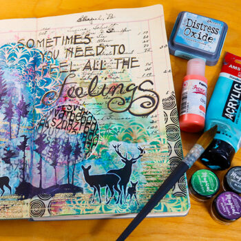
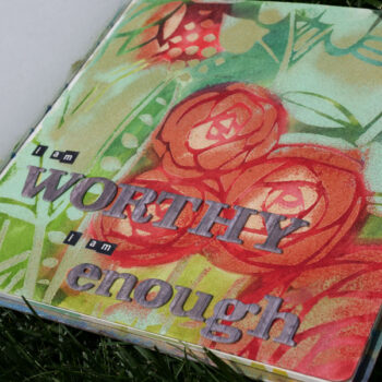
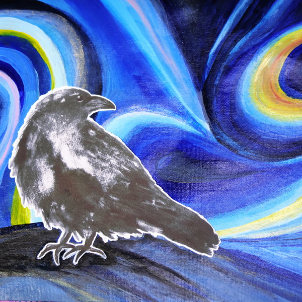
Adding in a Focal Image
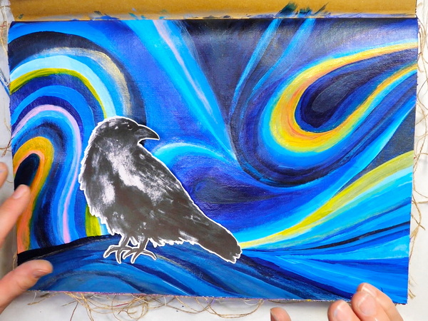
After you’ve completed your background, you can add in your focal images. I’m using large ephemera from Simply Stated Design. Simply Stated Design is a Canadian company that makes small runs of a beautiful designs that are perfect for the art journal.
I was originally going to add in both the moon and raven image, but after completing the painted background, I didn’t want to have anything take away from the sky. So I only added in the raven image.
You may find that as you work through a project, it may take on a different direction than what you first planned. That’s ok. It’s important that we don’t get too caught up on a design but adjust as we create. I promise that when you do this, you’ll be so much happier with the final result!
You can use any adhesive to add your focal image. I’m using Art Glitter glue because it dries clear. This way if there are any areas that the paint seeps past the image, you won’t notice the glue on the page.
Final Touches
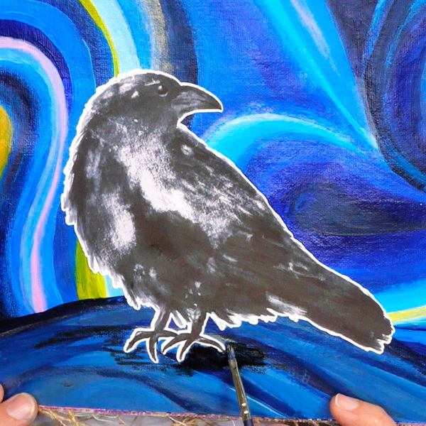
At this point, you could add in journaling or a title. I didn’t have any journaling that I felt like adding, so instead I added some final touches using the Stablio All black pencil.
I love the raven image, but I felt like it was sticking out on the page and didn’t feel part of the landscape. The Stabilo All Black pencil is one of my favorite ways to add shading to the art journal. It works on any surface and is water soluble.
Add Stablio All Pencil to the page around the legs of the raven. Then use a paint brush to blend the shading out. Continue to do this, adding layers until you’ve added in all the shadows you want. Now the raven feels like its part of the piece instead of something I added on later.
Any Questions?
Any questions about painting in the art journal and the process of emulating another artist’s work? This was a bit of an experiment for me, but I hope that you enjoyed following along with me as I explored. Do you have a favorite artist that you like to follow that inspires your work? Leave a comment below, I’d love to know who inspires you! I hope that you take some time this week for some creative self-care!
Project Supply List

NEW! Dina Wakley Media Large Journal 10″ x 14.25″
from: Ranger Ink Industries
Golden High Flow Acrylics – Anthraquinone Blue (Indigo), 1 oz bottle
from: Blick Art Materials
Golden Fluid Acrylics – Titanium White, 1 oz bottle
from: Blick Art Materials

Golden High Flow Acrylics – Quinacridone Magenta, 1 oz bottle
from: Blick Art Materials


- Professional quality
- Comparable pigment load to Golden Heavy Body Acrylics
- 100% acrylic emulsion; no fillers, dyes, or opacifiers
- Intense, permanent colors with a smooth, fluid consistency


Golden Interference and Iridescent Heavy Body Acrylics add an exciting range of options to your creative repertoire. Used alone or mixed with other acrylic paints, they enable you to achieve color effects that are truly spectacular.
Golden Fluid Acrylics – Iridescent Micaceous Iron Oxide, 1 oz bottle
from: Blick Art Materials

Liquitex Acrylic Gesso – Neutral Gray, 8 oz bottle – $13.93
from: Blick Art Materials

Art Glitter Glue is permanent and dries clear and adheres to a variety of surfaces. It's water based and acid free. Make sure to close lid to avoid drying of glitter glue. Bundle comes with one bottle of 8oz, one bottle of 2 oz and a metal tip for easy application.

This paintbrush set are made of top-grade imported nylon wool, nickel plated copper tube and wood body. It is a well-made delicate painting brush set with solid and flexible hair, sturdy and washable.